Design: ideas and frameworks explained
A collection of ideas, frameworks and techniques related to Design, explained clearly so they are easy to understand and share. Browse practical concepts, principles and tips, with visual examples to make them memorable.
 Front-load Key Words
 Diagonal Billing (or Staggered Billing)
 Apples and Ideas
 Spectrum of Abstraction
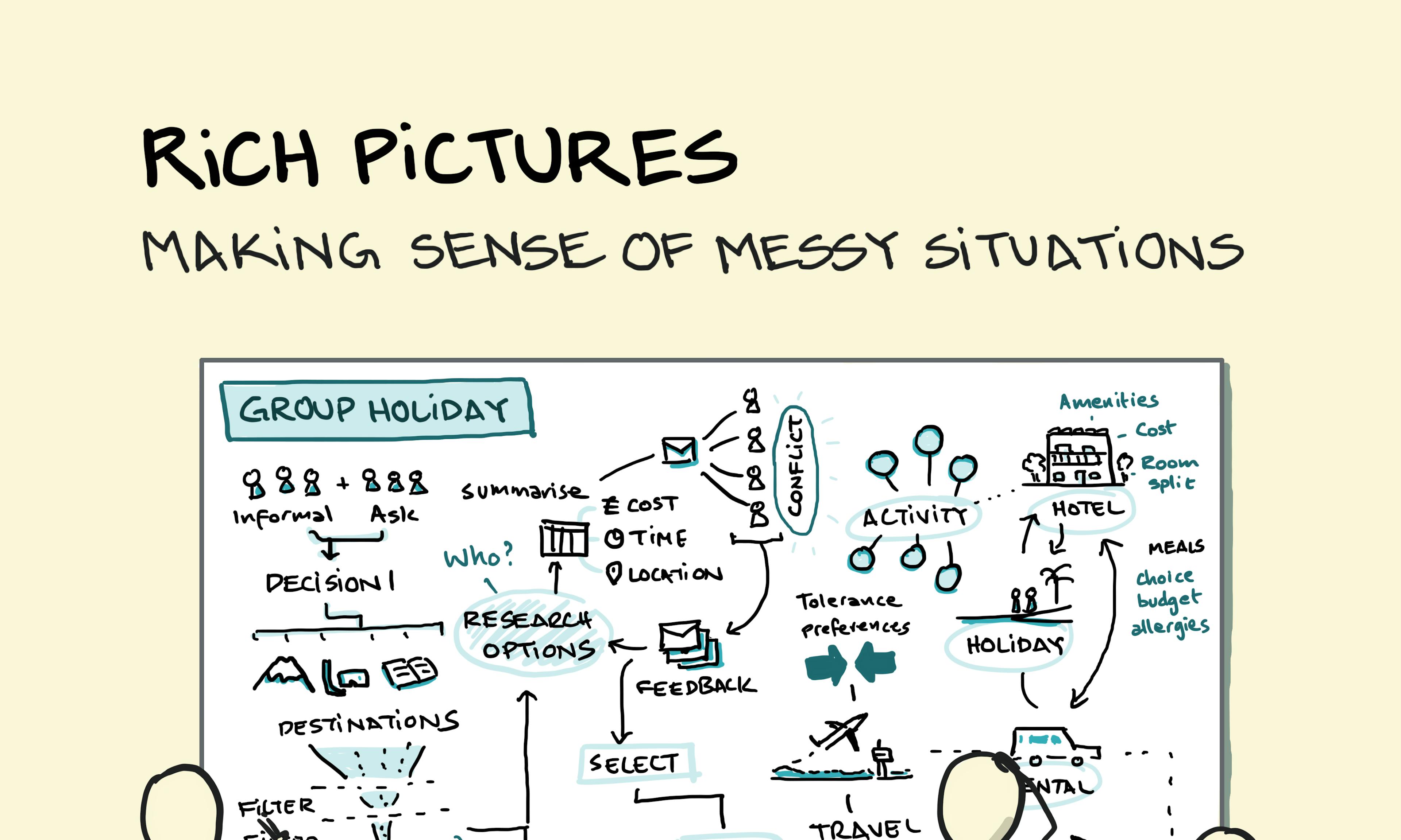 Rich Pictures: Making Sense of Complex Problems
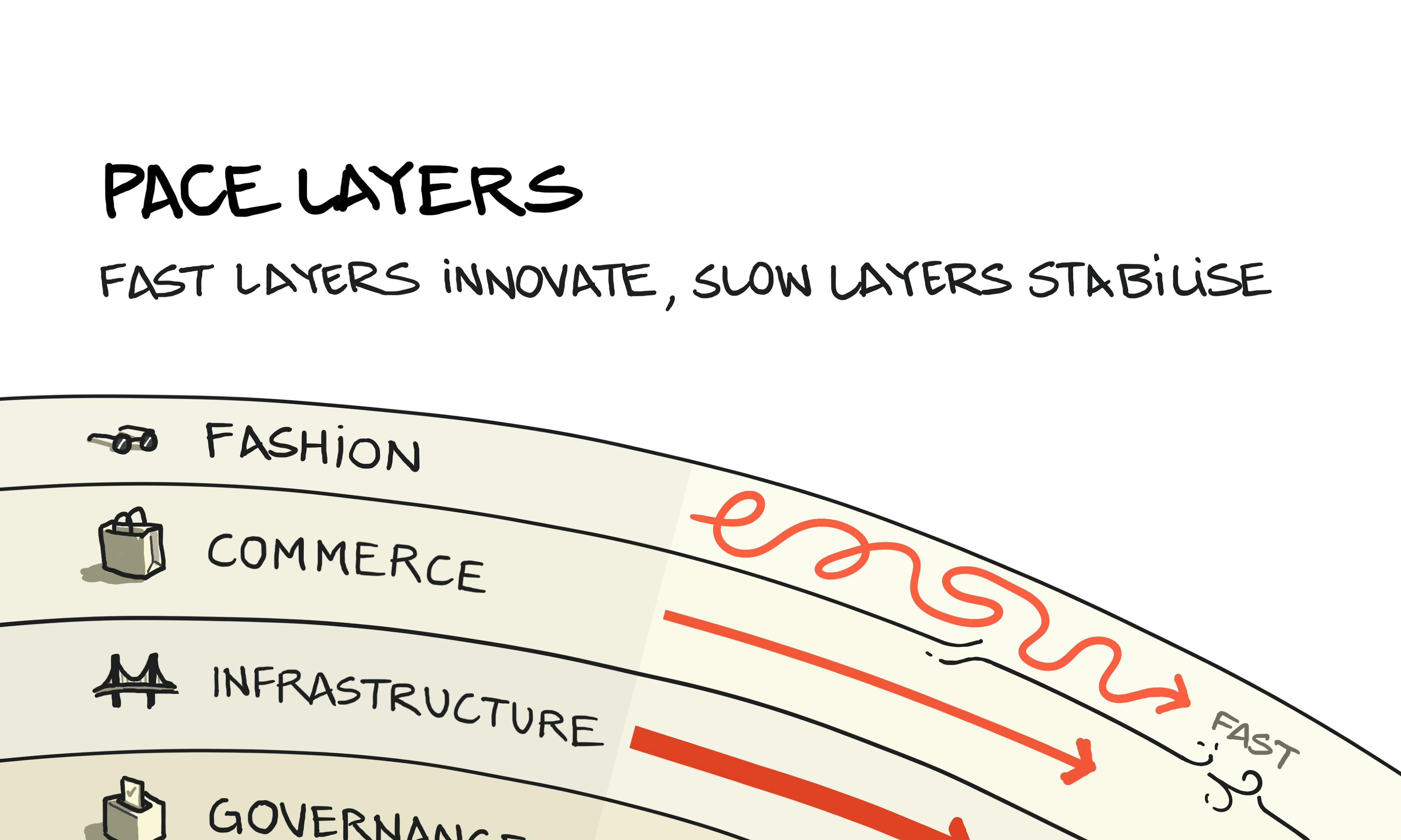 Pace Layers: Six layers of robust and adaptable civilisations
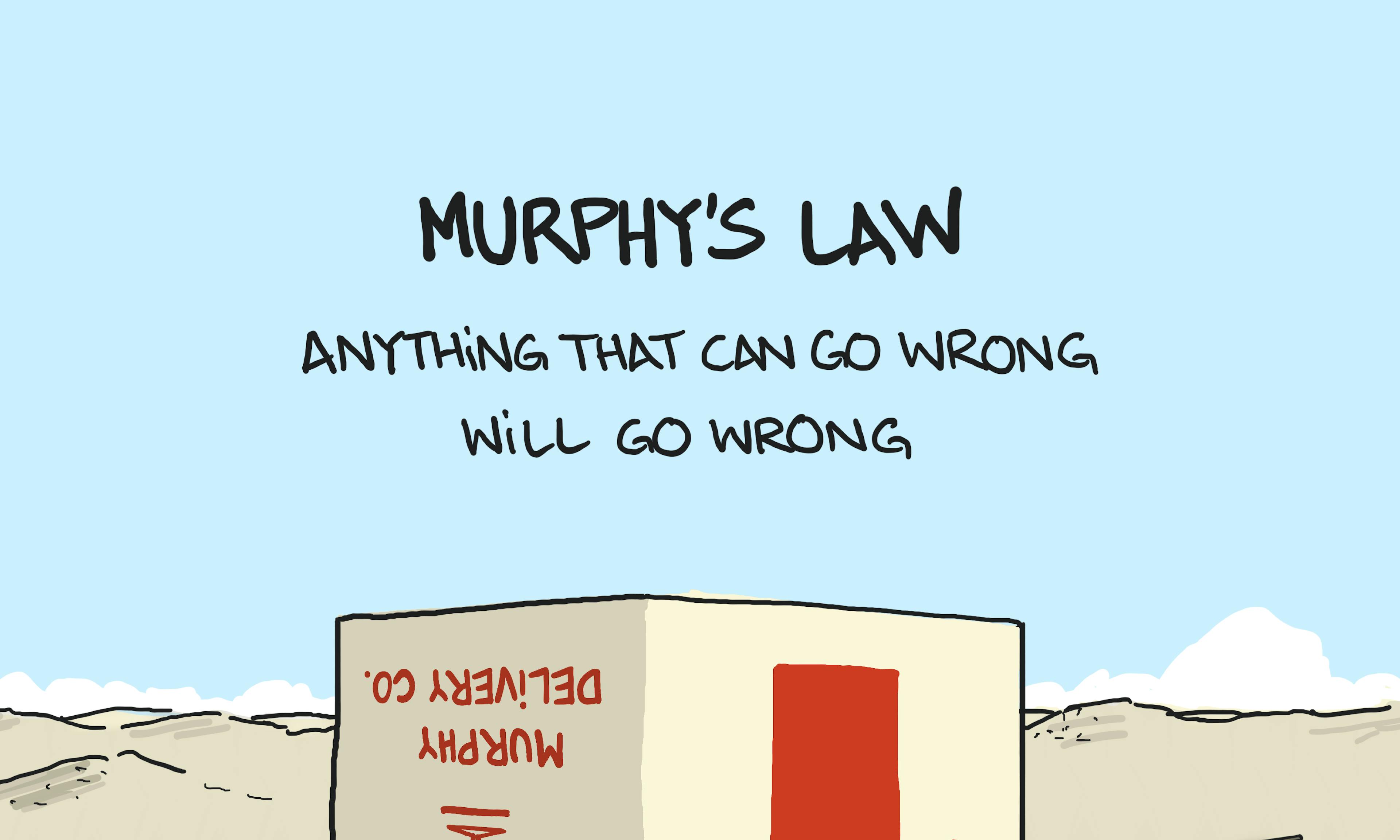 Murphy's Law
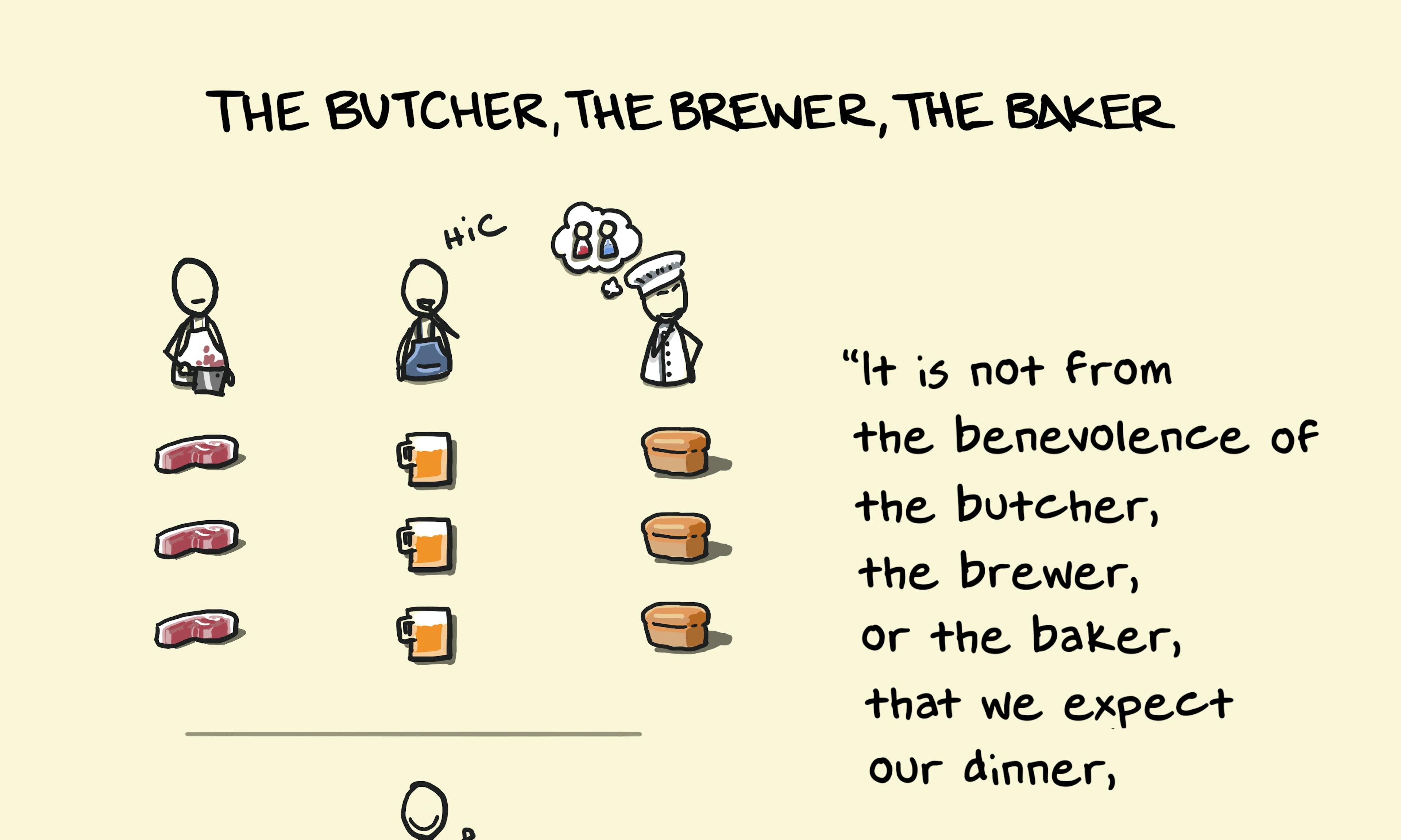 The Butcher, the Brewer, the Baker — Adam Smith quote
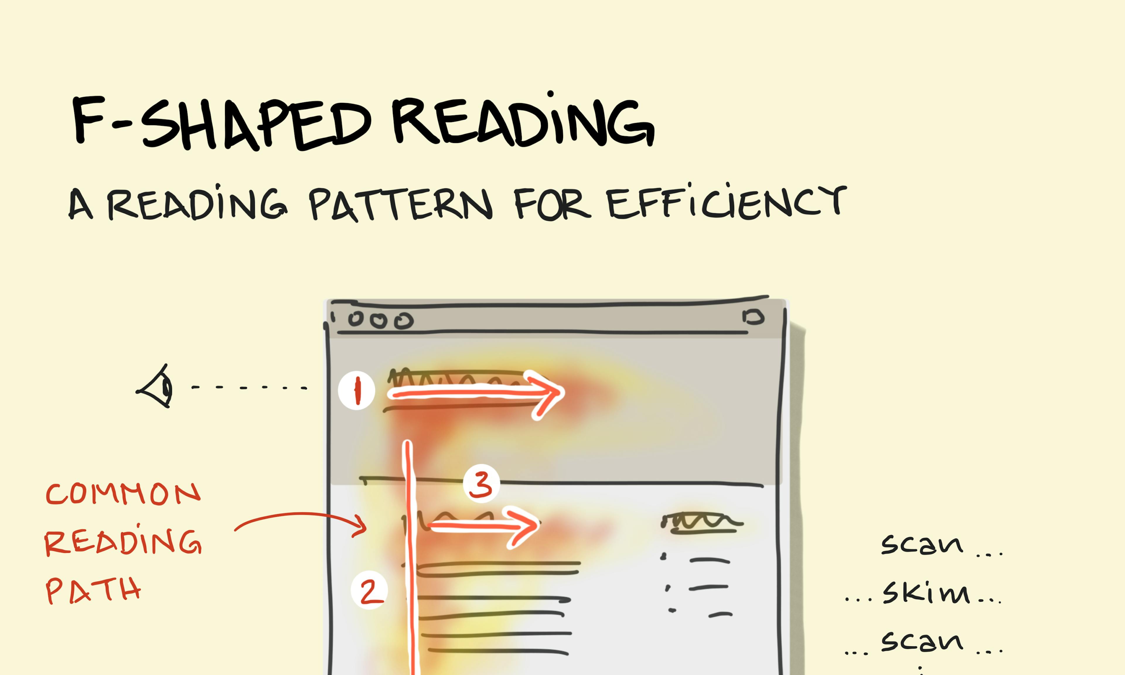 F-Shaped Reading
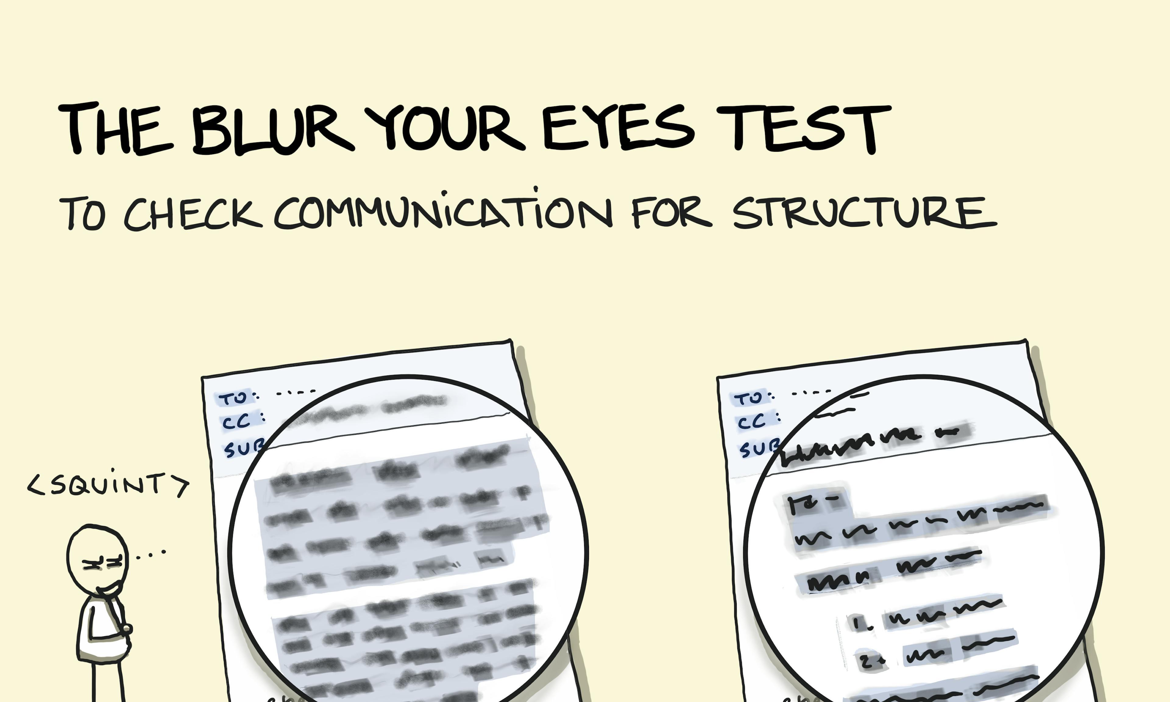 The Blur Your Eyes Test
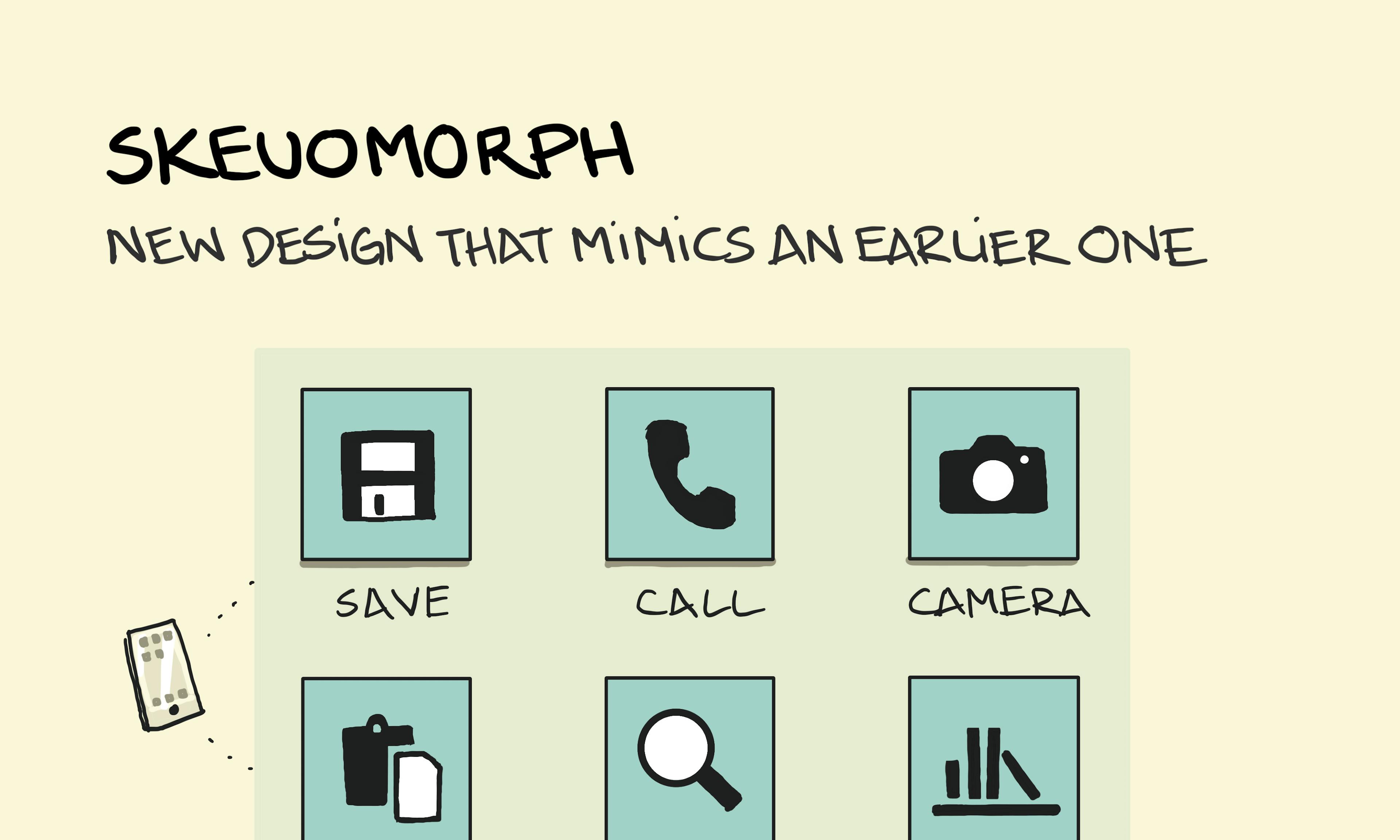 Skeuomorph
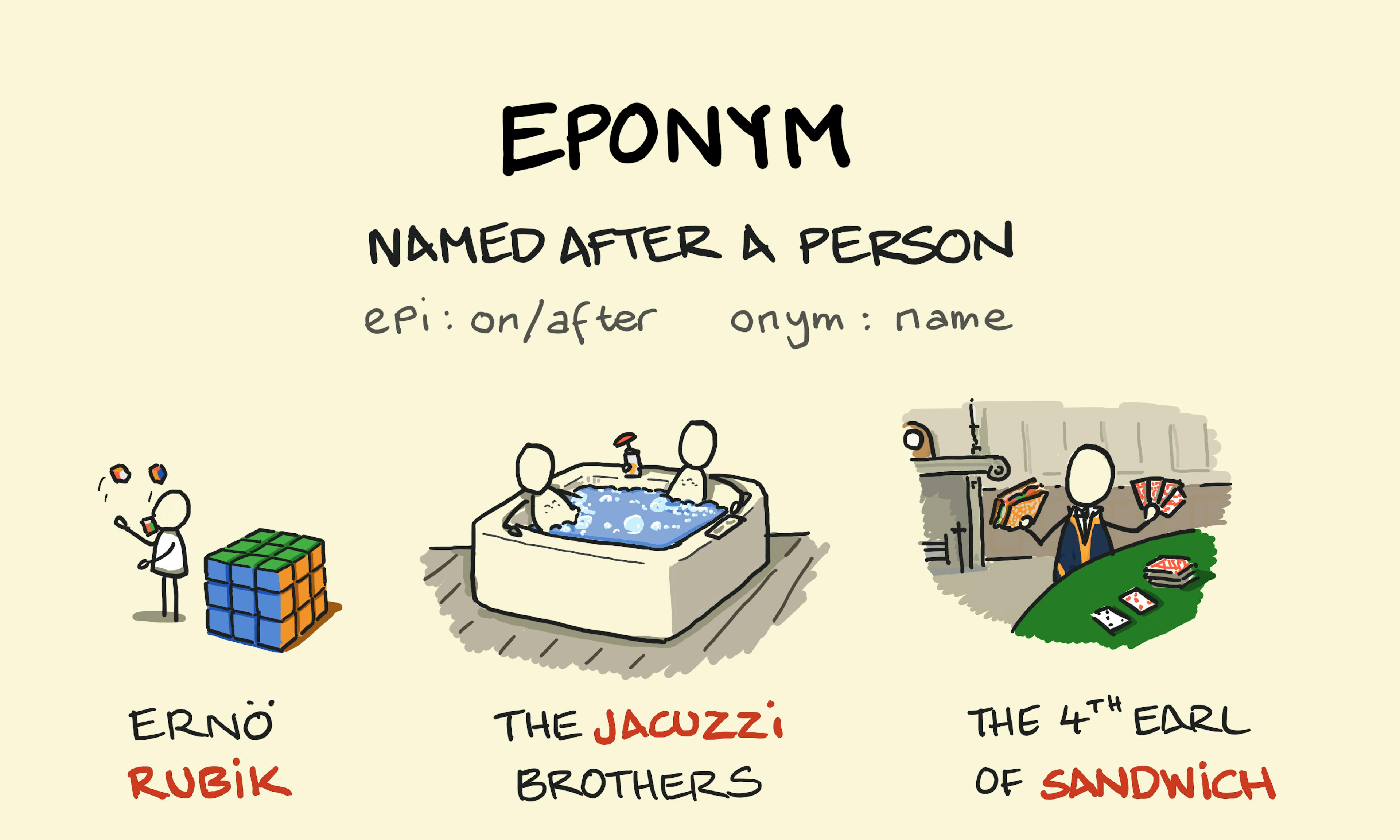 Eponym
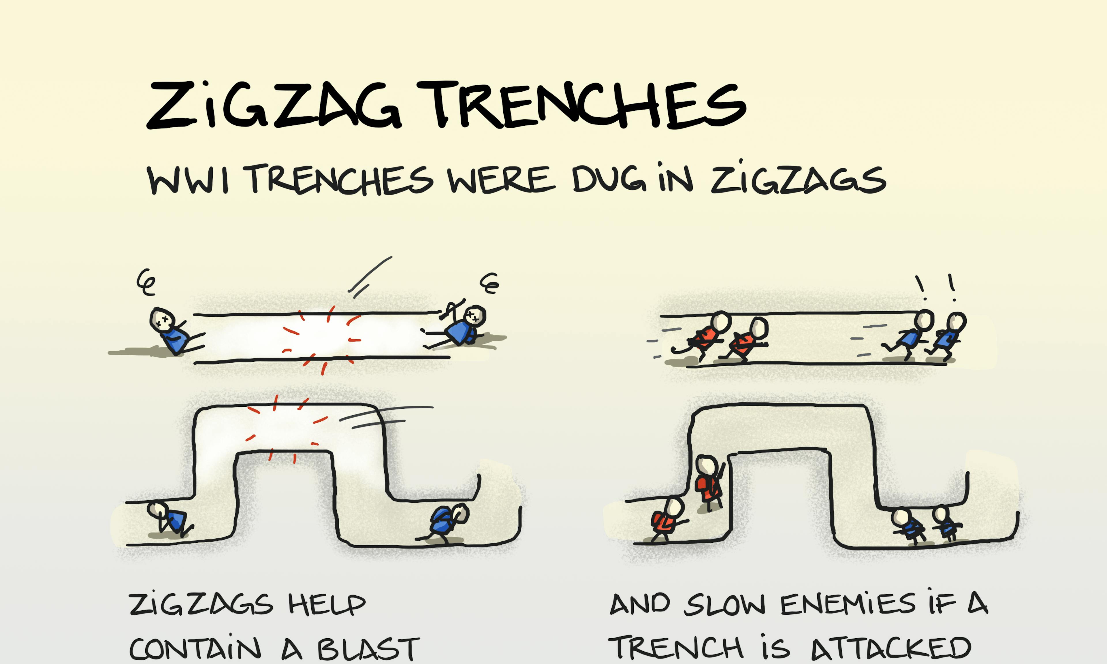 Zigzag trenches
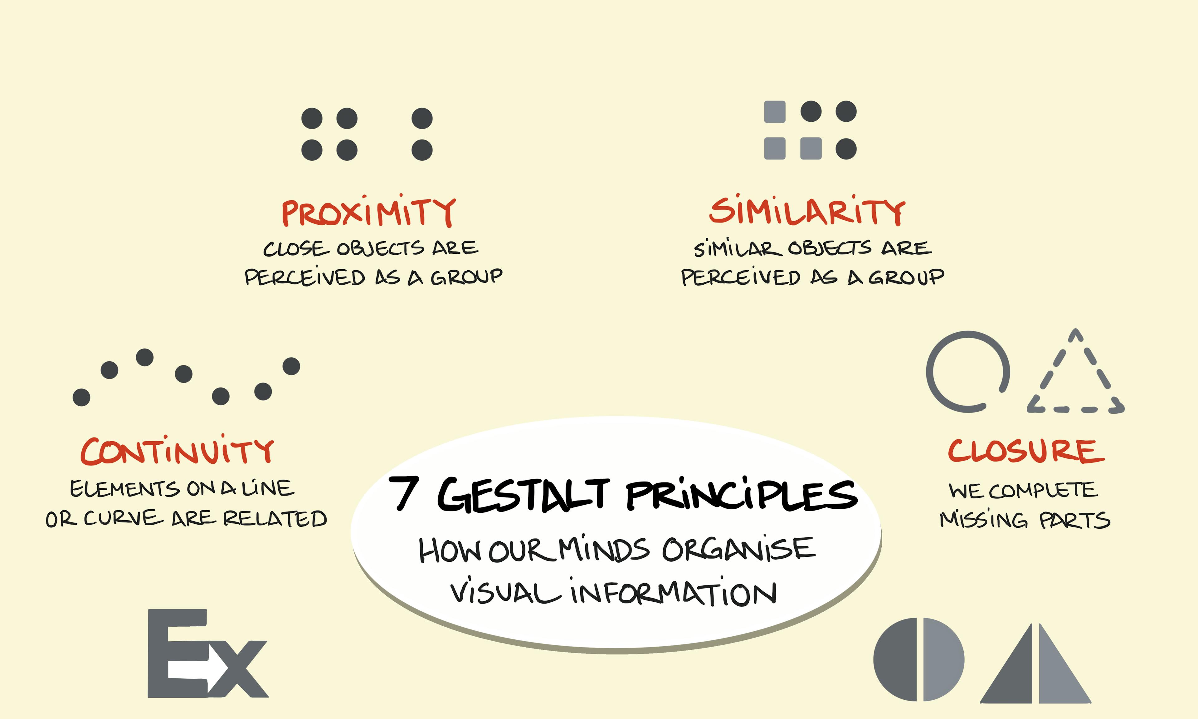 Gestalt principles
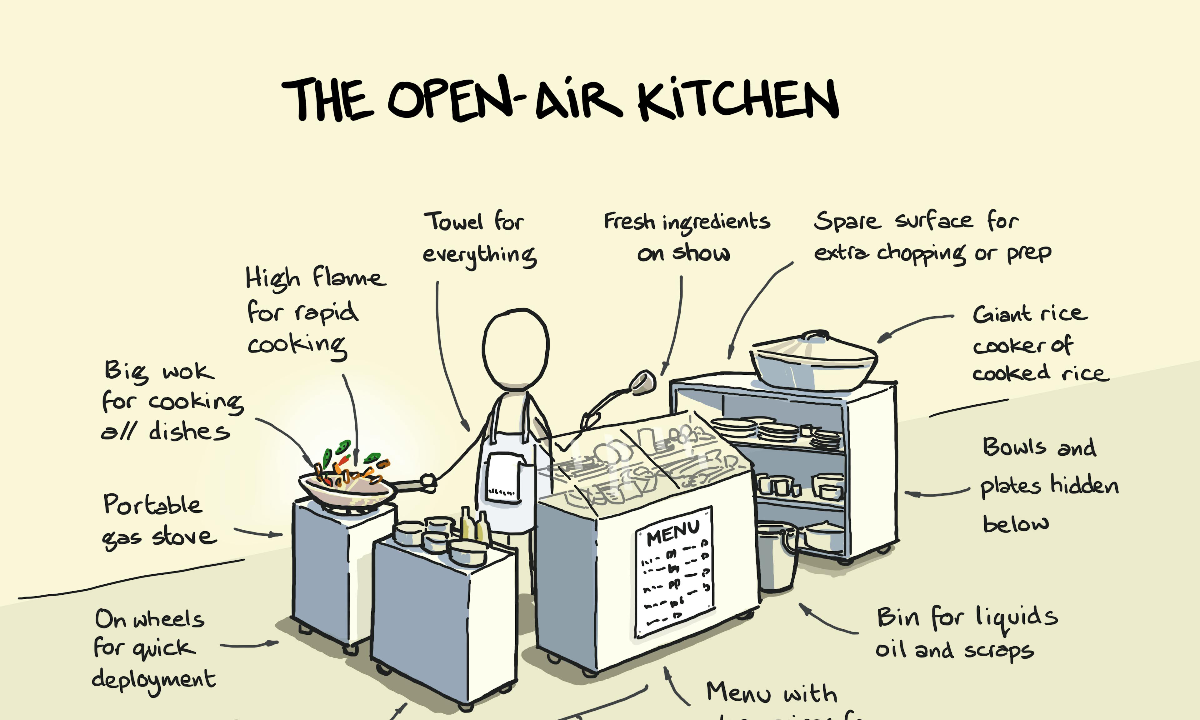 The street food open-air kitchen
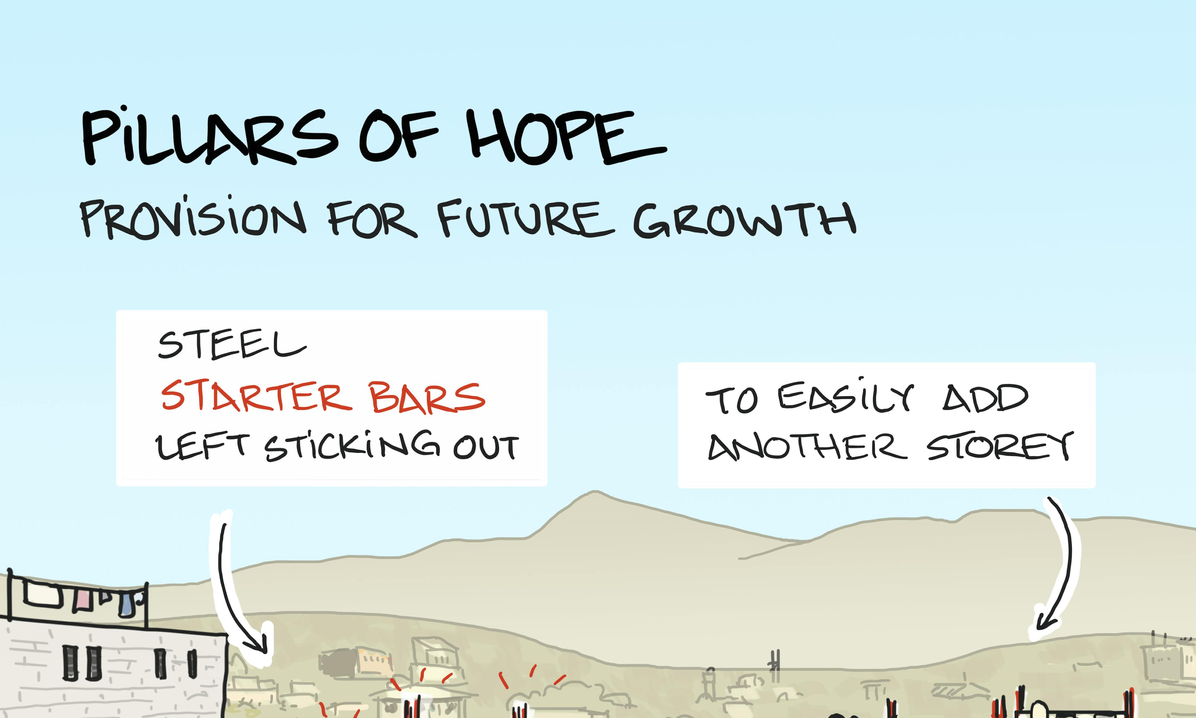 Pillars of hope
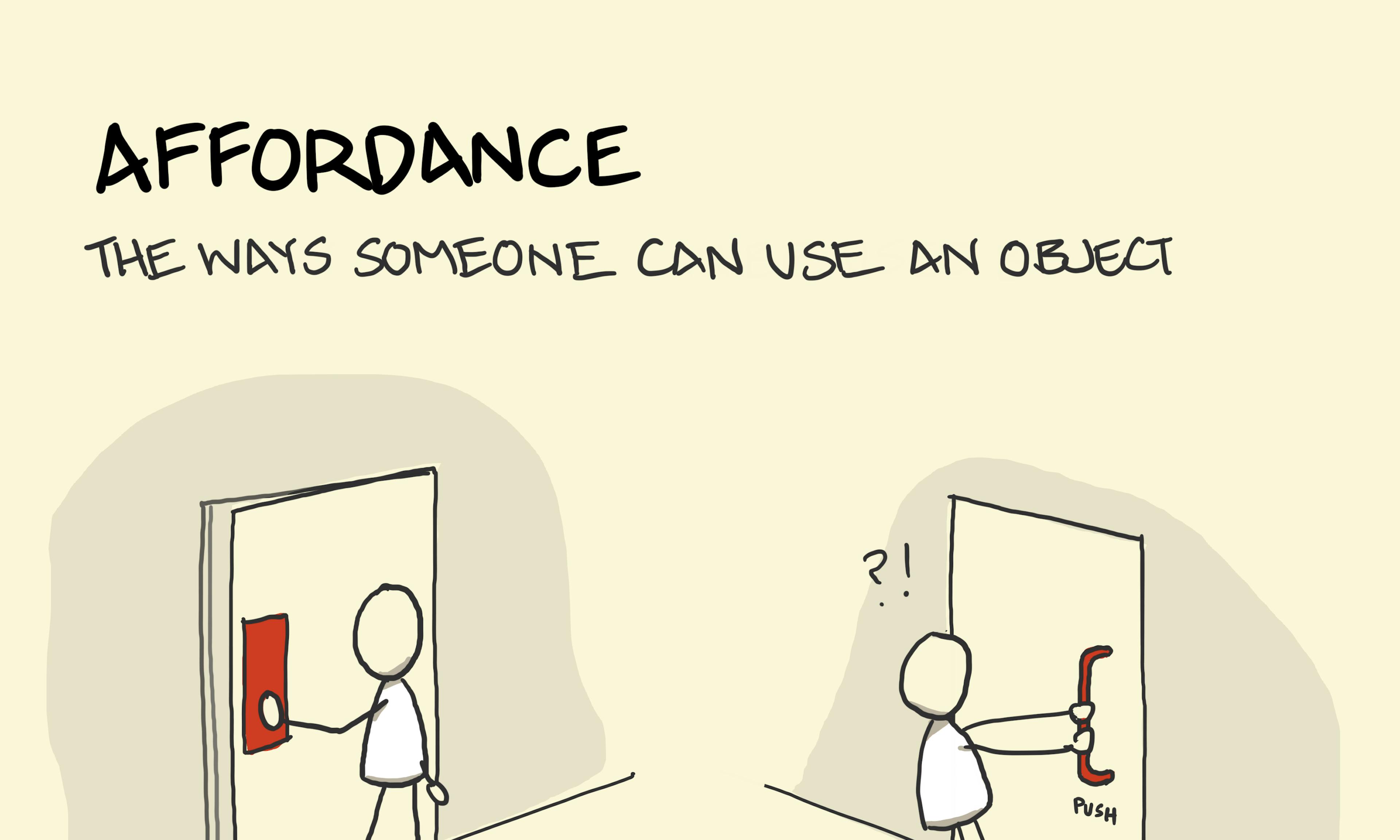 Affordance
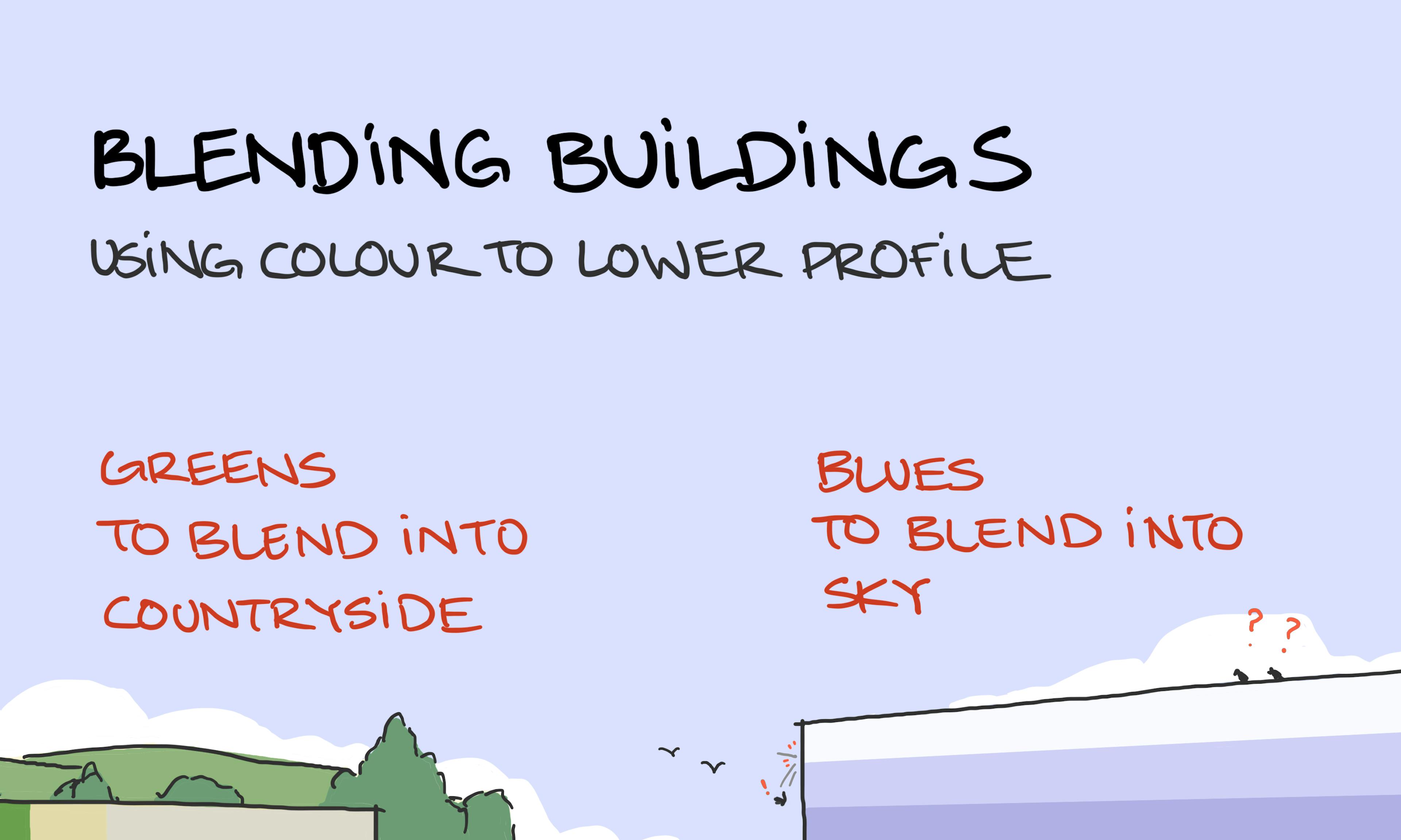 Blending buildings
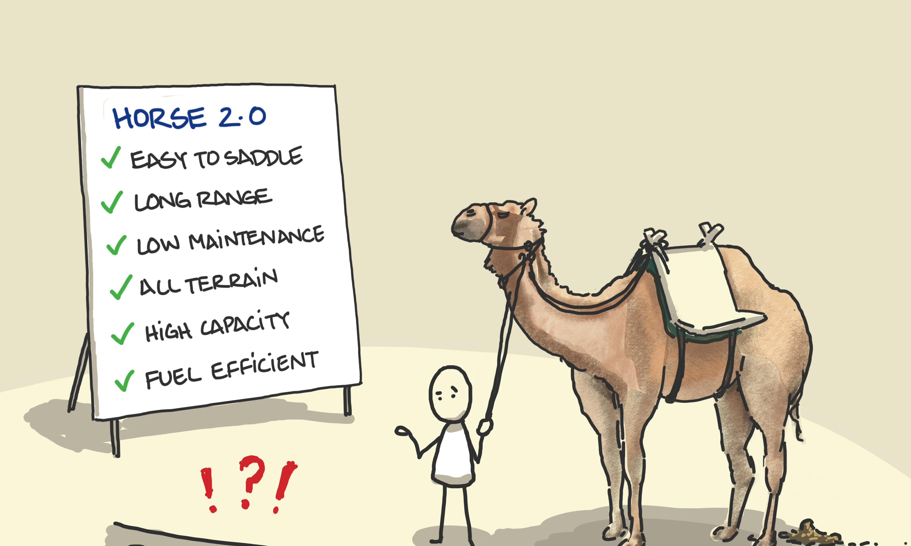 Design by committee
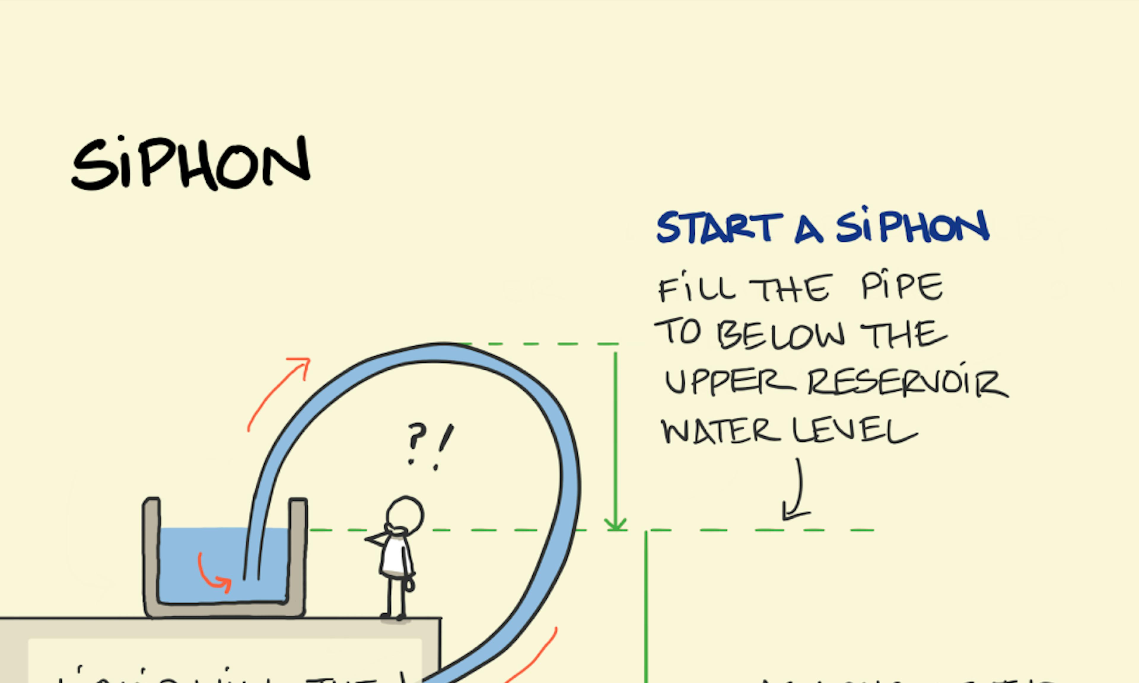 Siphon
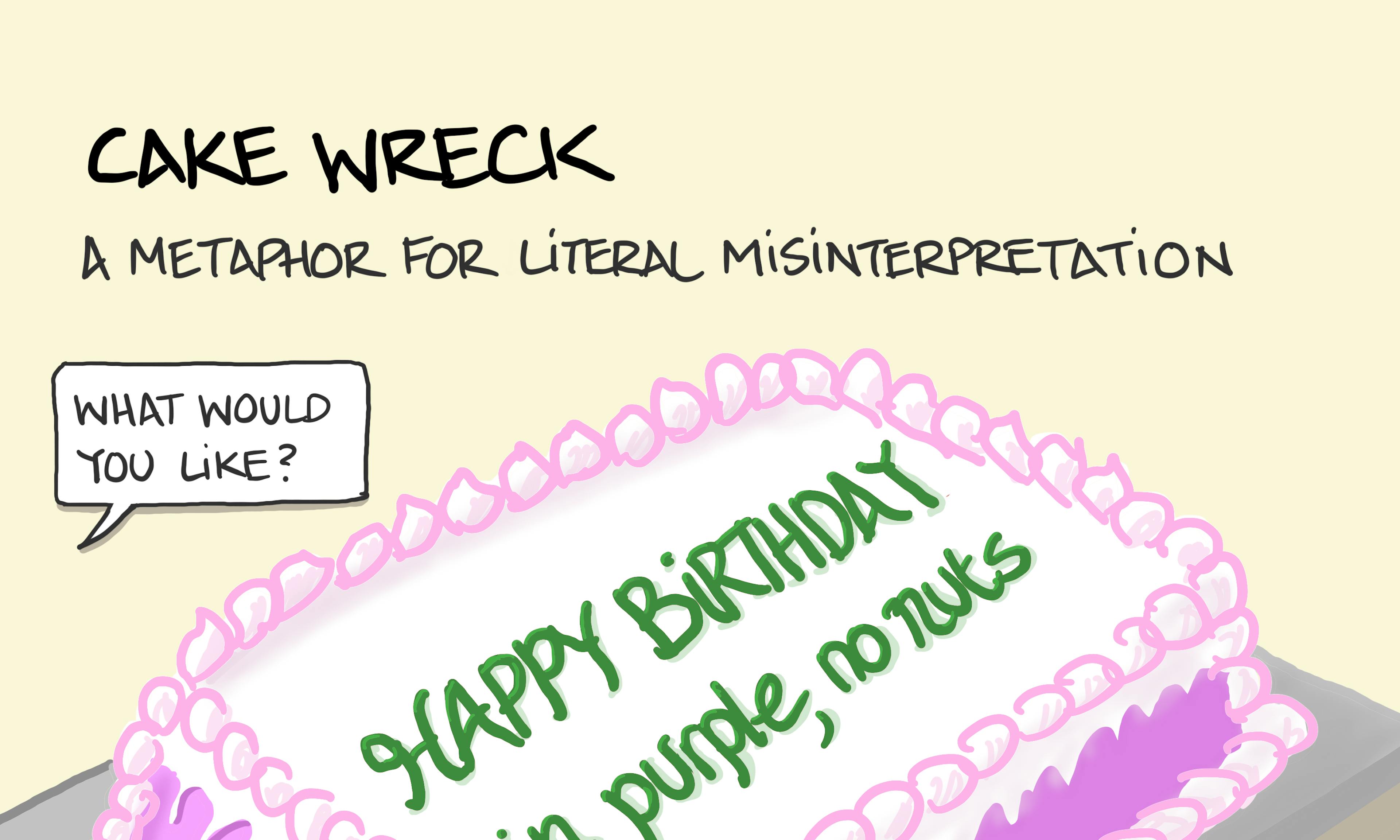 Cake wreck
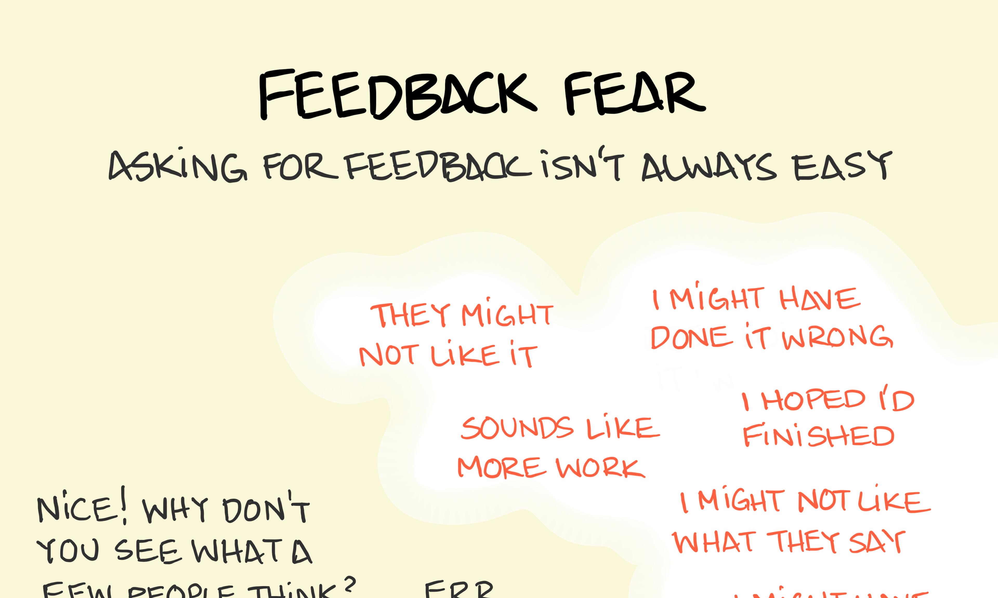 Feedback fear
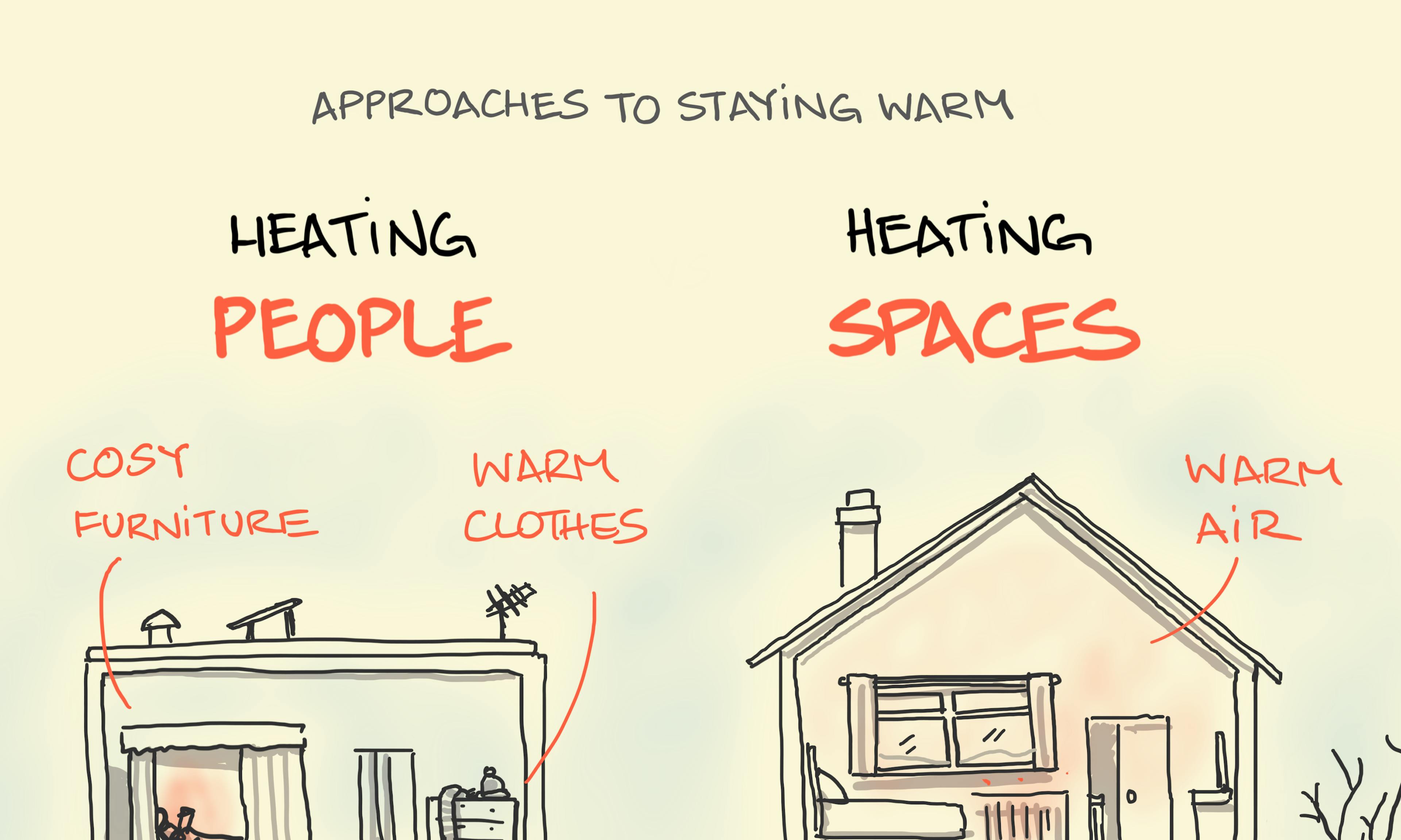 Heating people, heating spaces
 A common orb spider web
 The first draft is always perfect
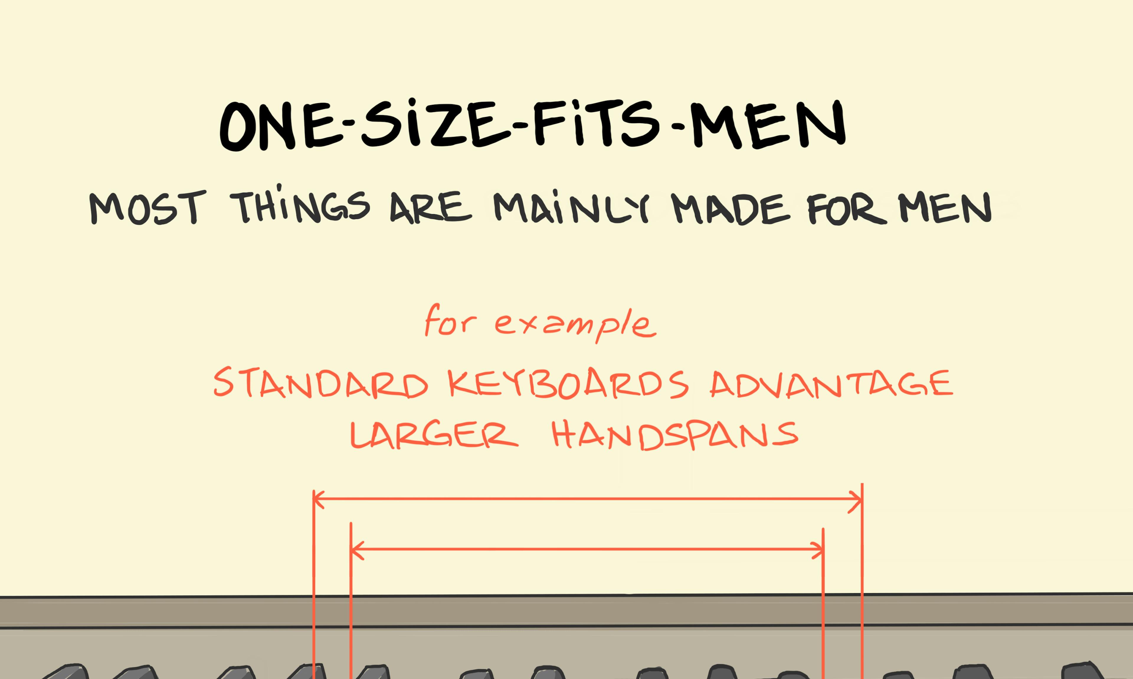 One-size-fits-men
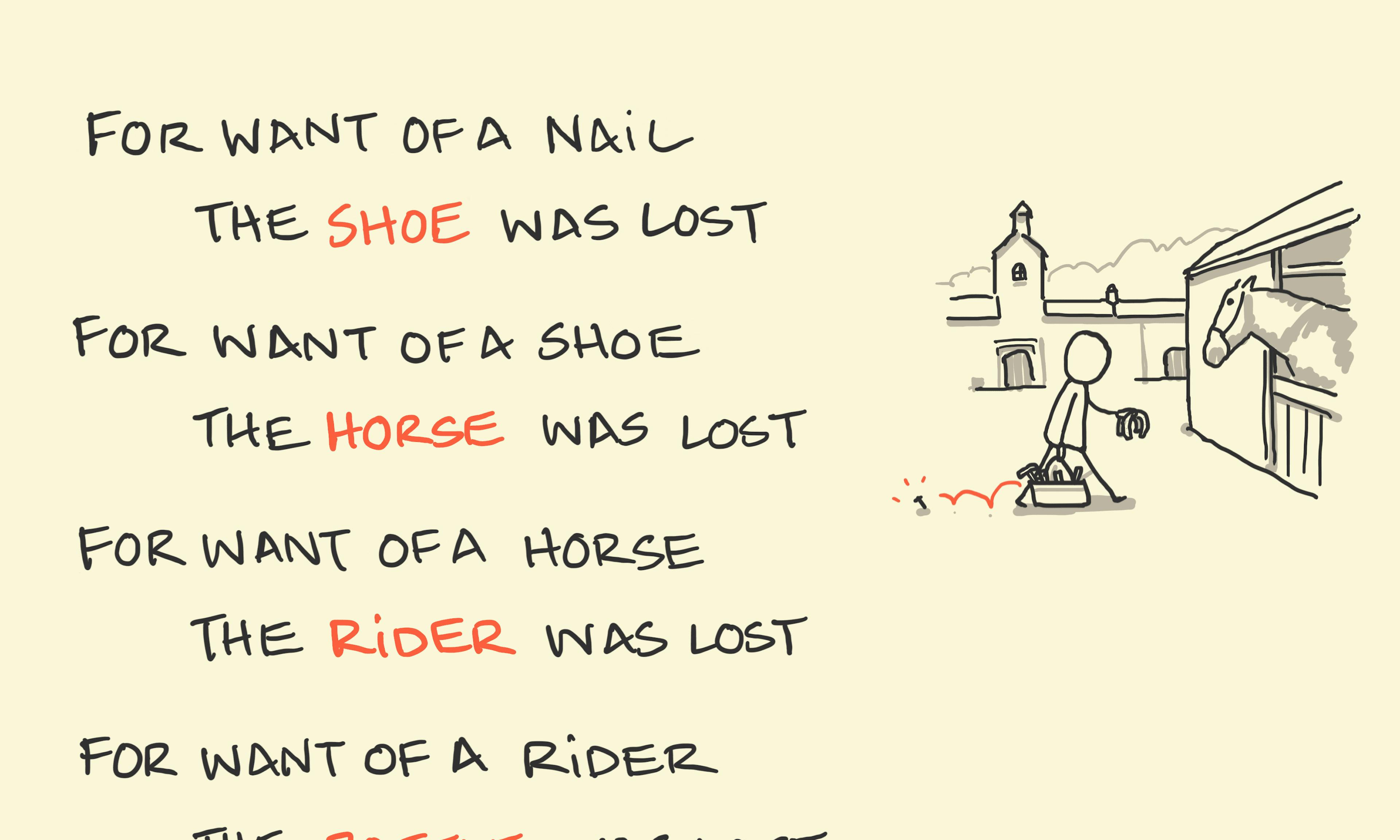 For want of a nail
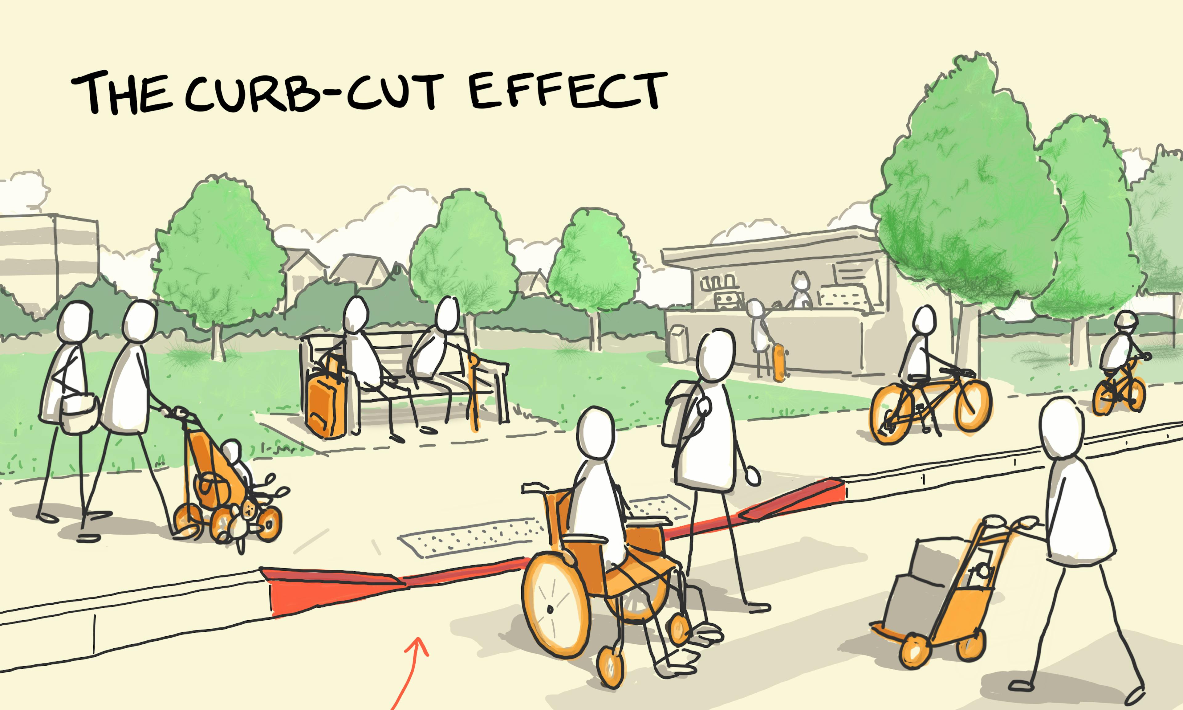 The curb-cut effect
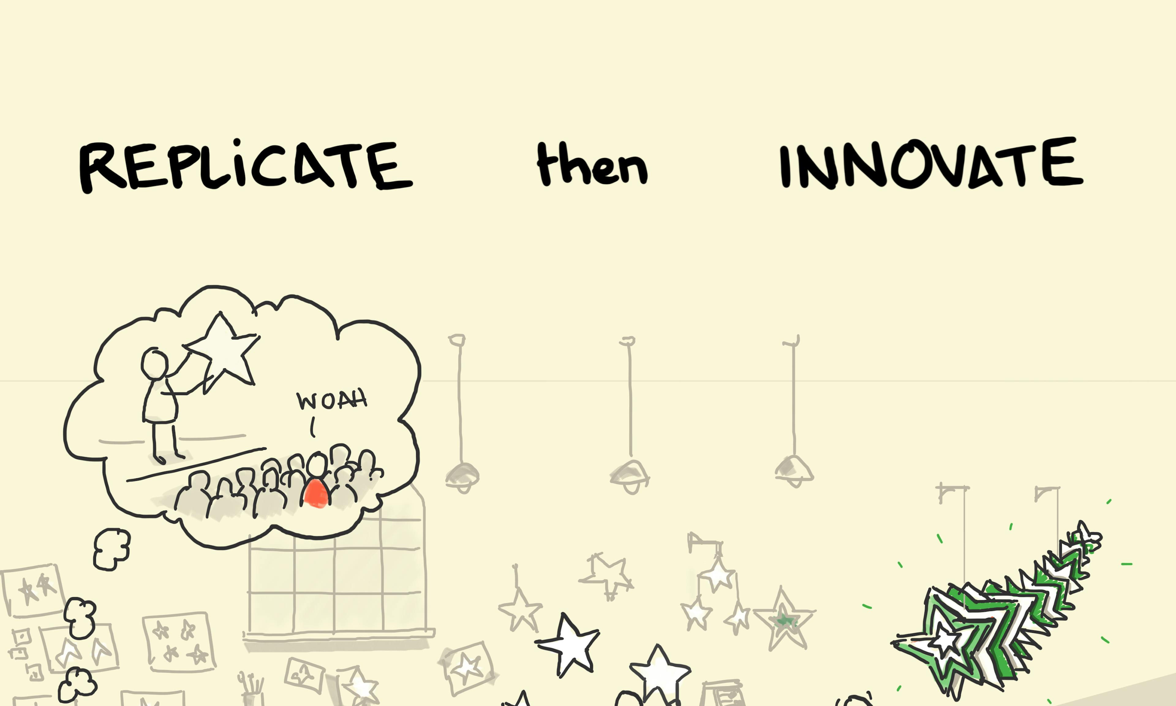 Replicate then innovate
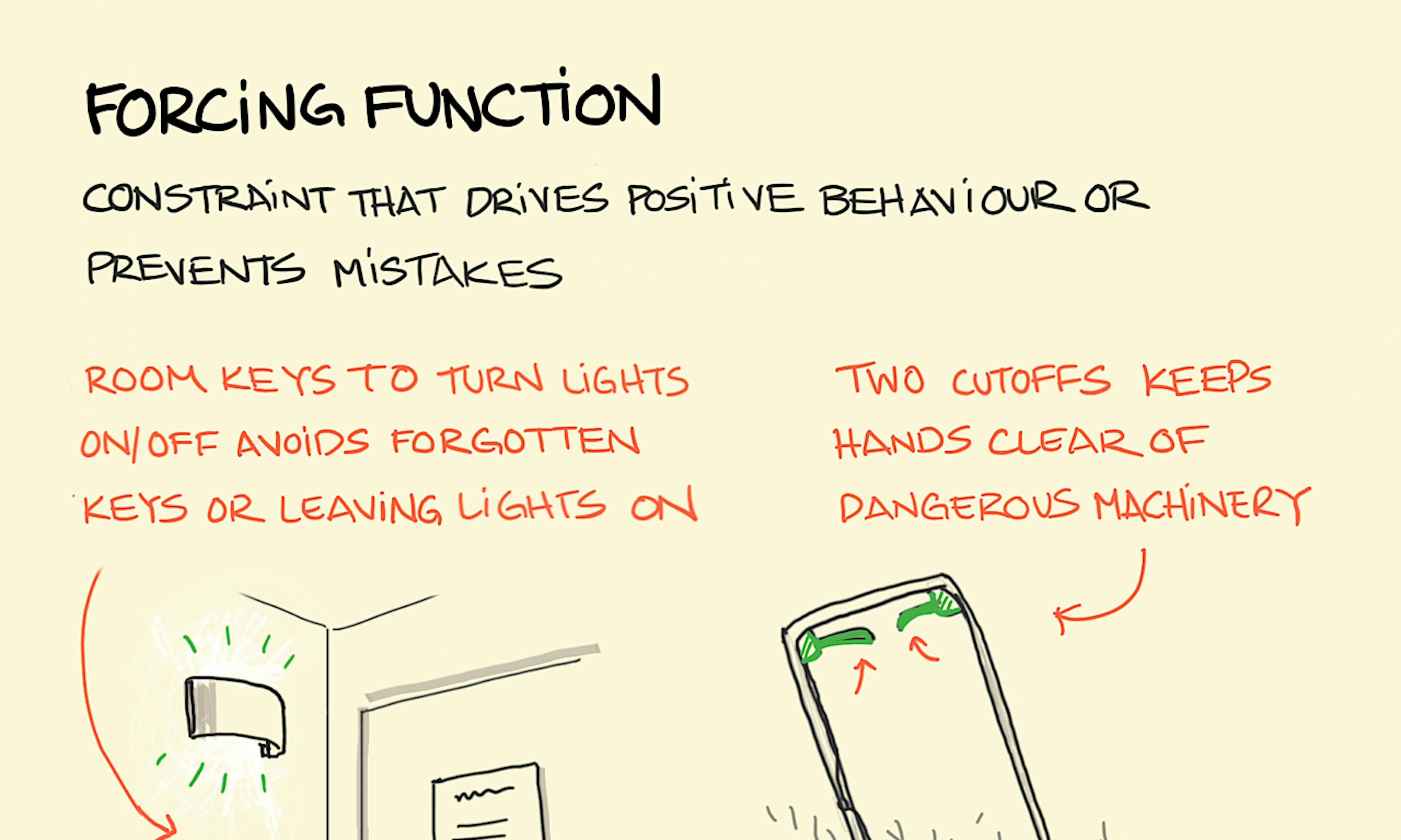 Forcing function — design
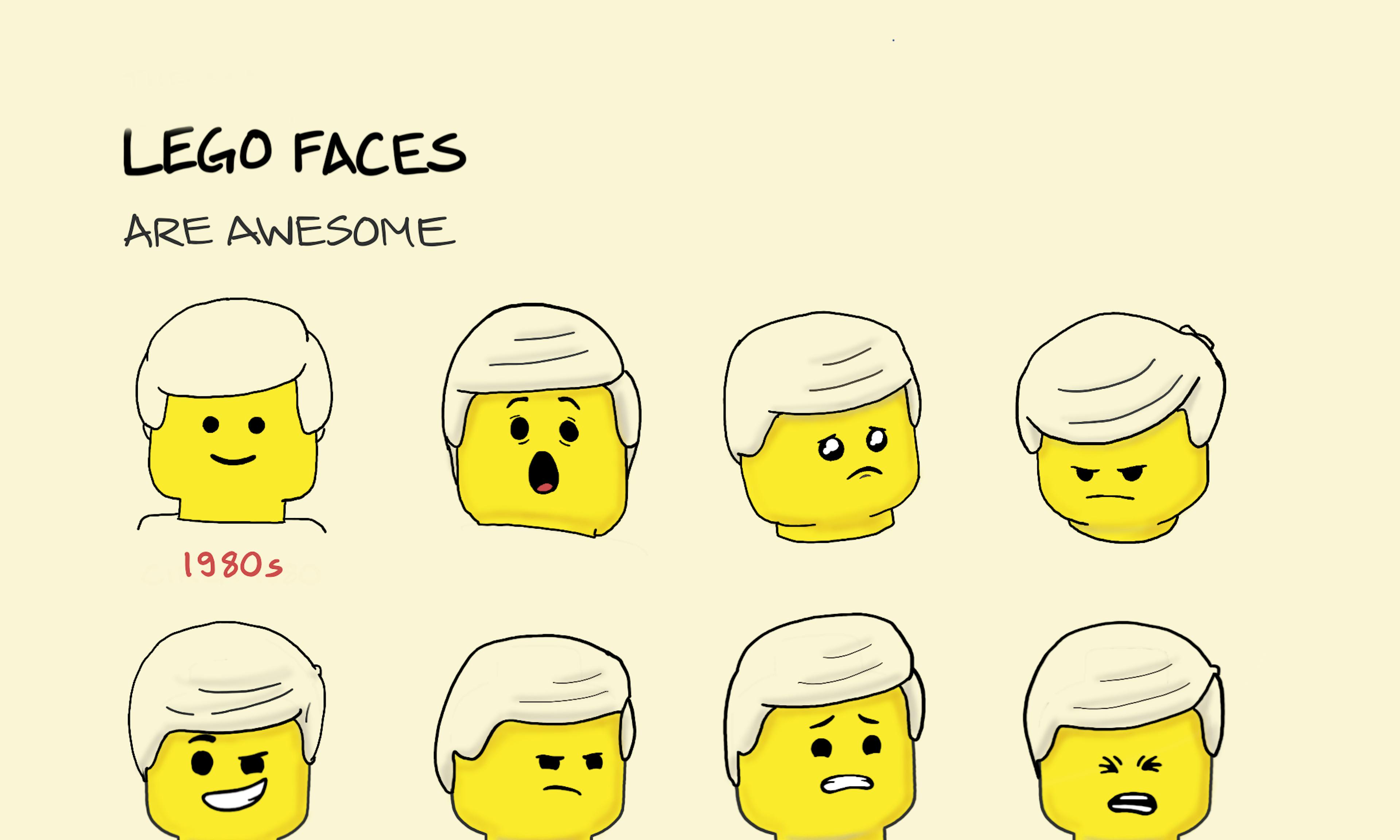 LEGO faces
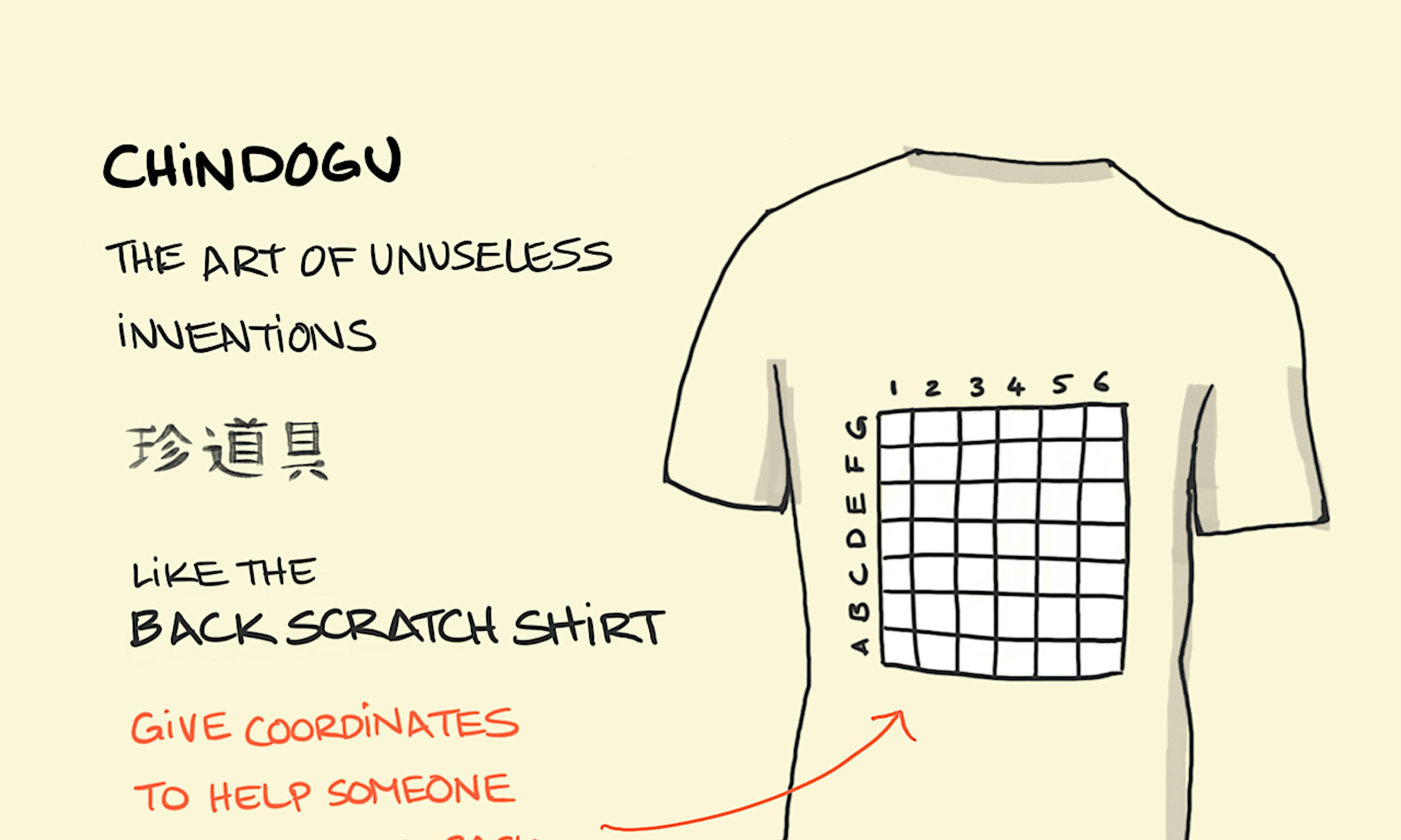 Chindogu
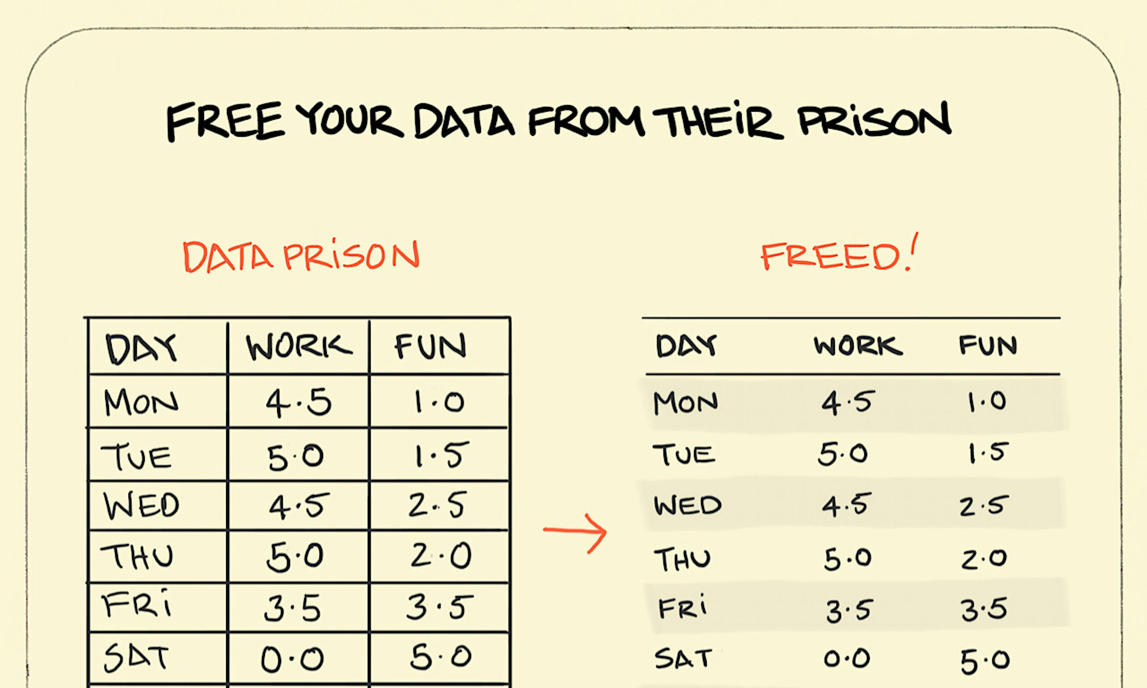 The data prison
 Thesis, antithesis, synthesis
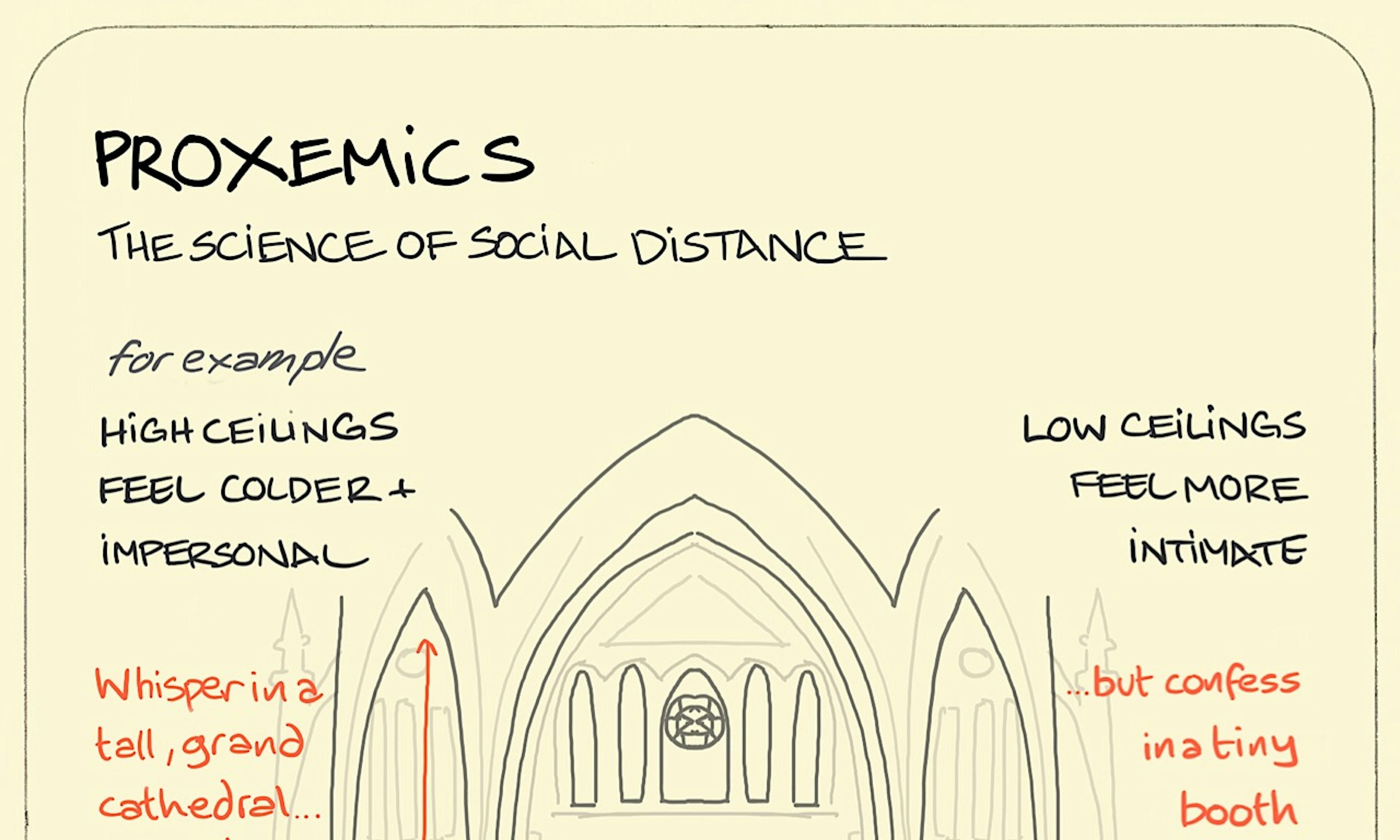 Proxemics
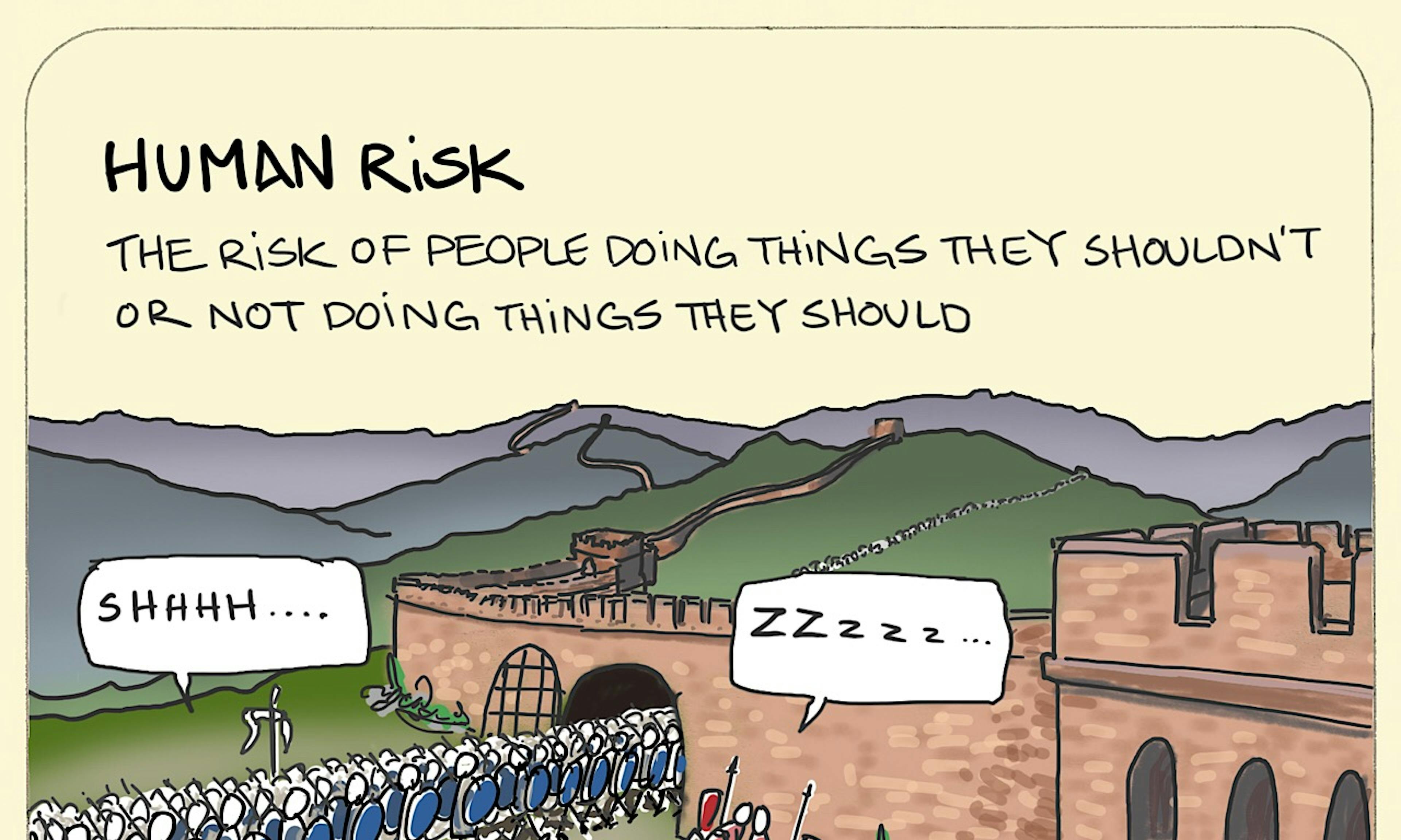 Human risk
 What is Two-Factor Authentication (2FA)?
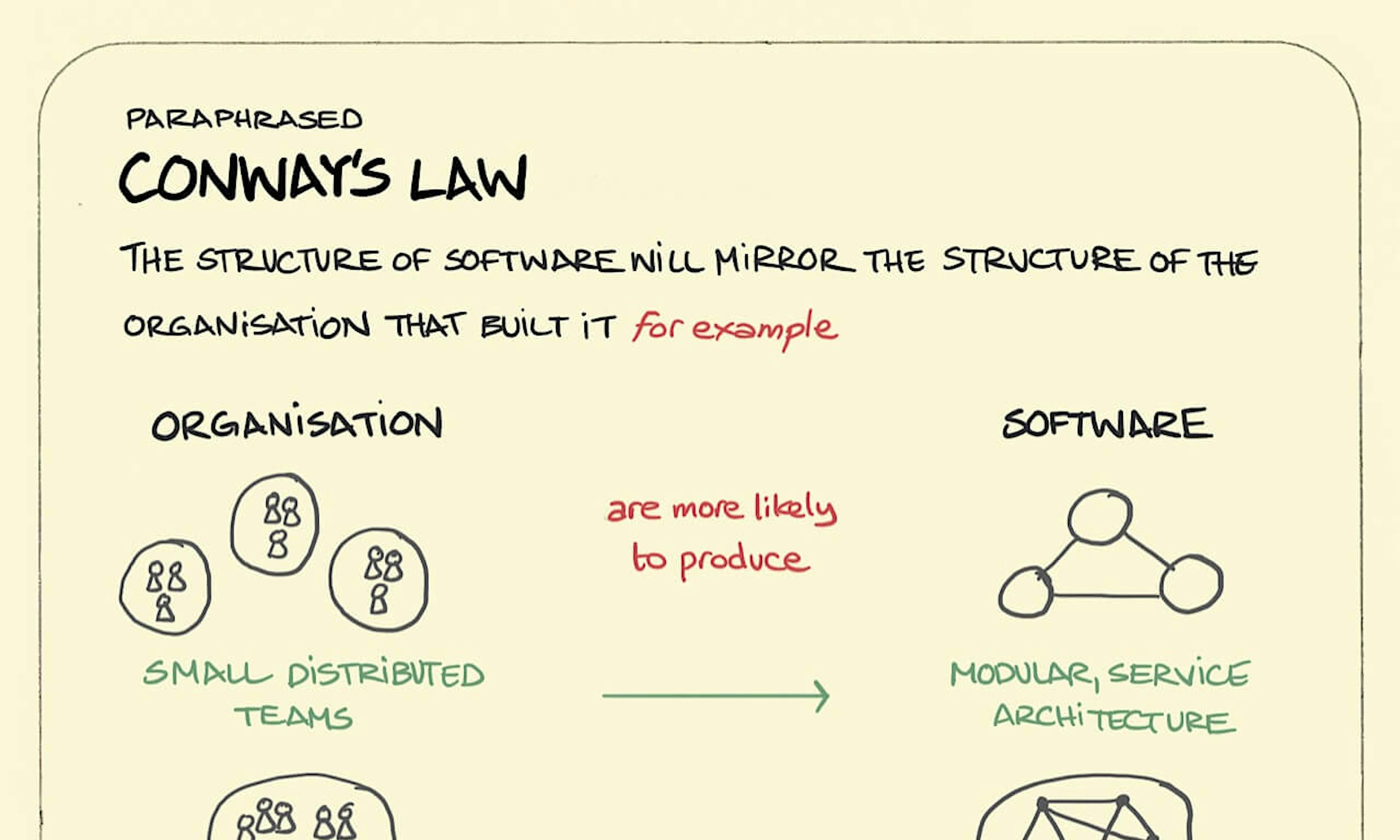 Conway’s Law
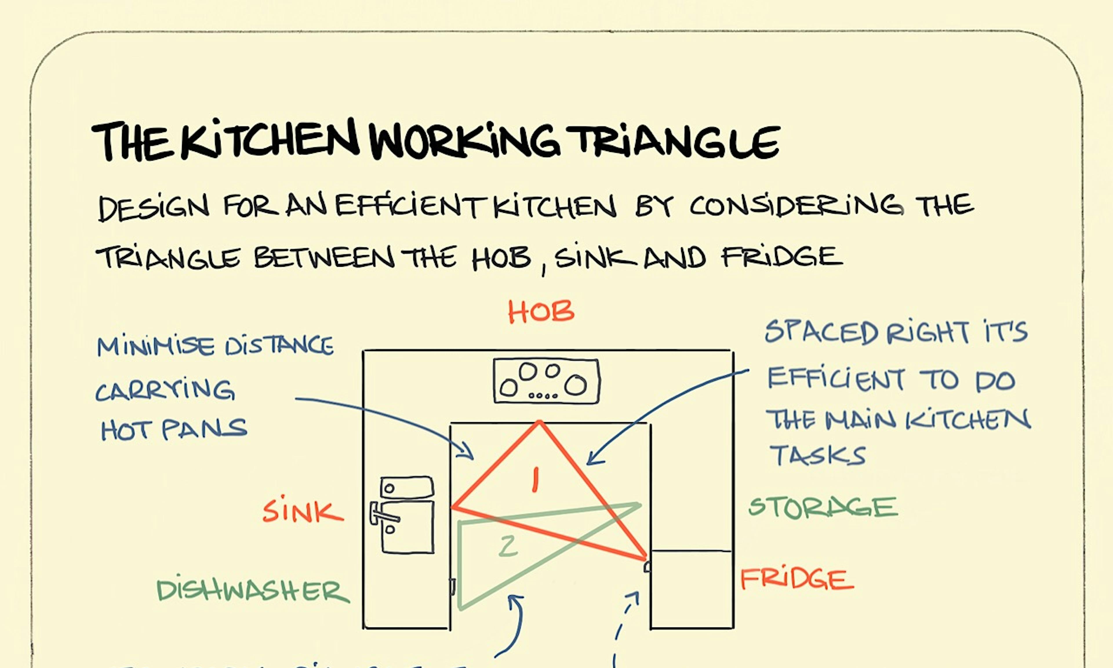 The kitchen working triangle
 The Environment as the Third Teacher in Early Childhood and Beyond
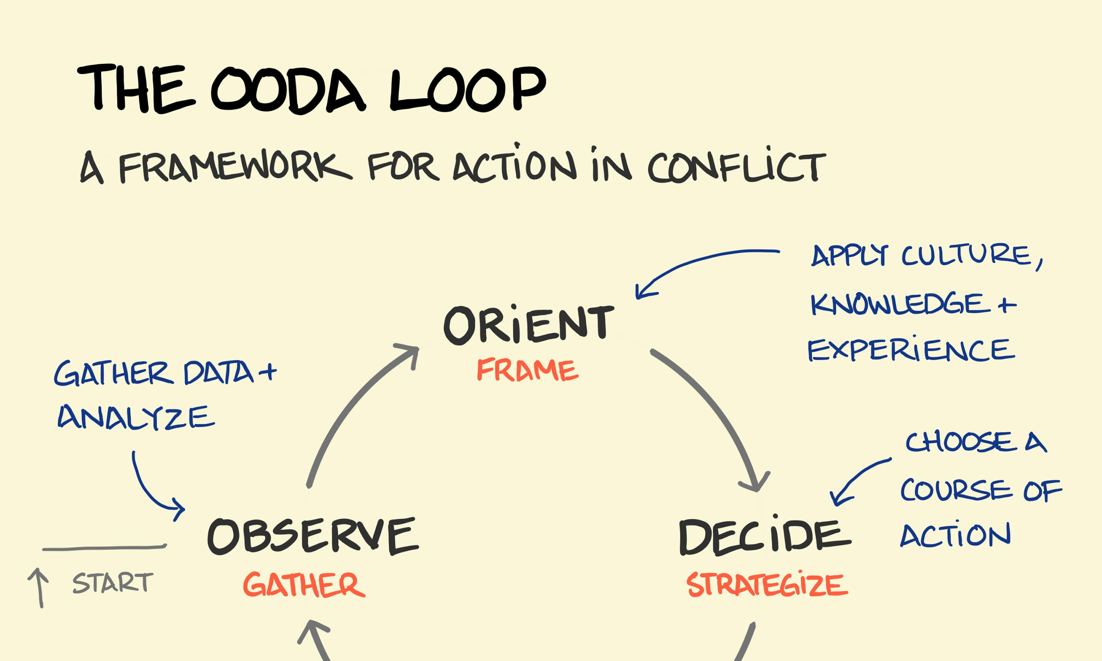 OODA Loop
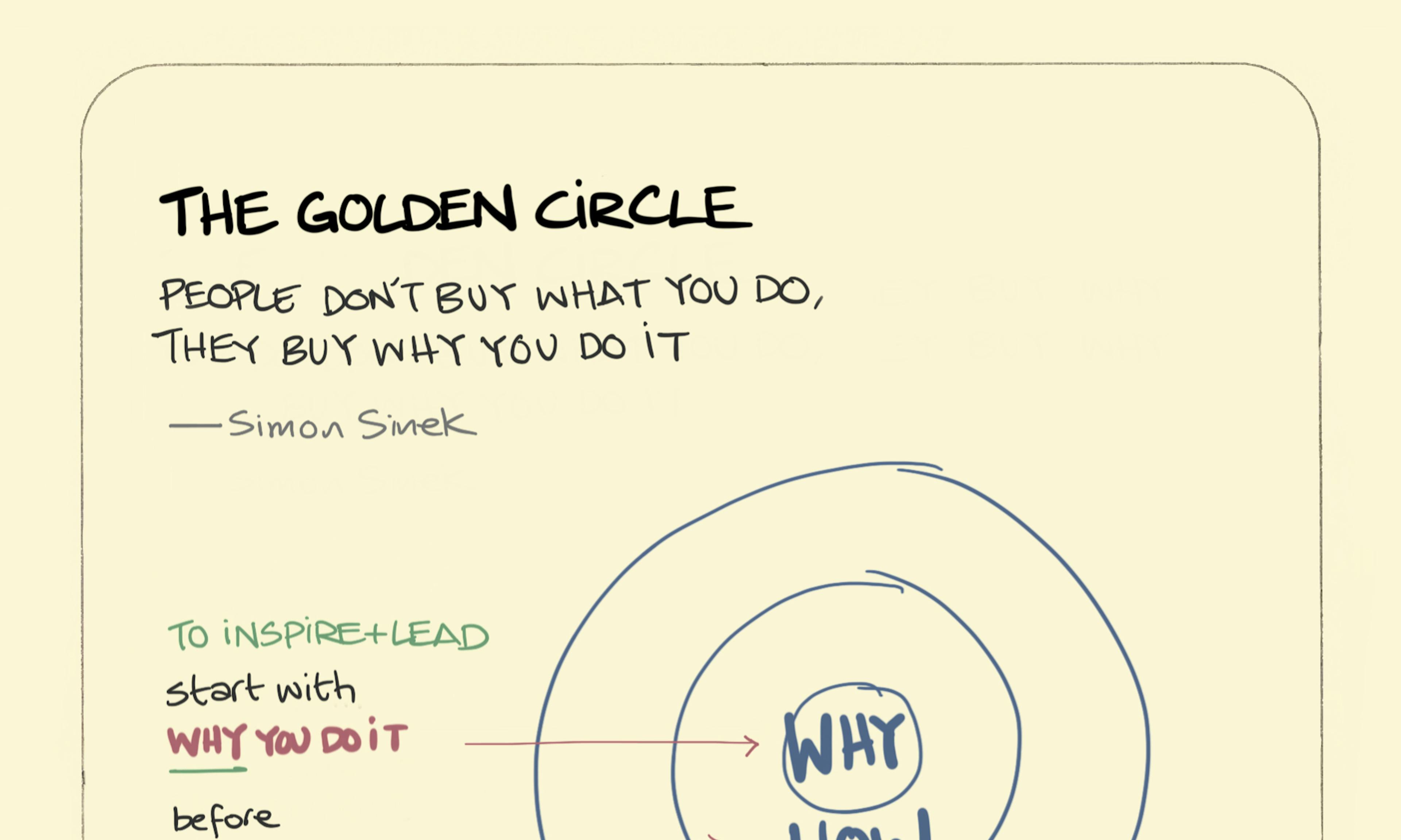 The golden circle
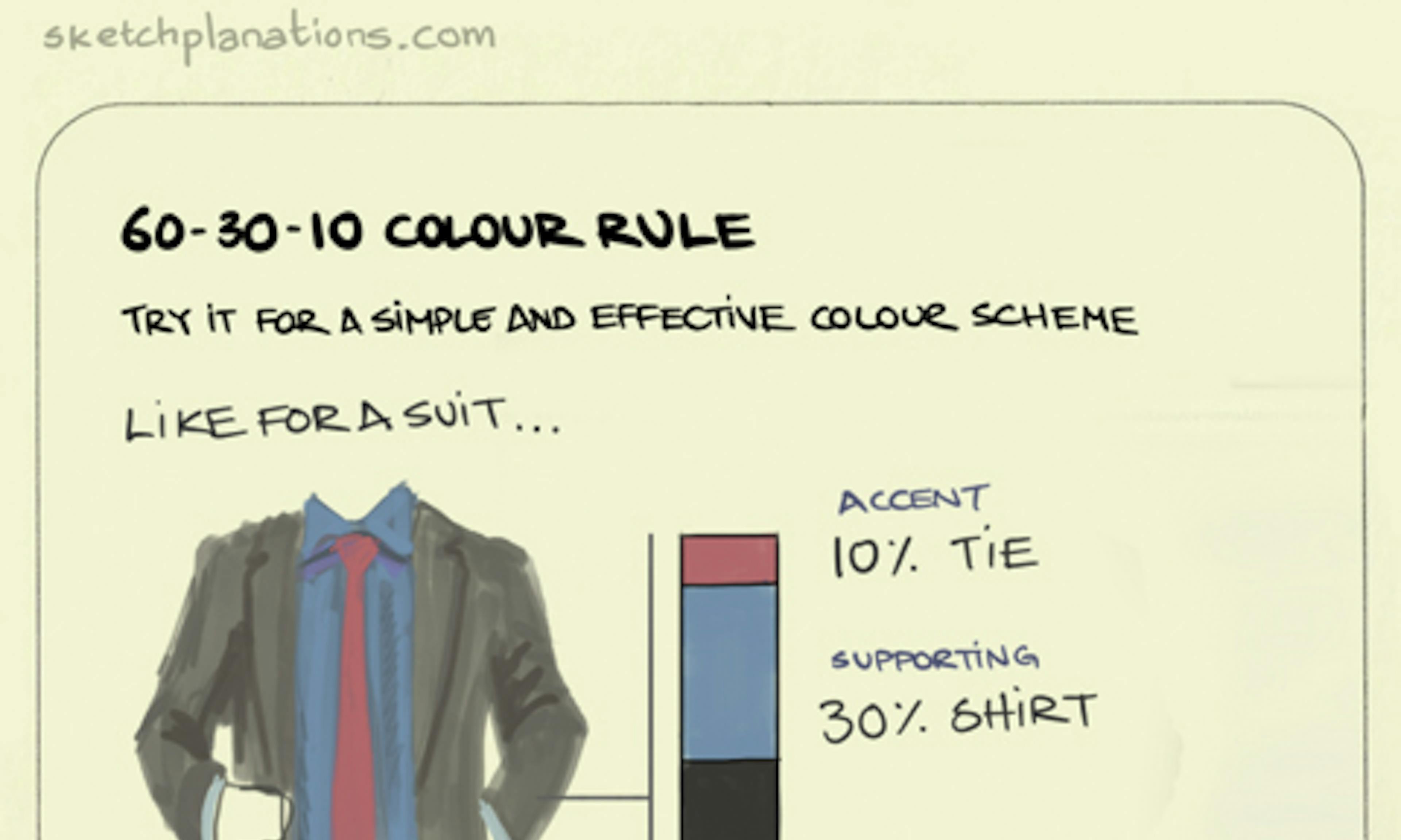 60-30-10 Colour rule
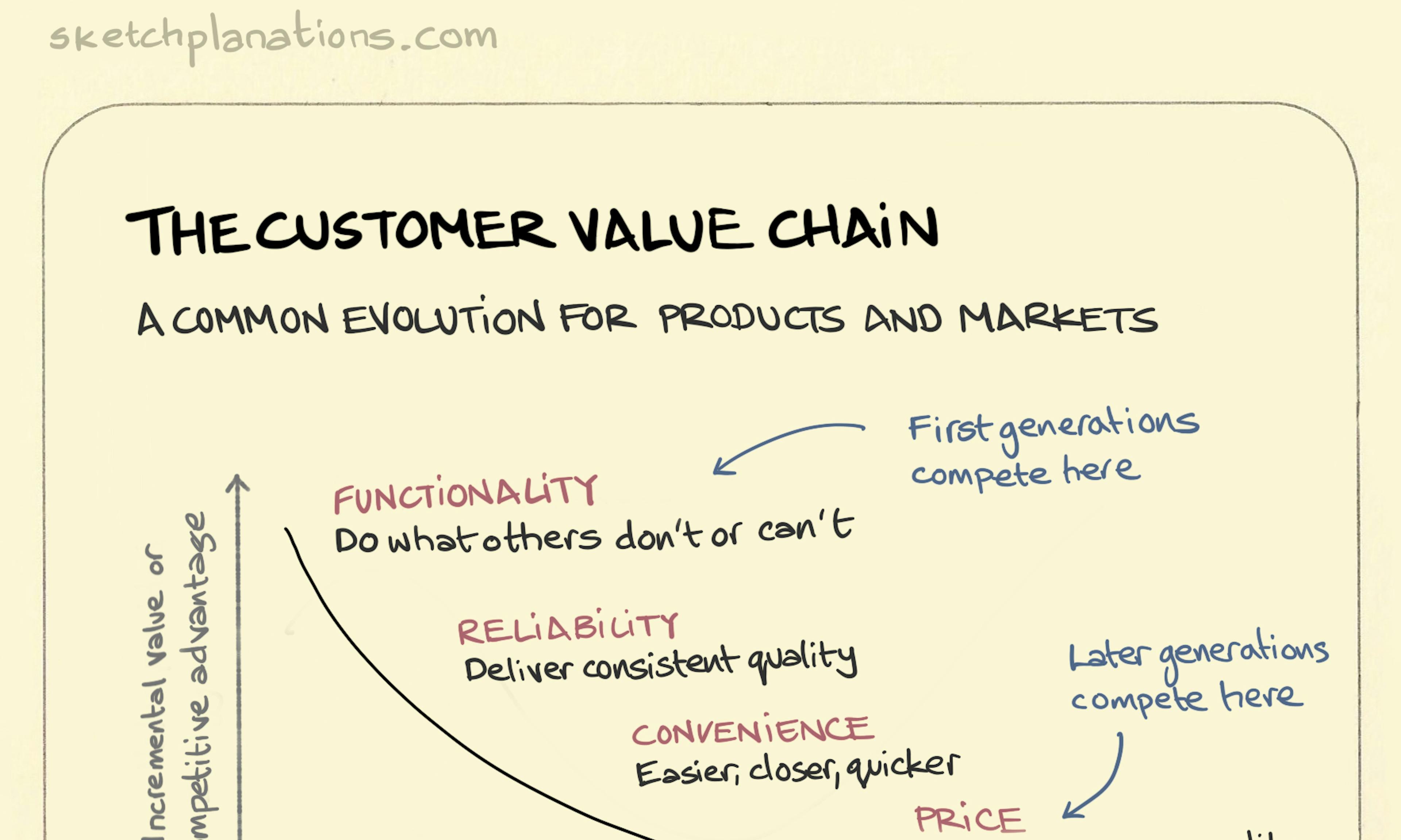 The customer value chain
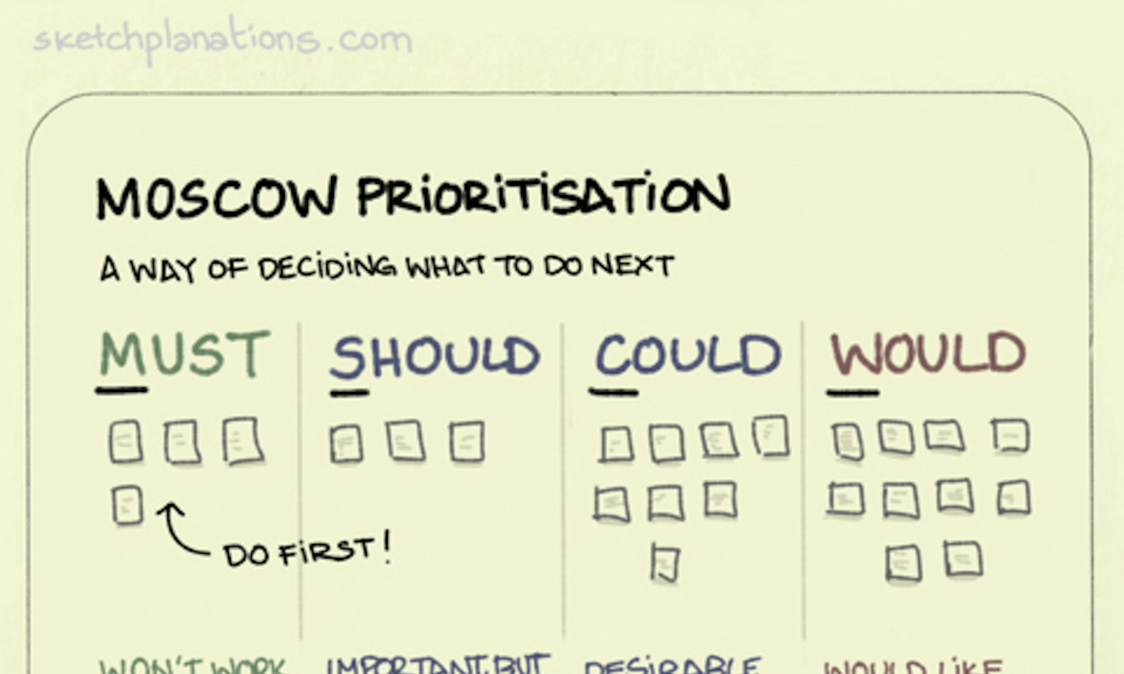 MOSCOW Prioritisation
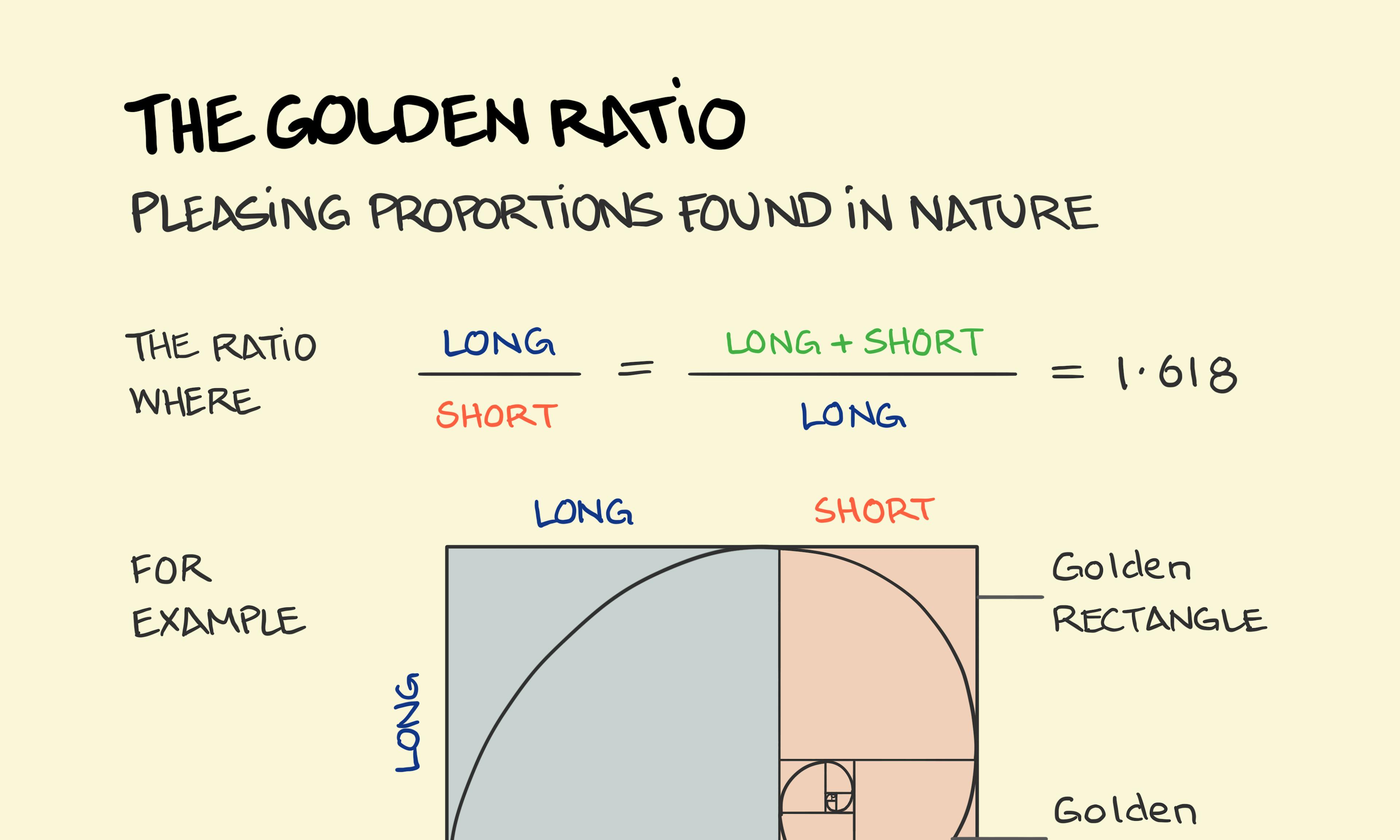 The Golden Ratio: Nature's Perfect Proportions
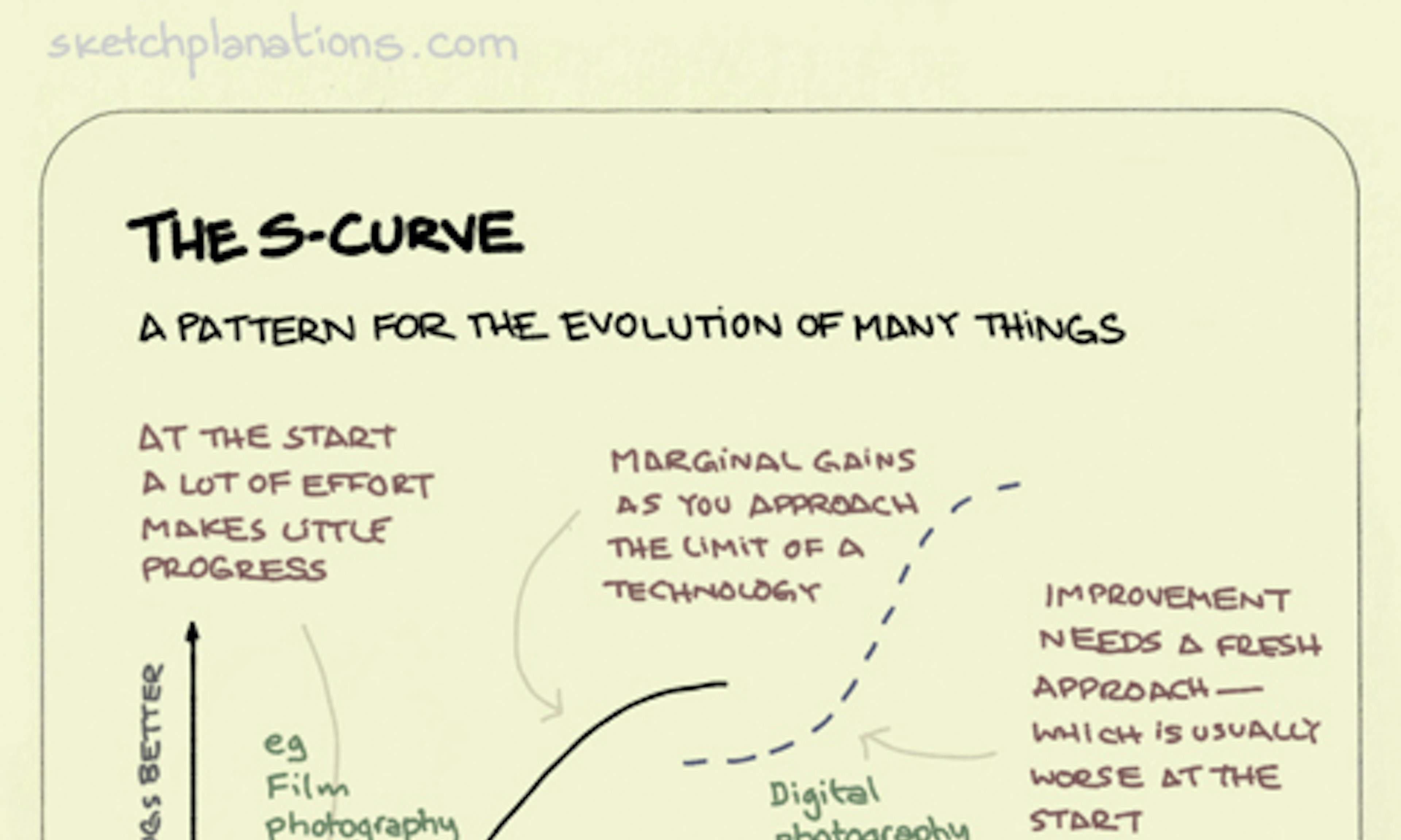 The S-curve
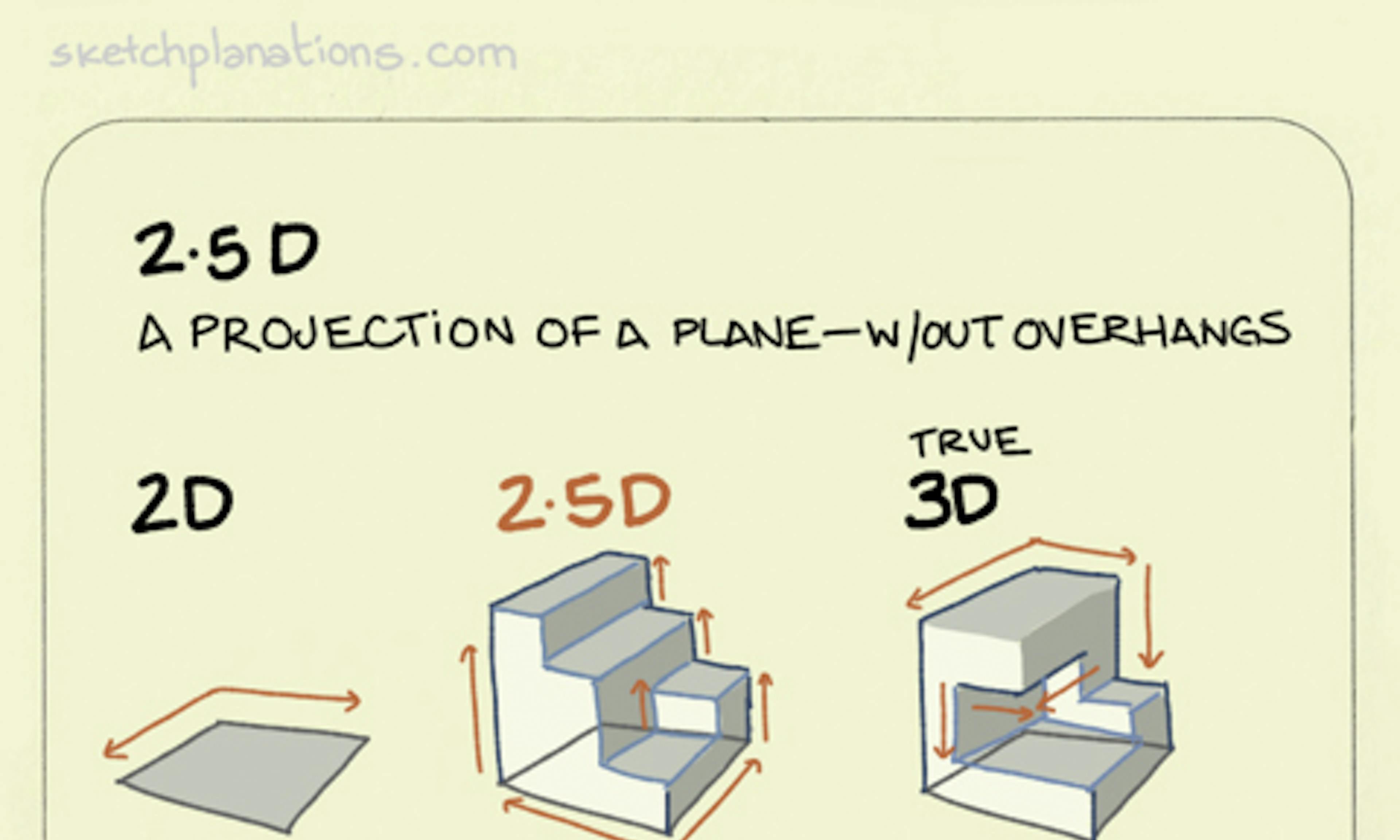 2.5D
2.5D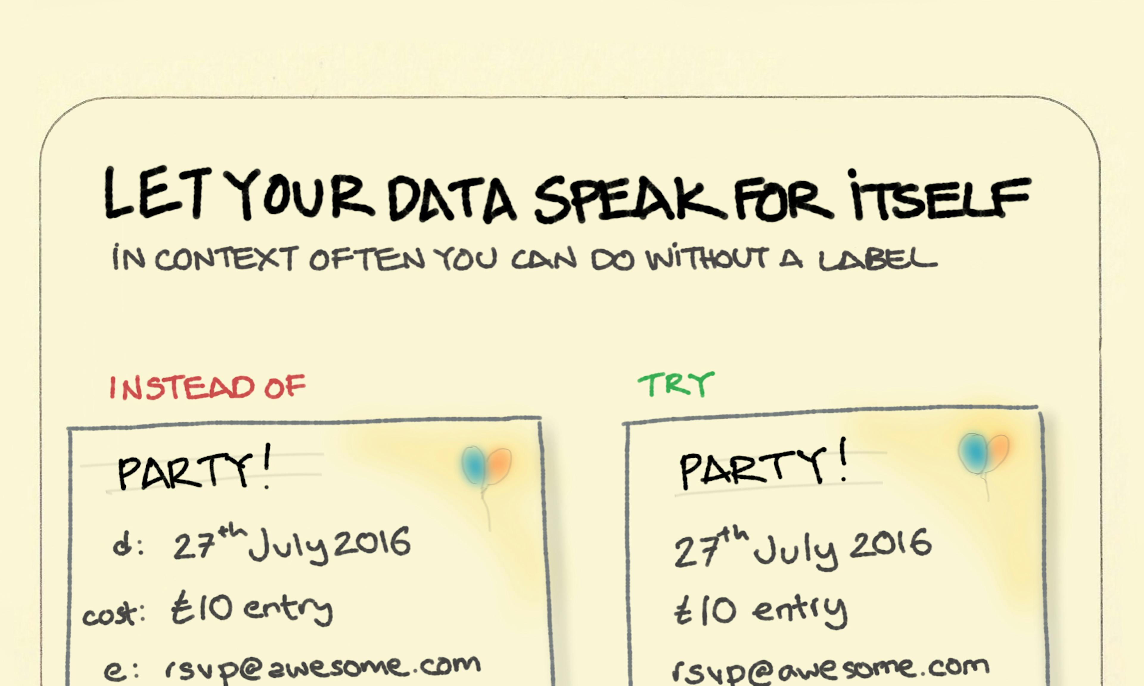 Let your data speak for itself.
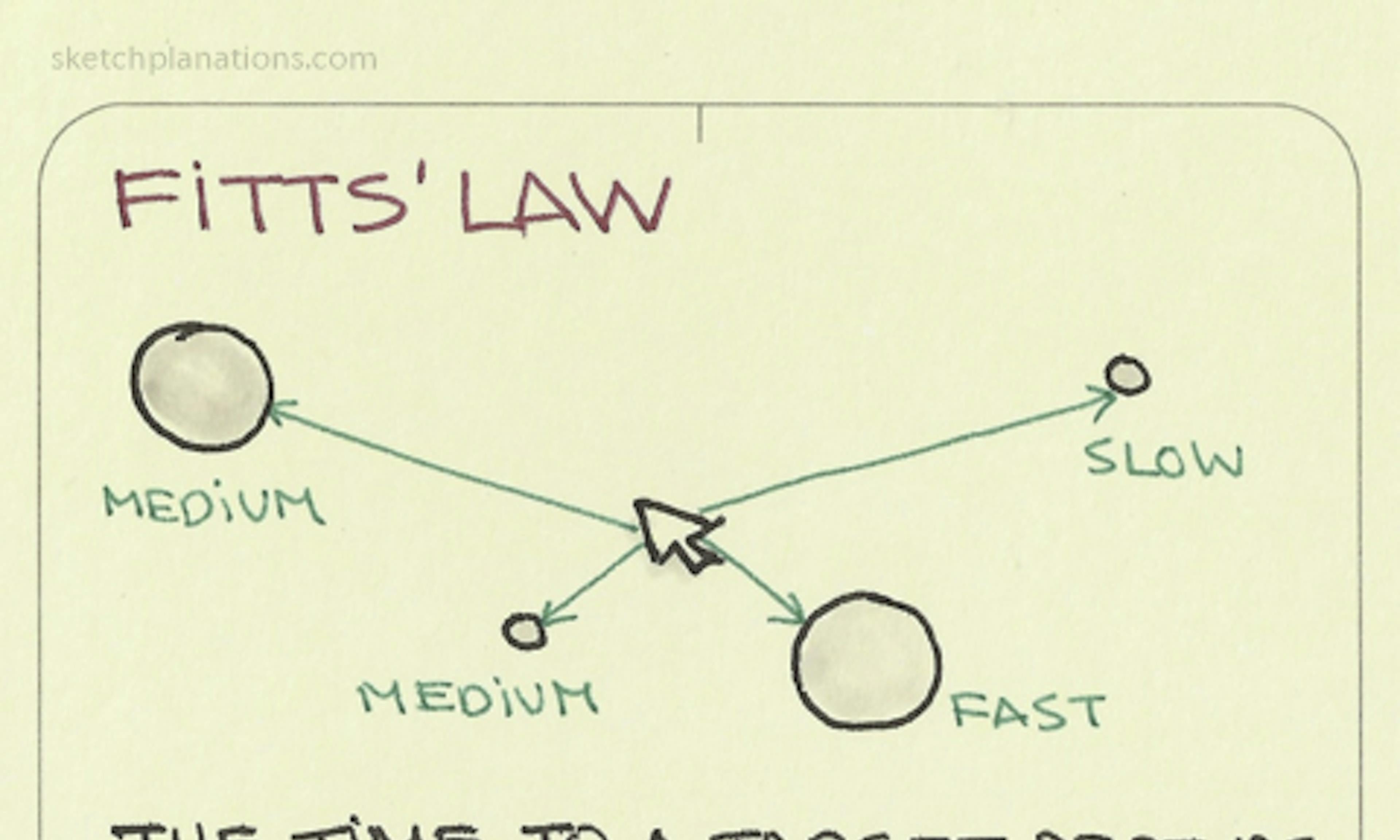 Fitts’ Law
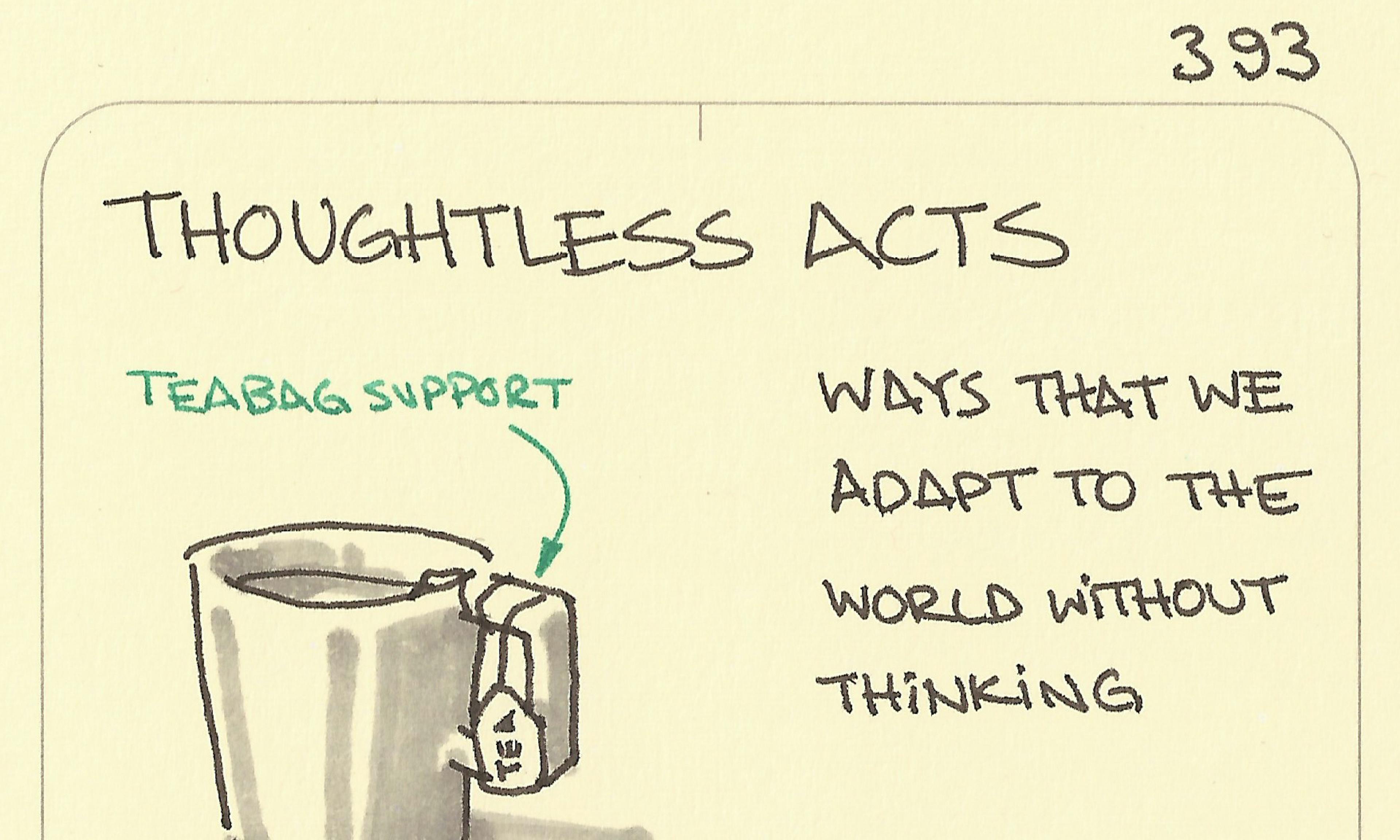 Thoughtless acts
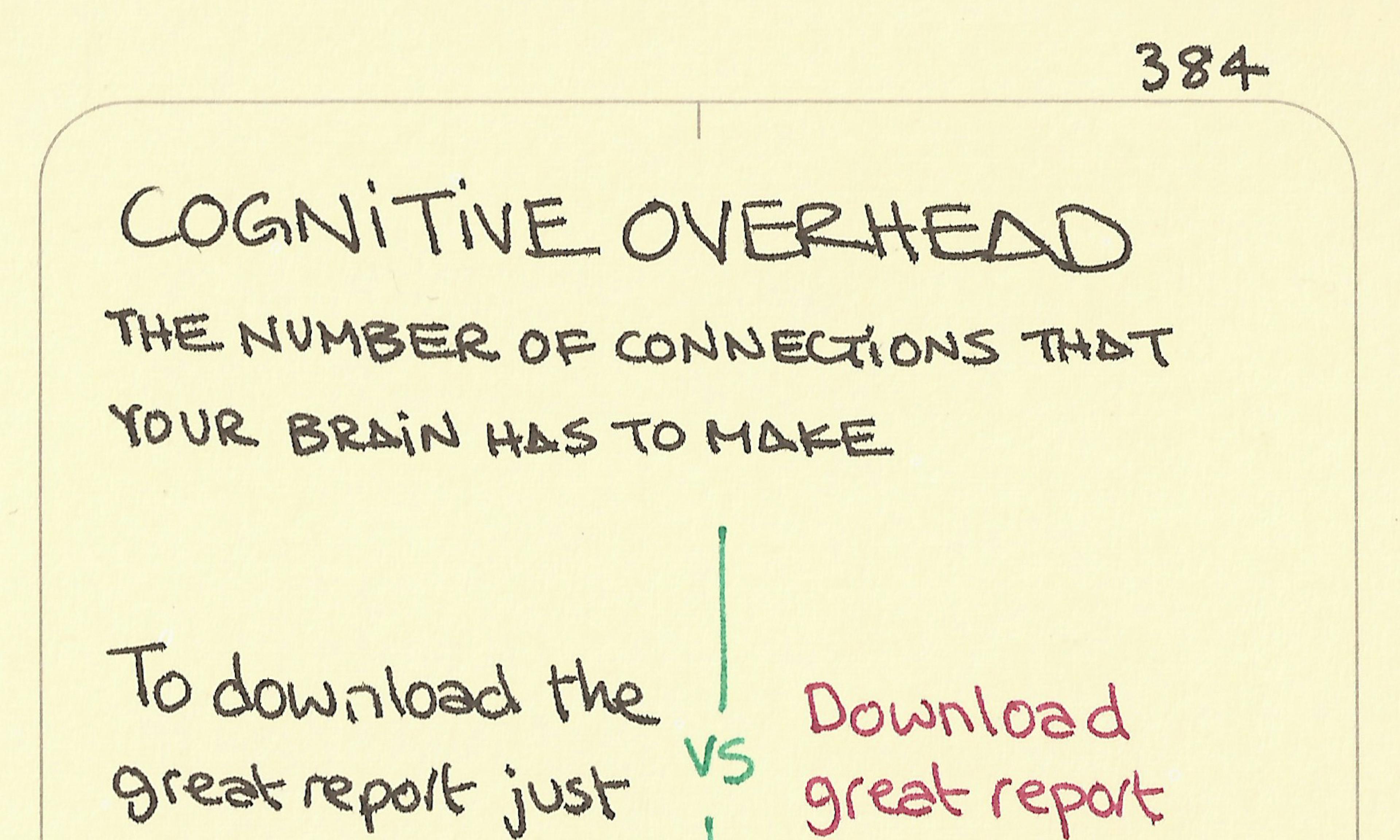 Cognitive overhead
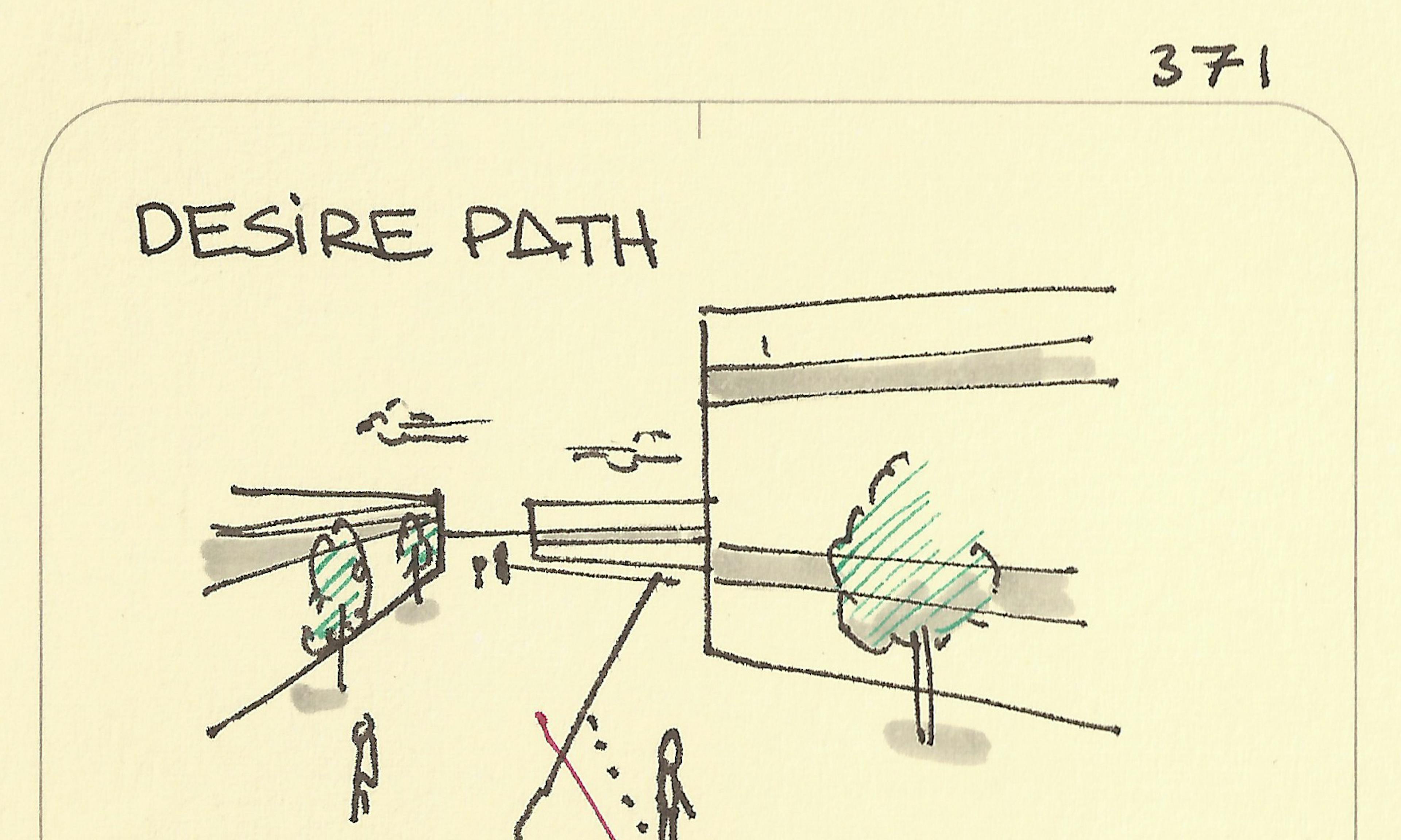 Desire path
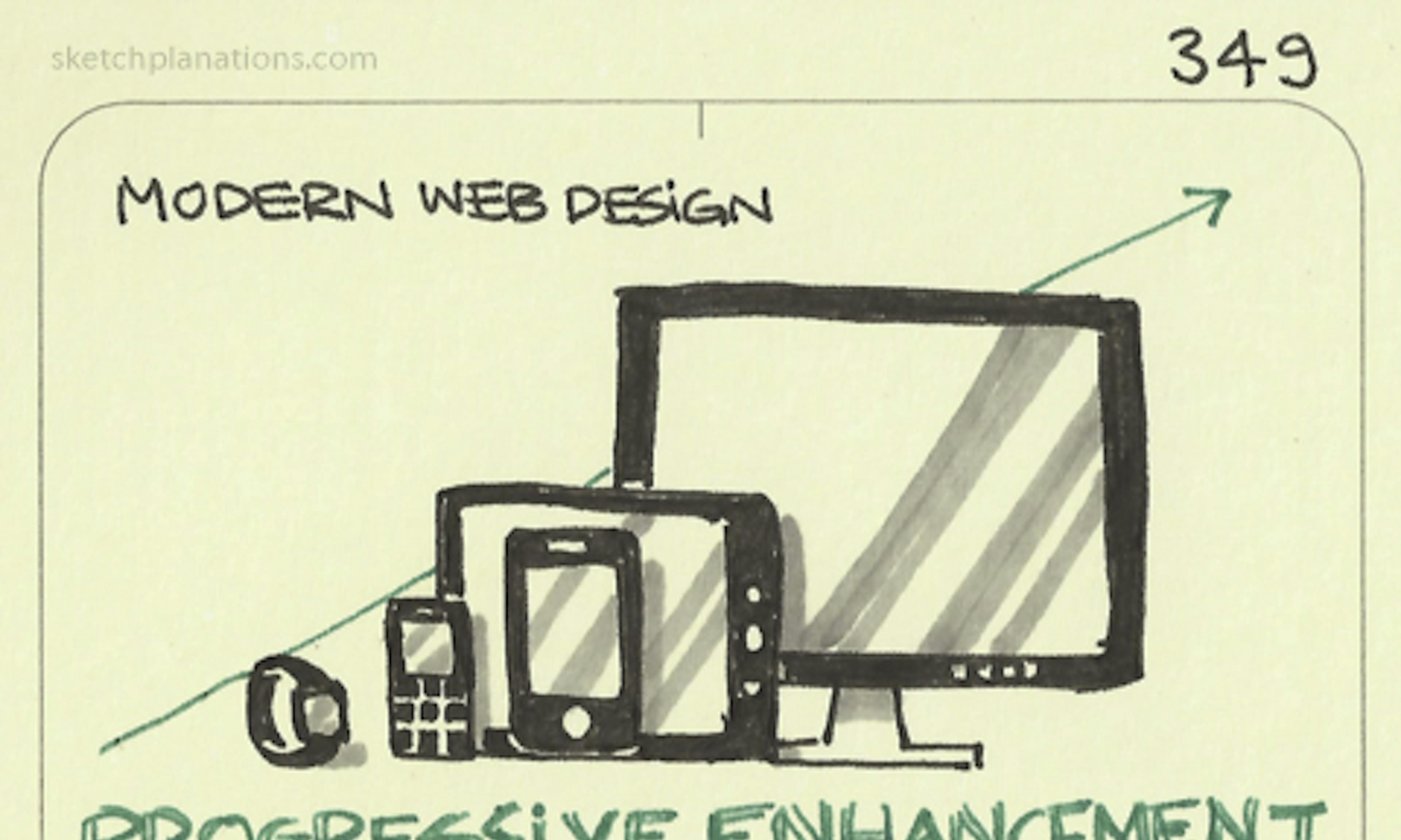 Progressive enhancement
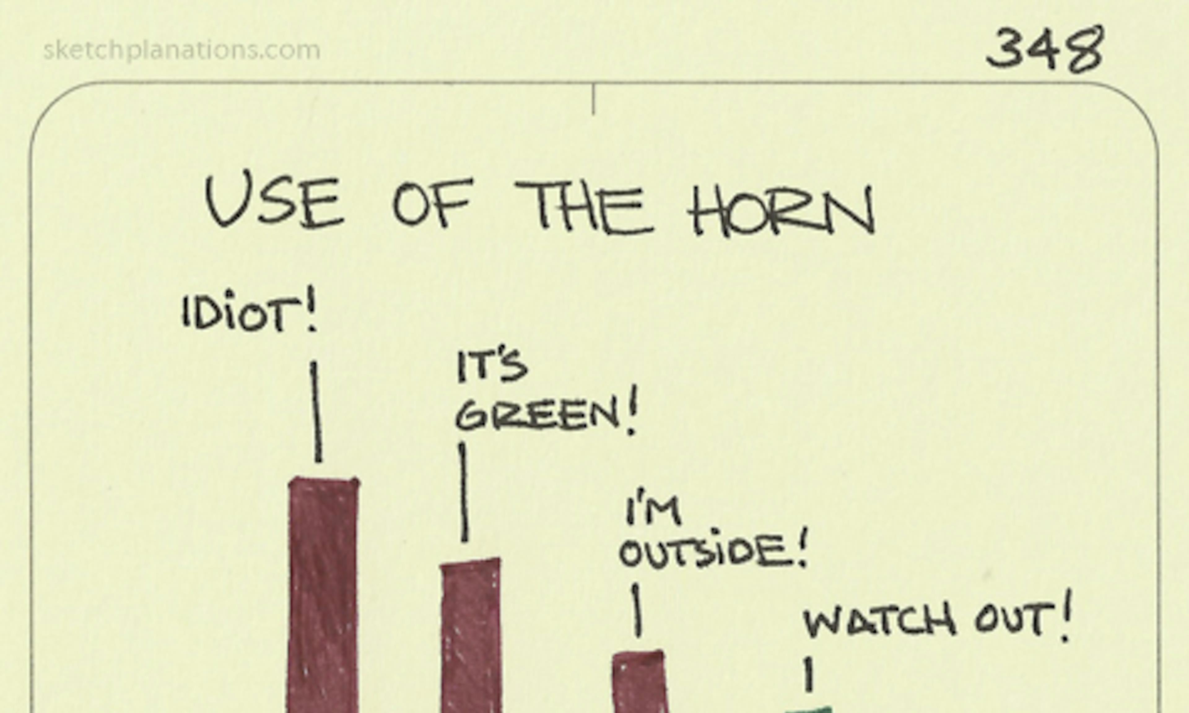 Use of the car horn
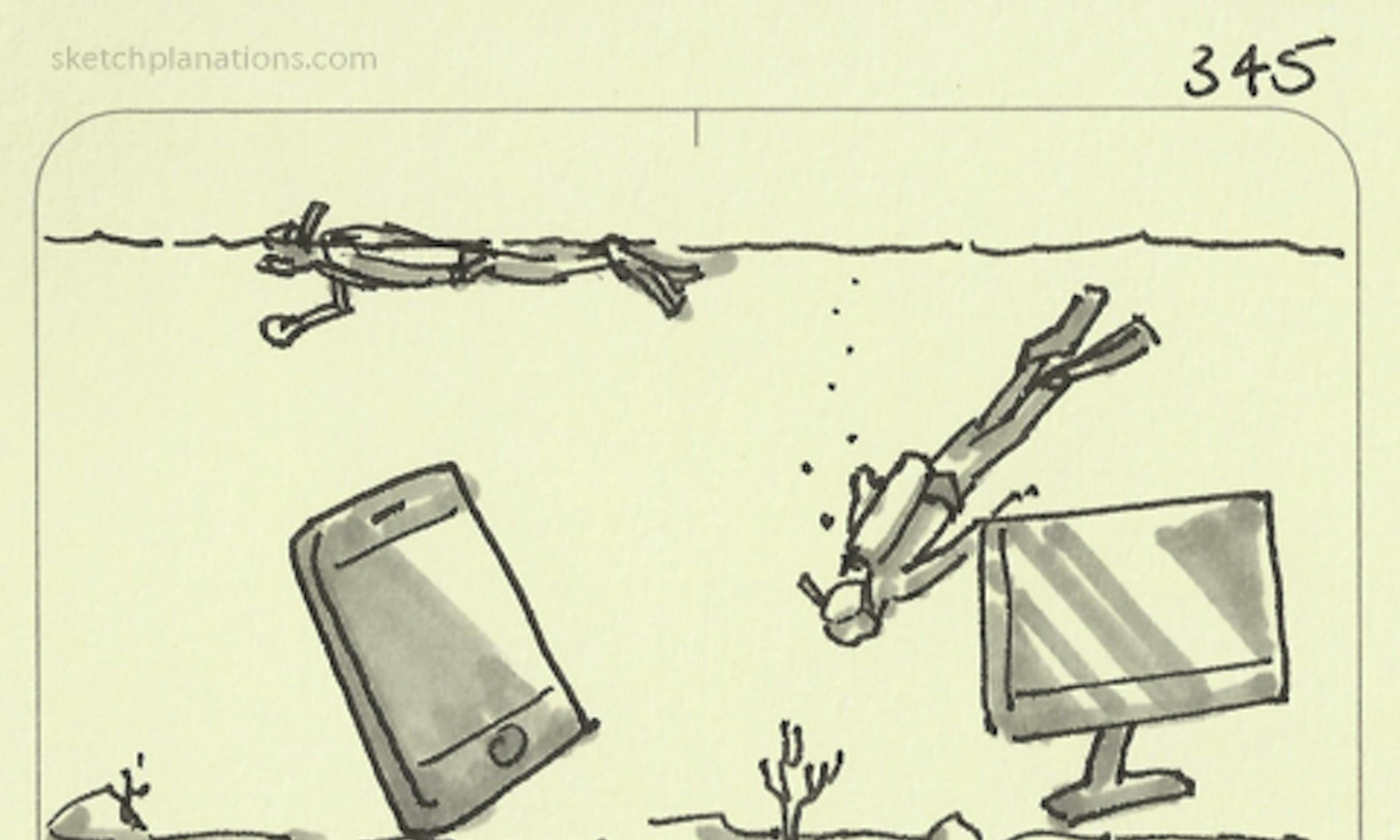 Mobile is snorkelling. Desktop is diving
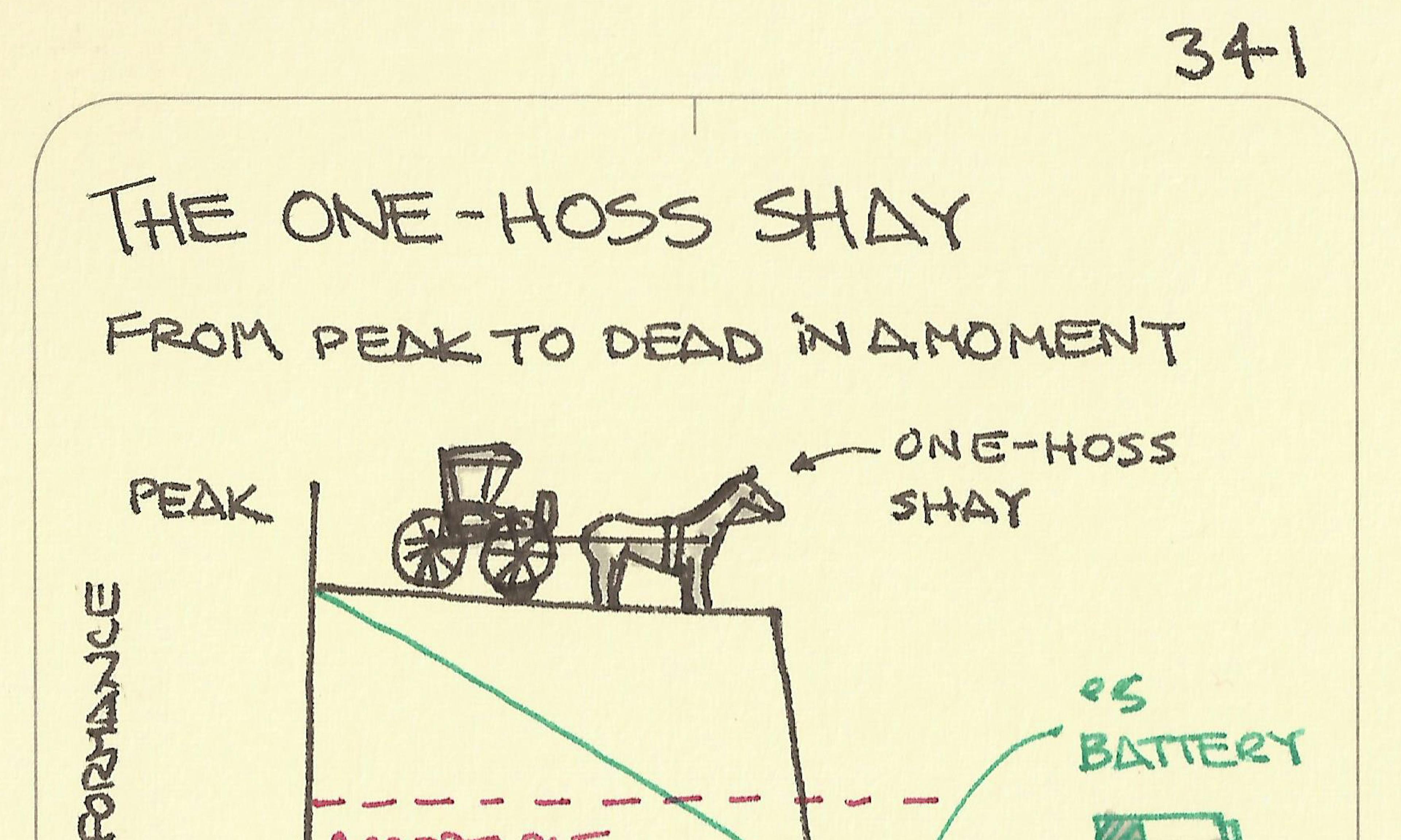 The one-hoss shay
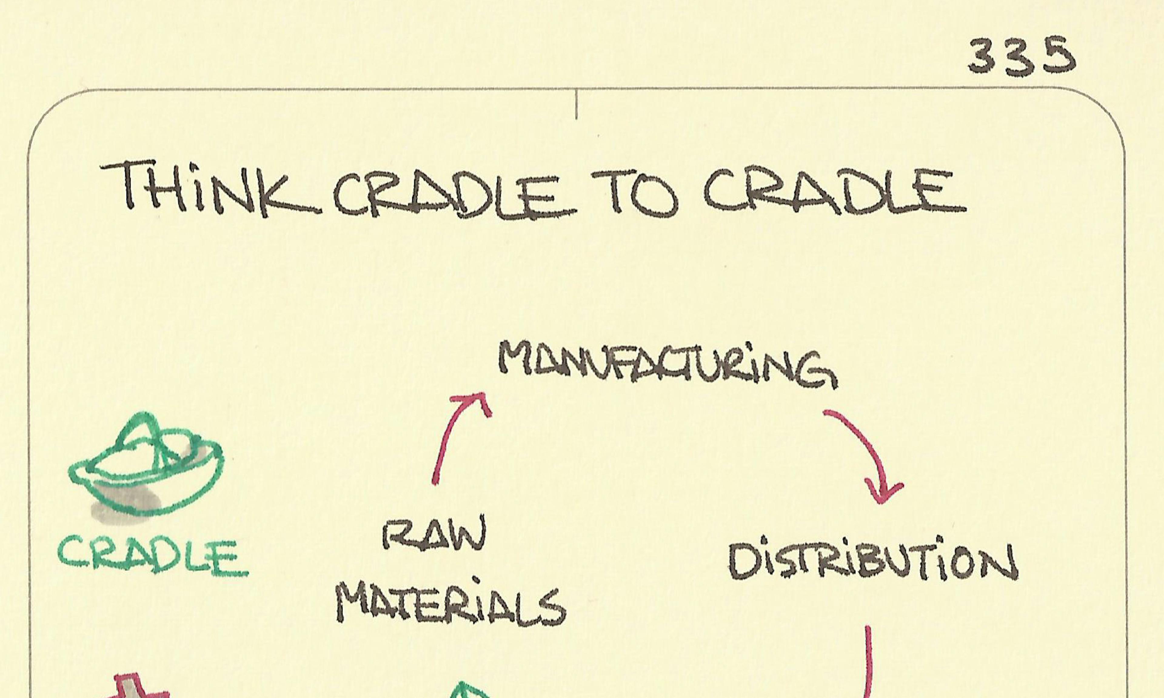 Think cradle to cradle
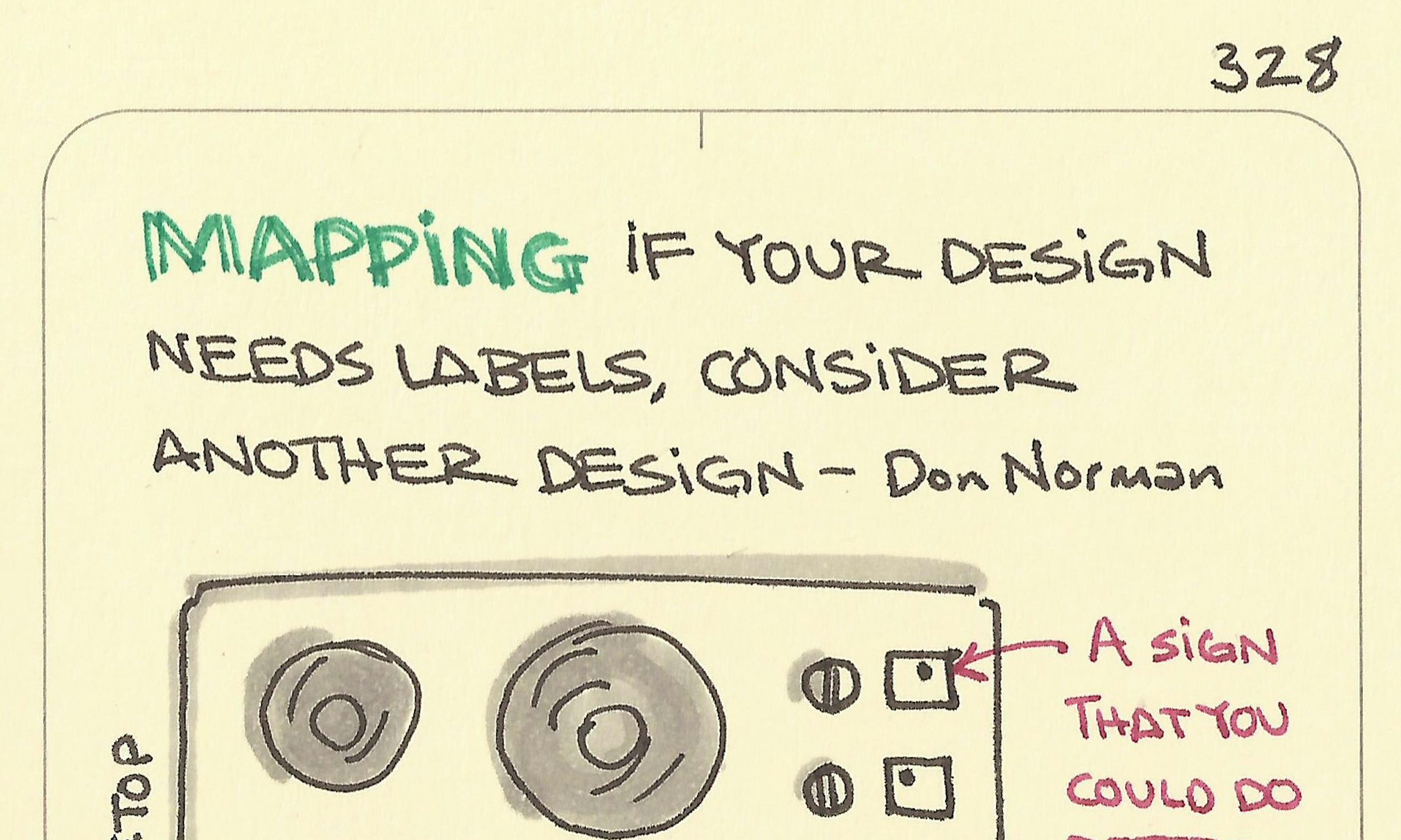 Mapping
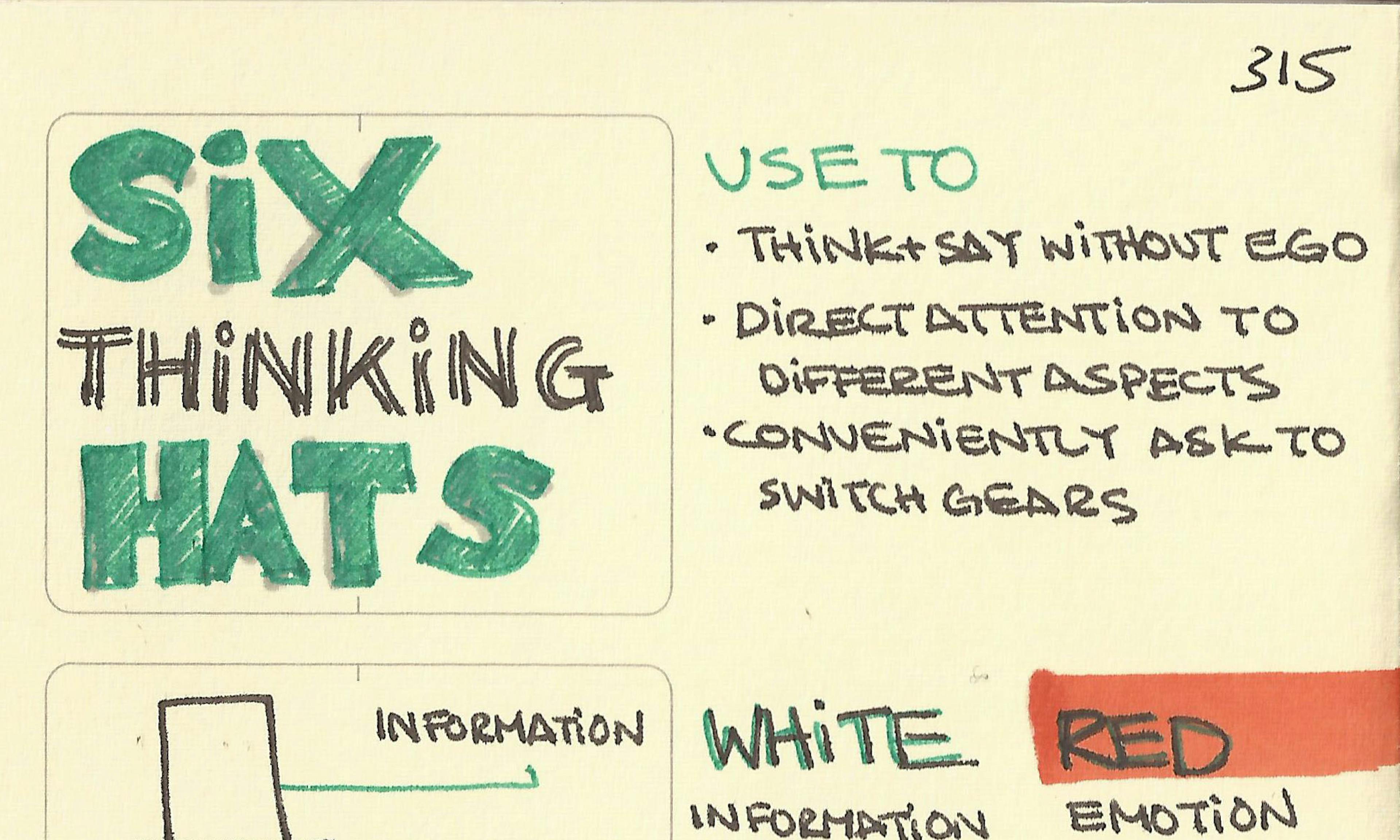 Six thinking hats
 The Betty Crocker Effect
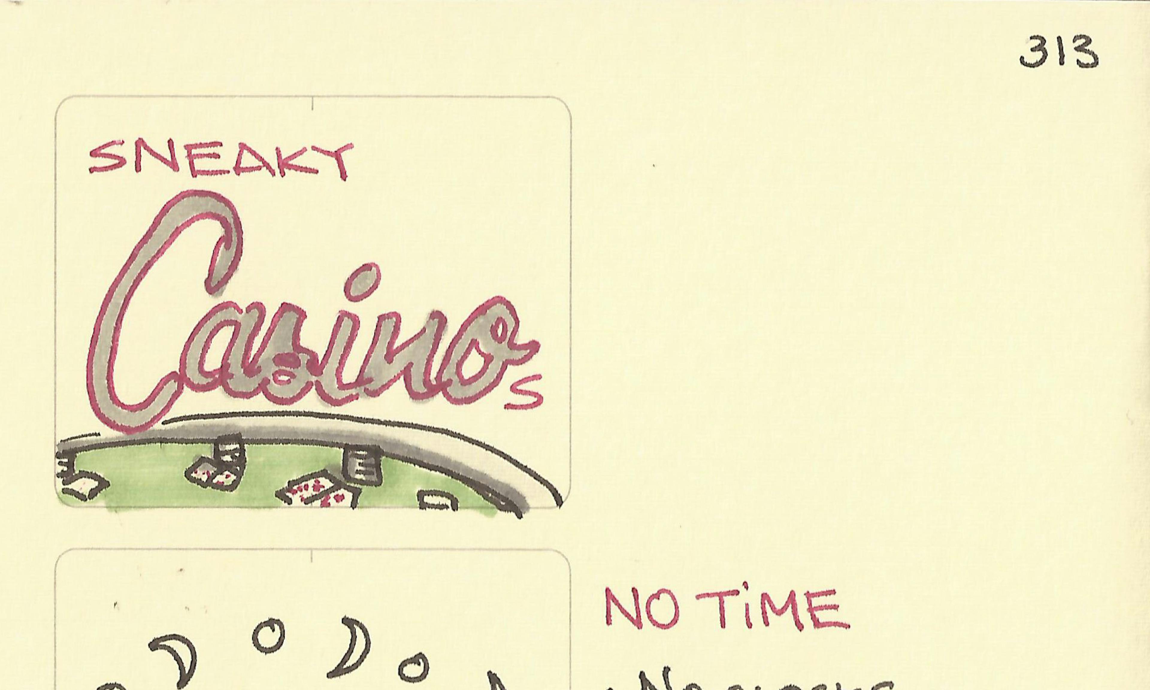 Sneaky casinos
 Design for a Glance, a Look and a Read
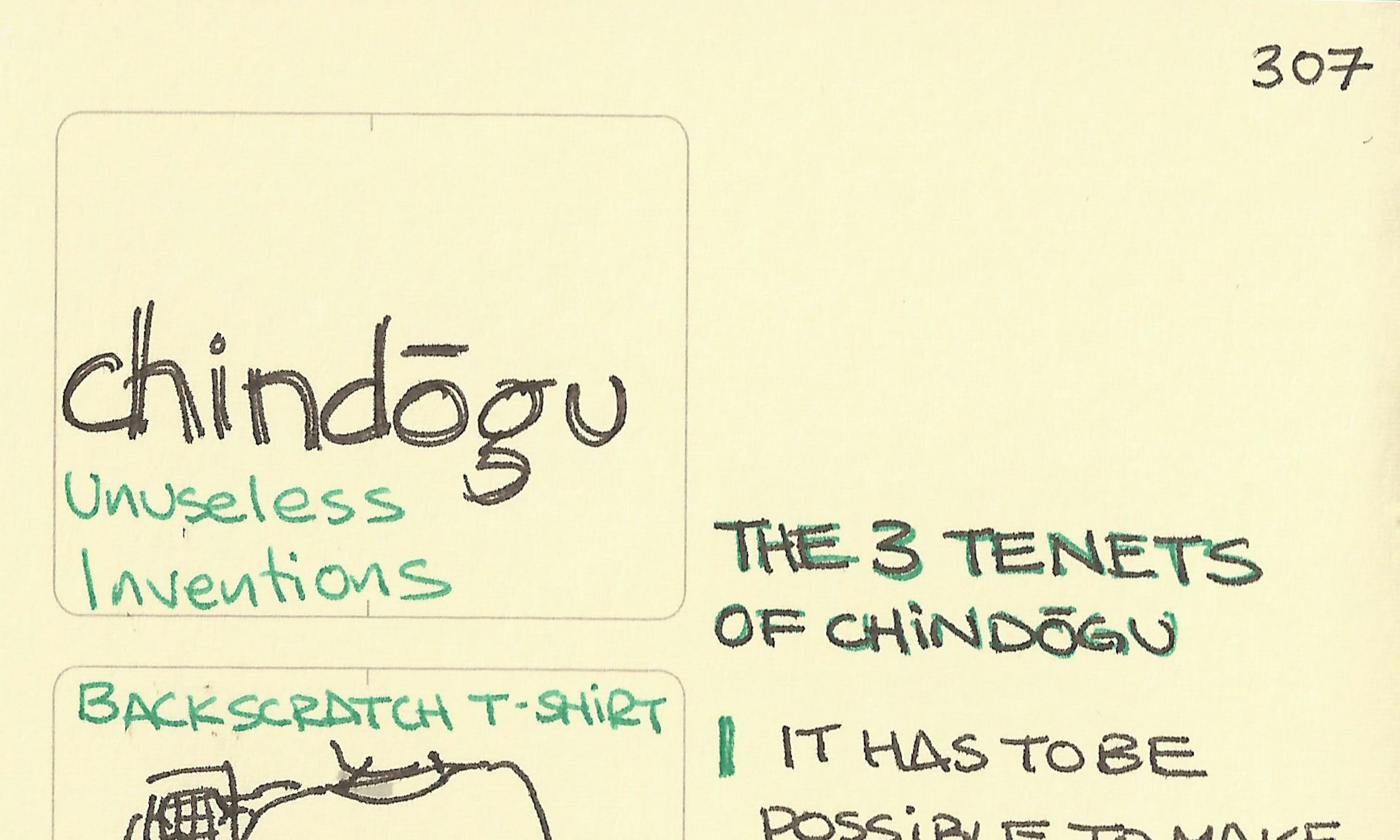 Chindogu: unuseless inventions
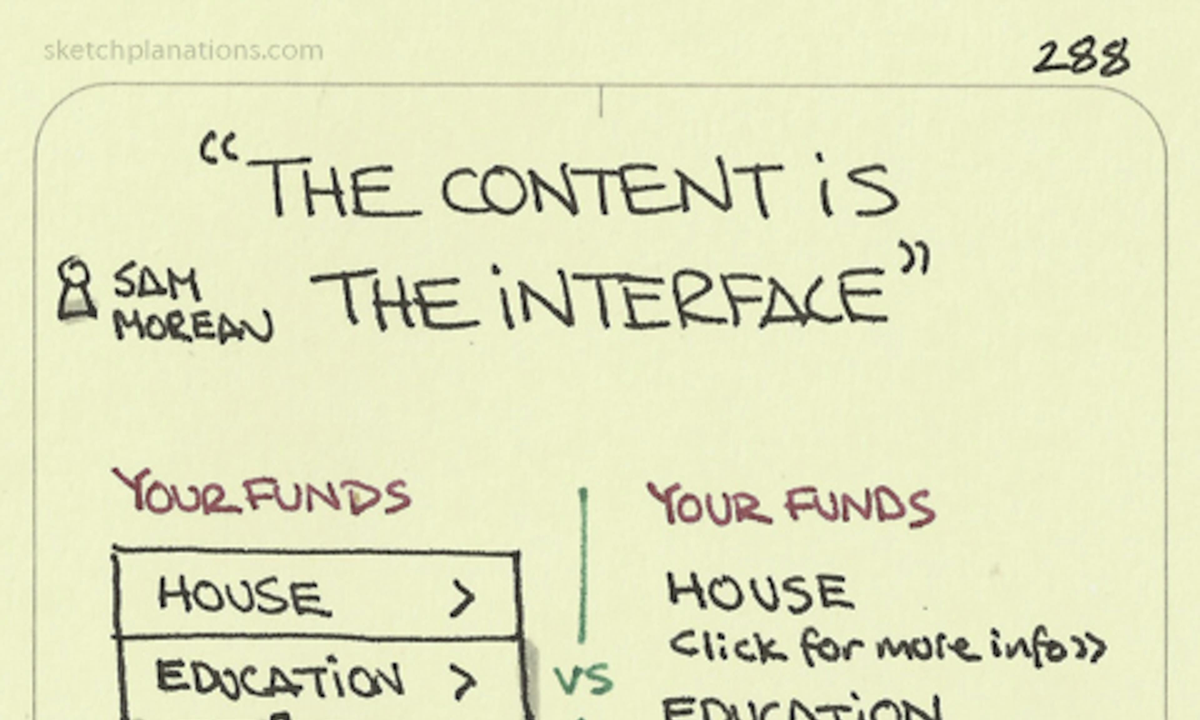 The content is the interface
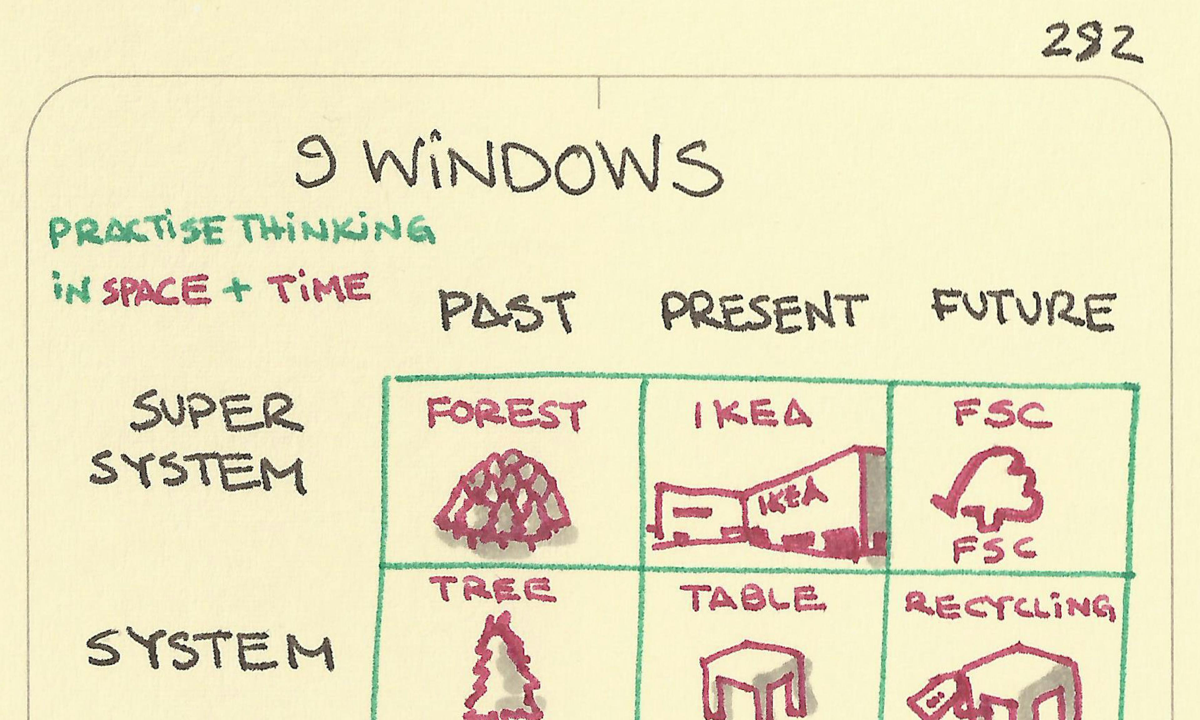 9 Windows
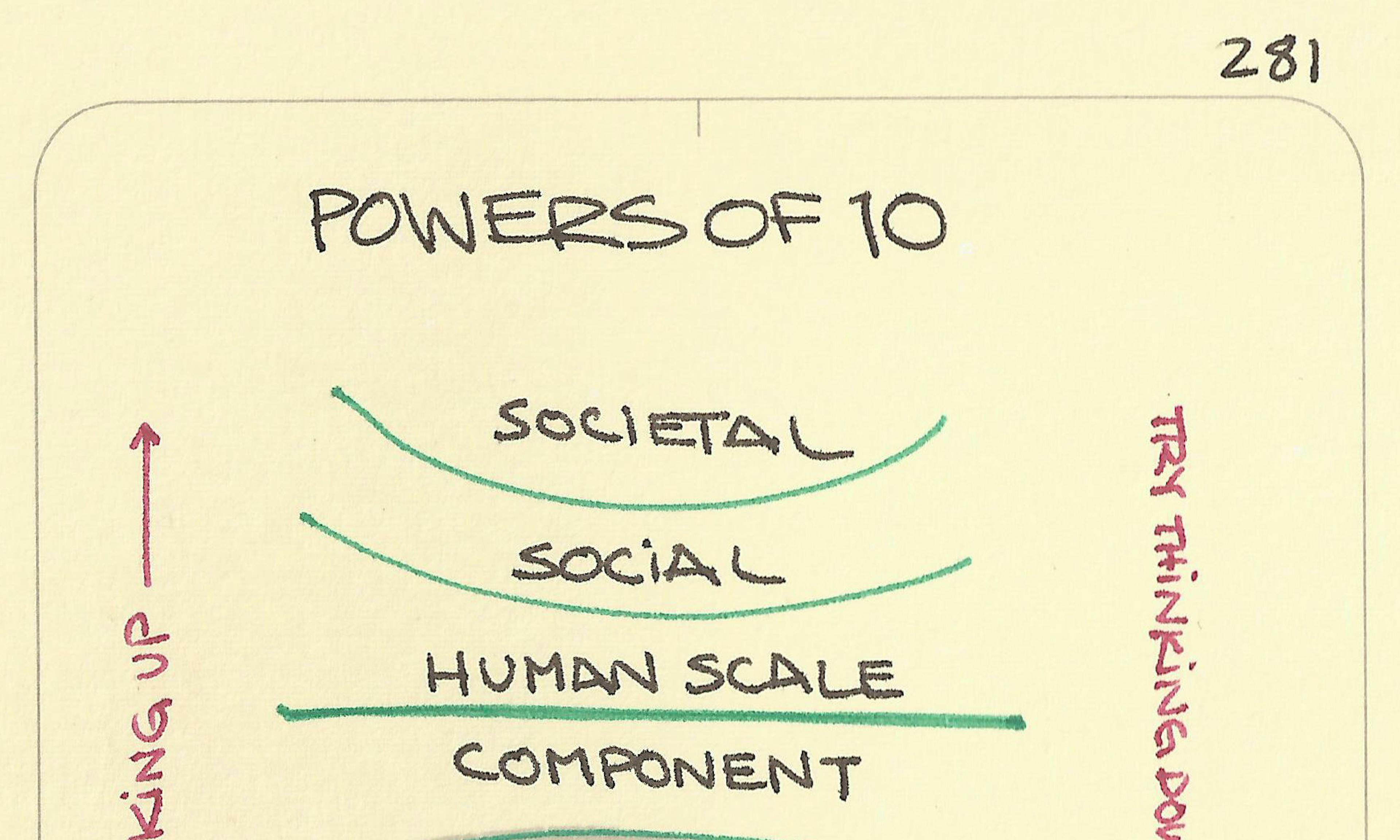 Powers of 10
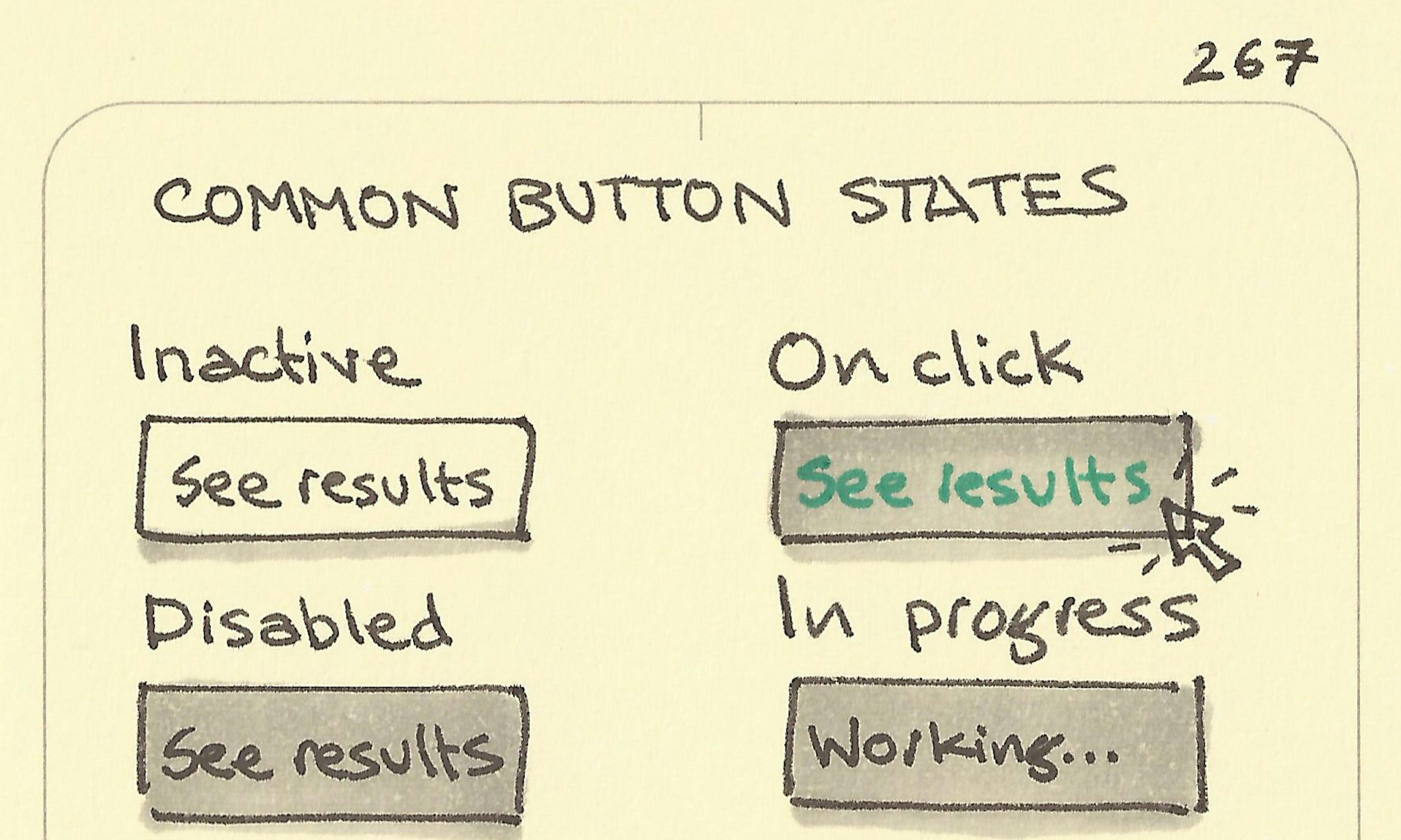 Common button states
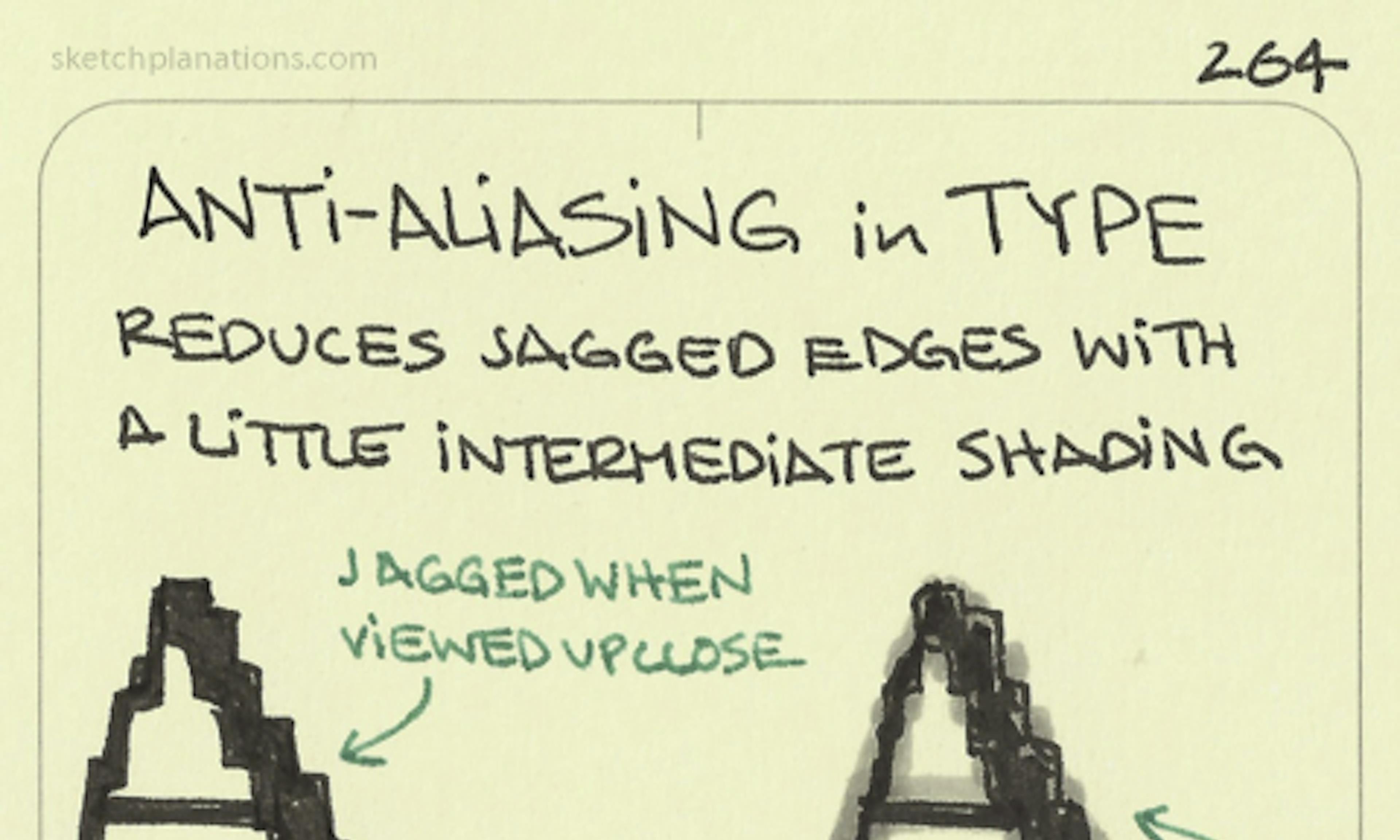 Anti-aliasing
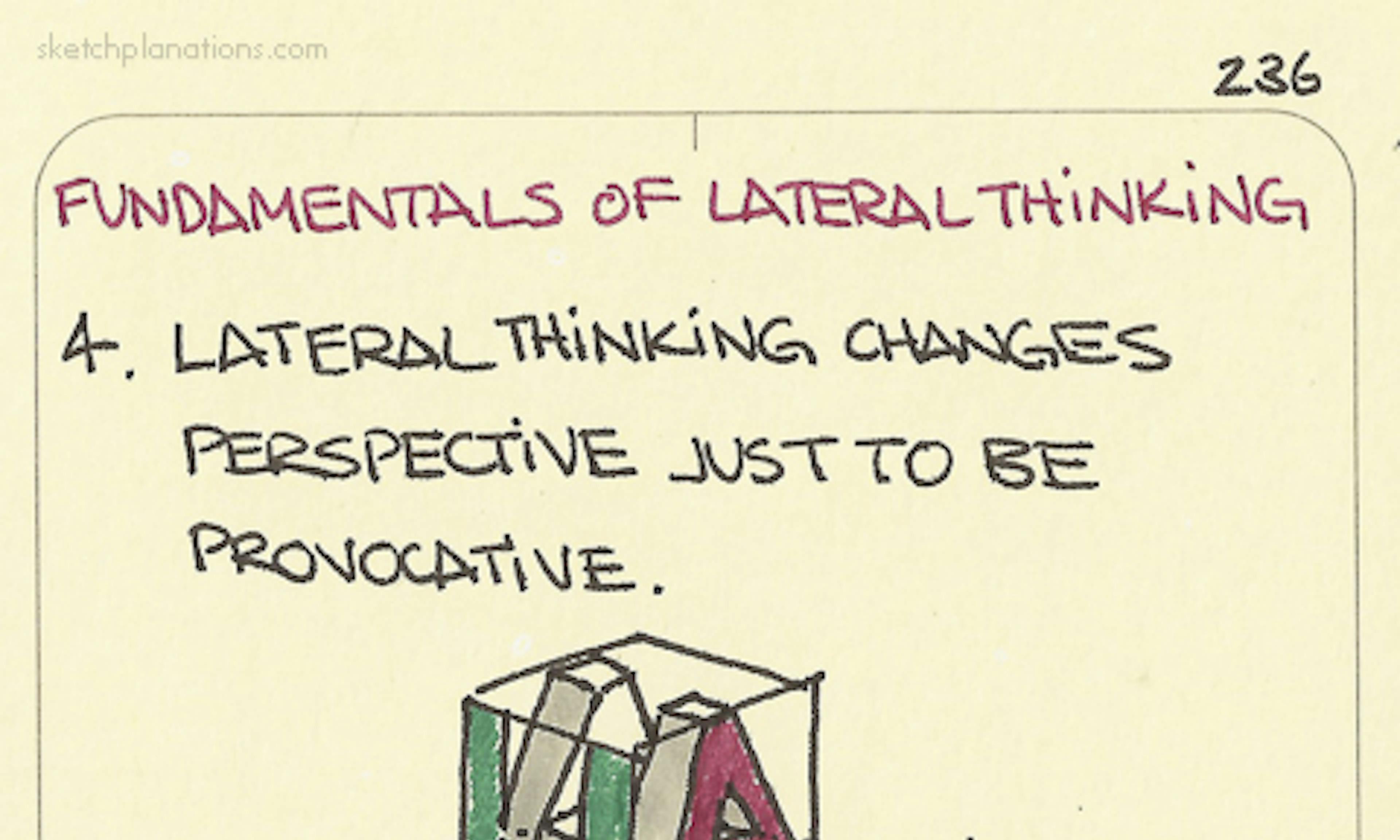 Lateral thinking: 4. Lateral thinking changes perspective just to be provocative
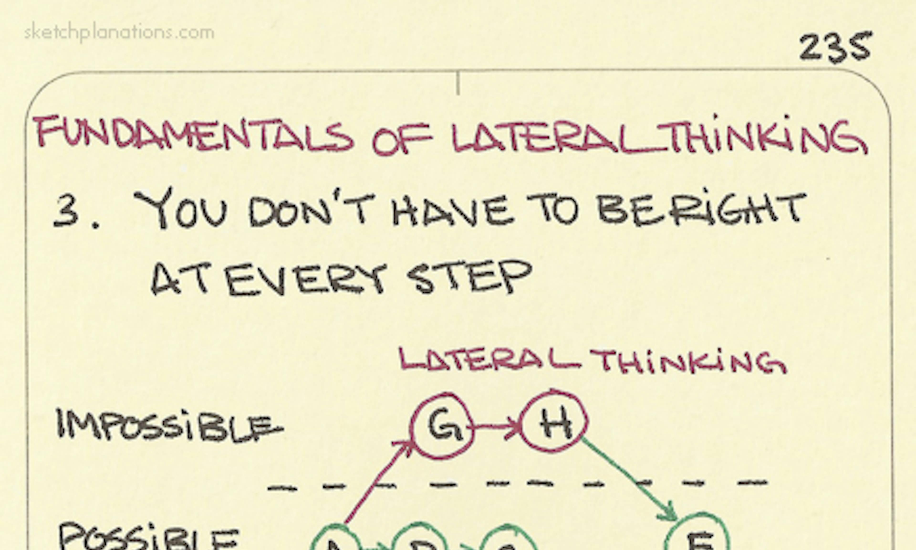 Lateral thinking: 3. You don’t have to be right at every step
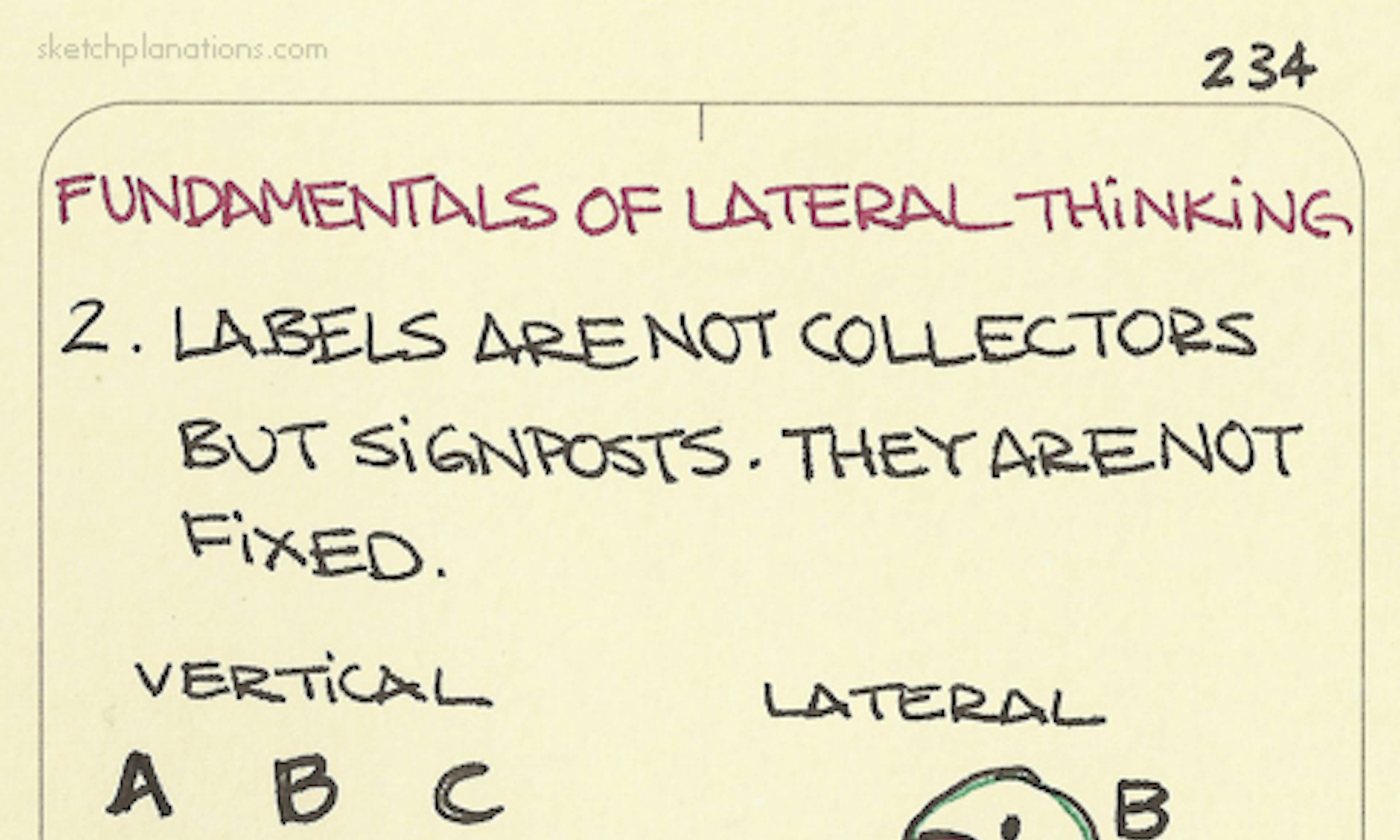 Lateral thinking: 2. Labels are not collectors but signposts. They are not fixed
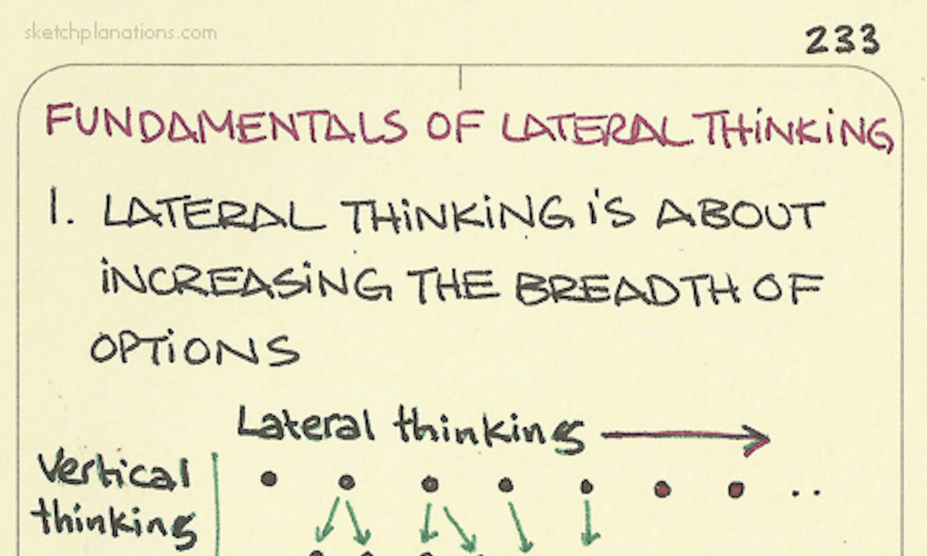 Lateral thinking: 1. Lateral thinking is about increasing the breadth of options
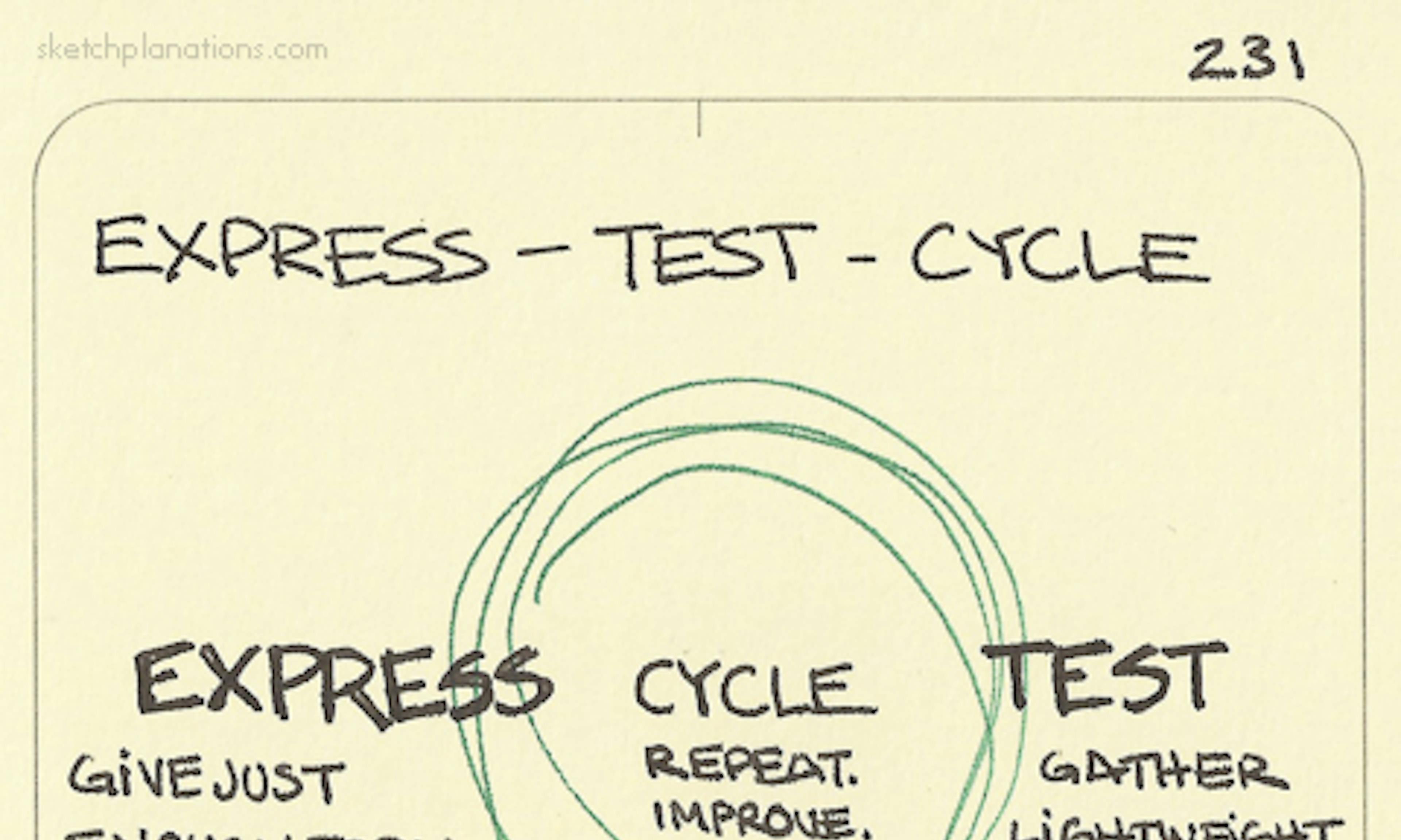 Express - Test - Cycle
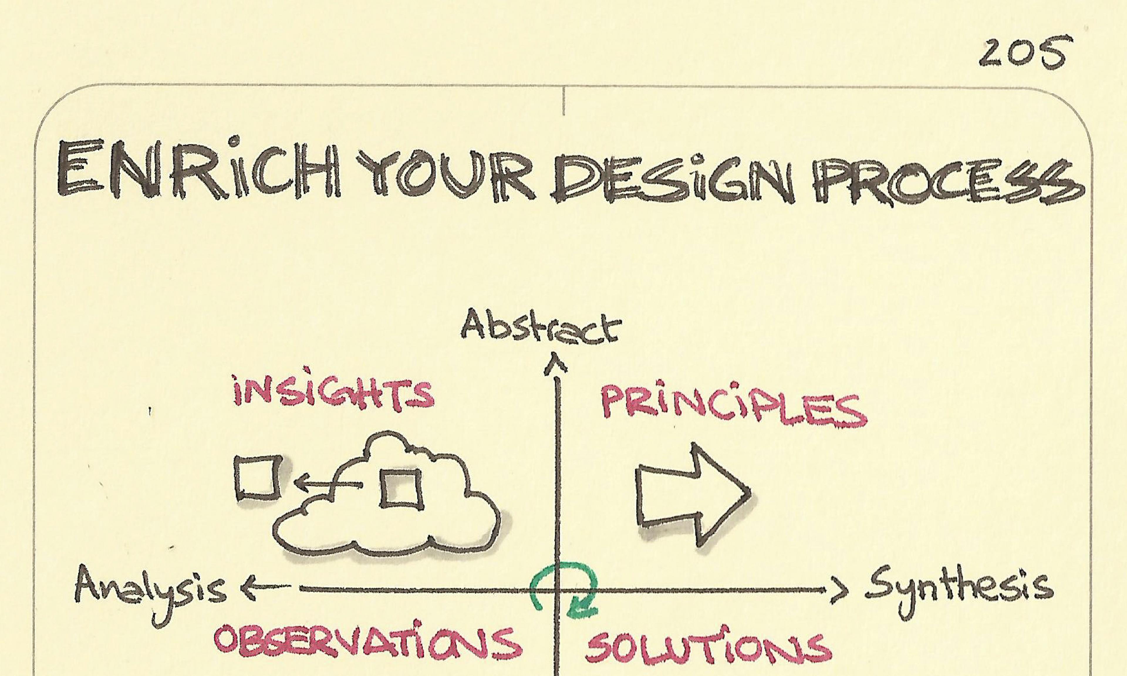 Enrich your design process
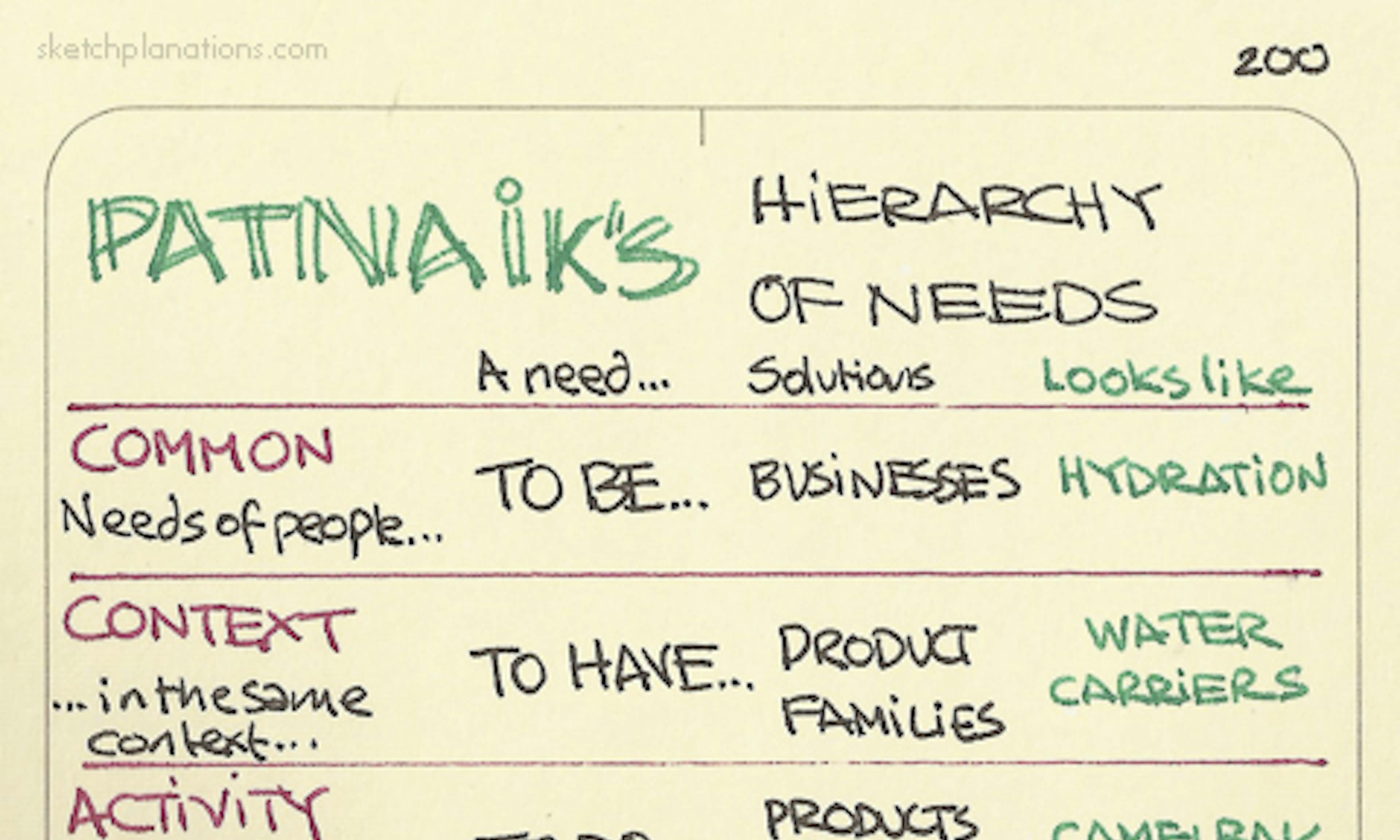 Patnaik’s Hierarchy of Needs
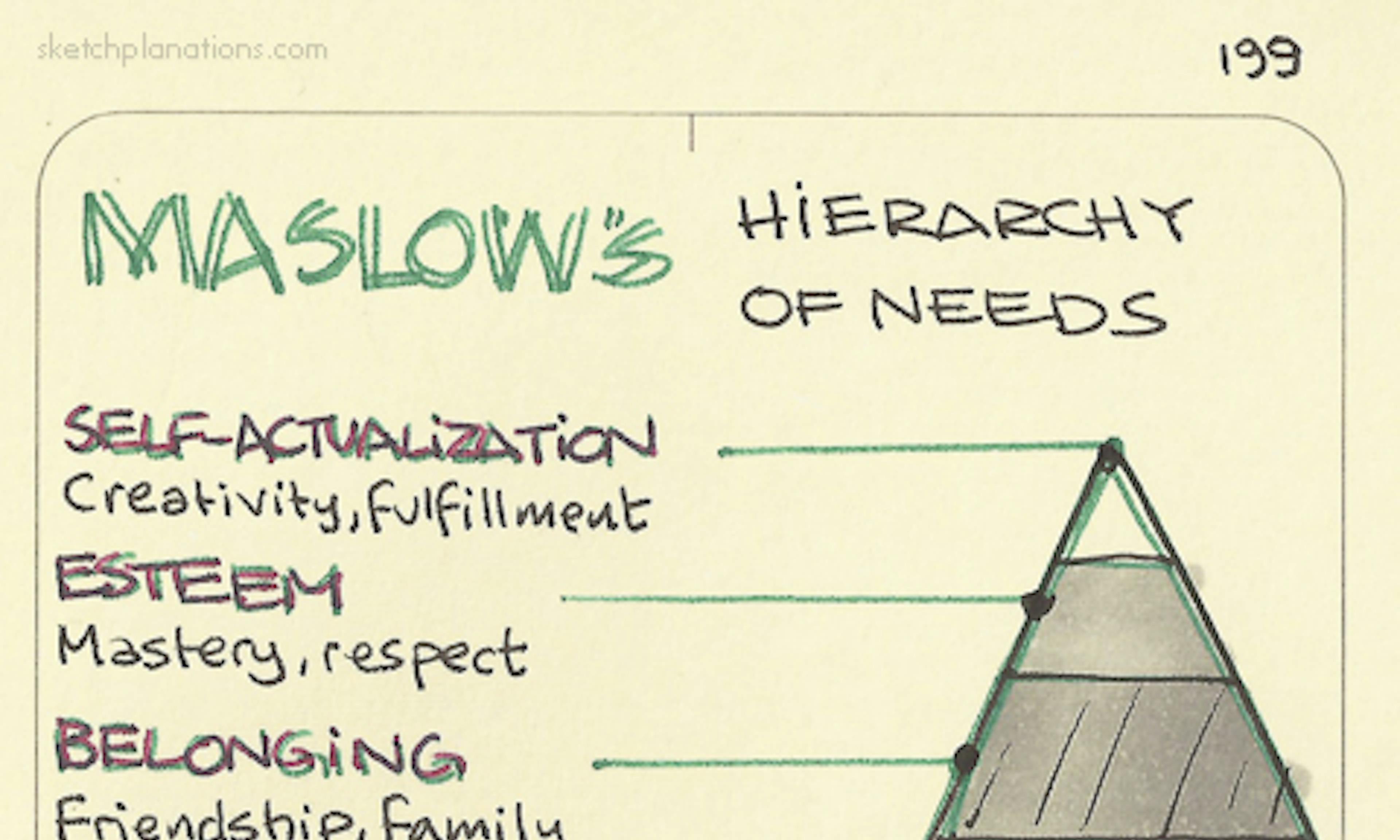 Maslow’s Hierarchy of needs
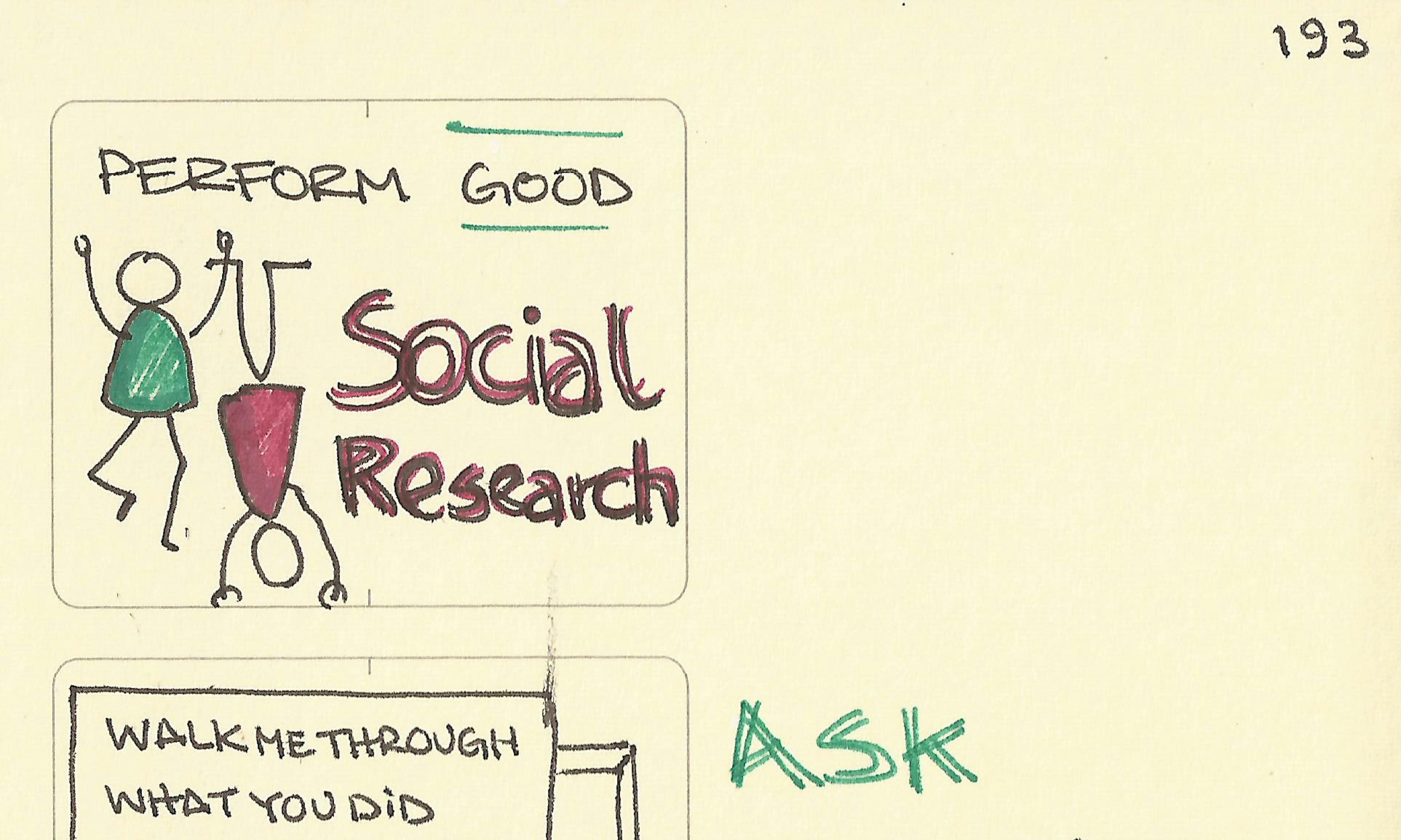 Perform good social research
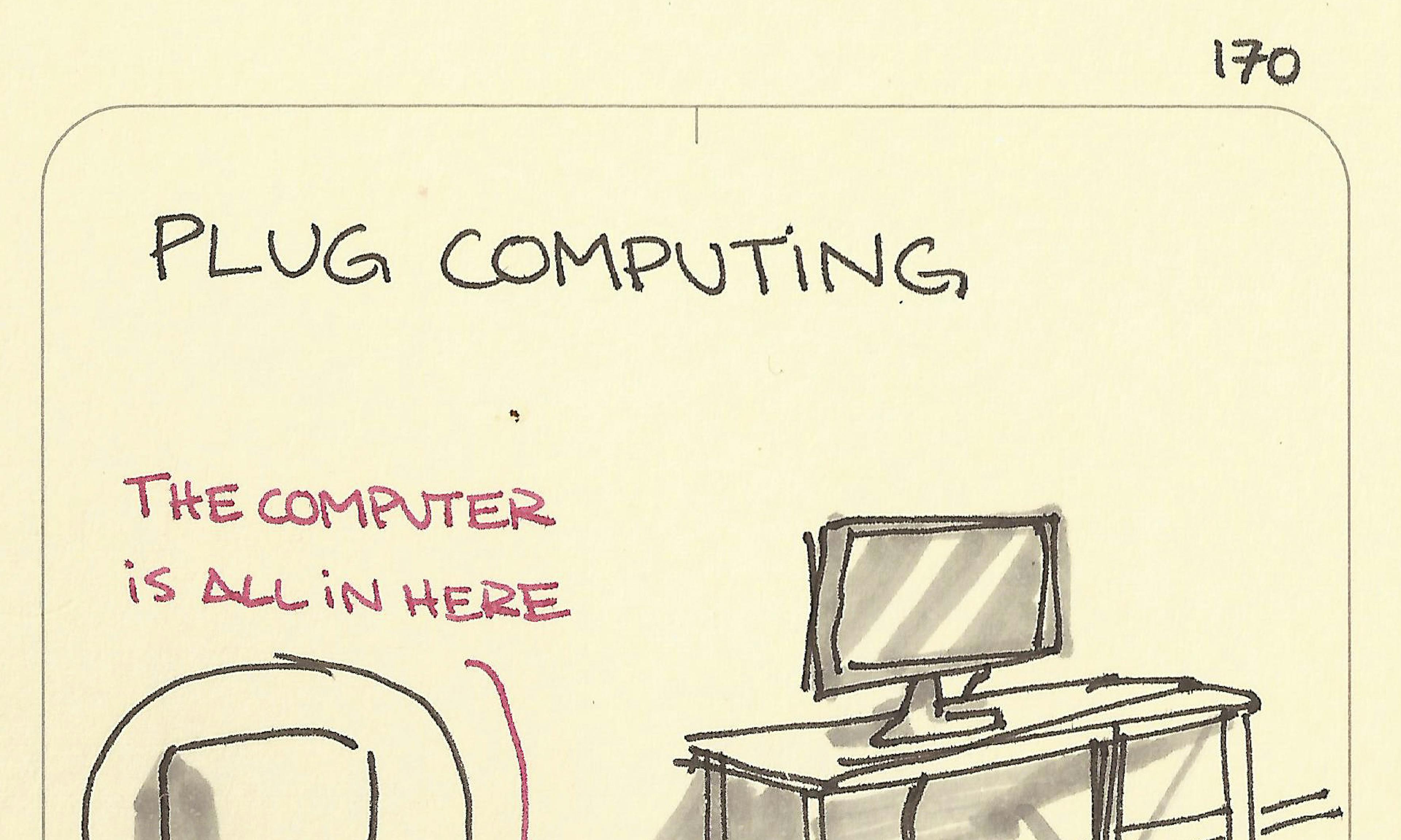 Plug computing
 The number of ideas produced in an ideation session is proportional to the size of the stack of paper in front of you
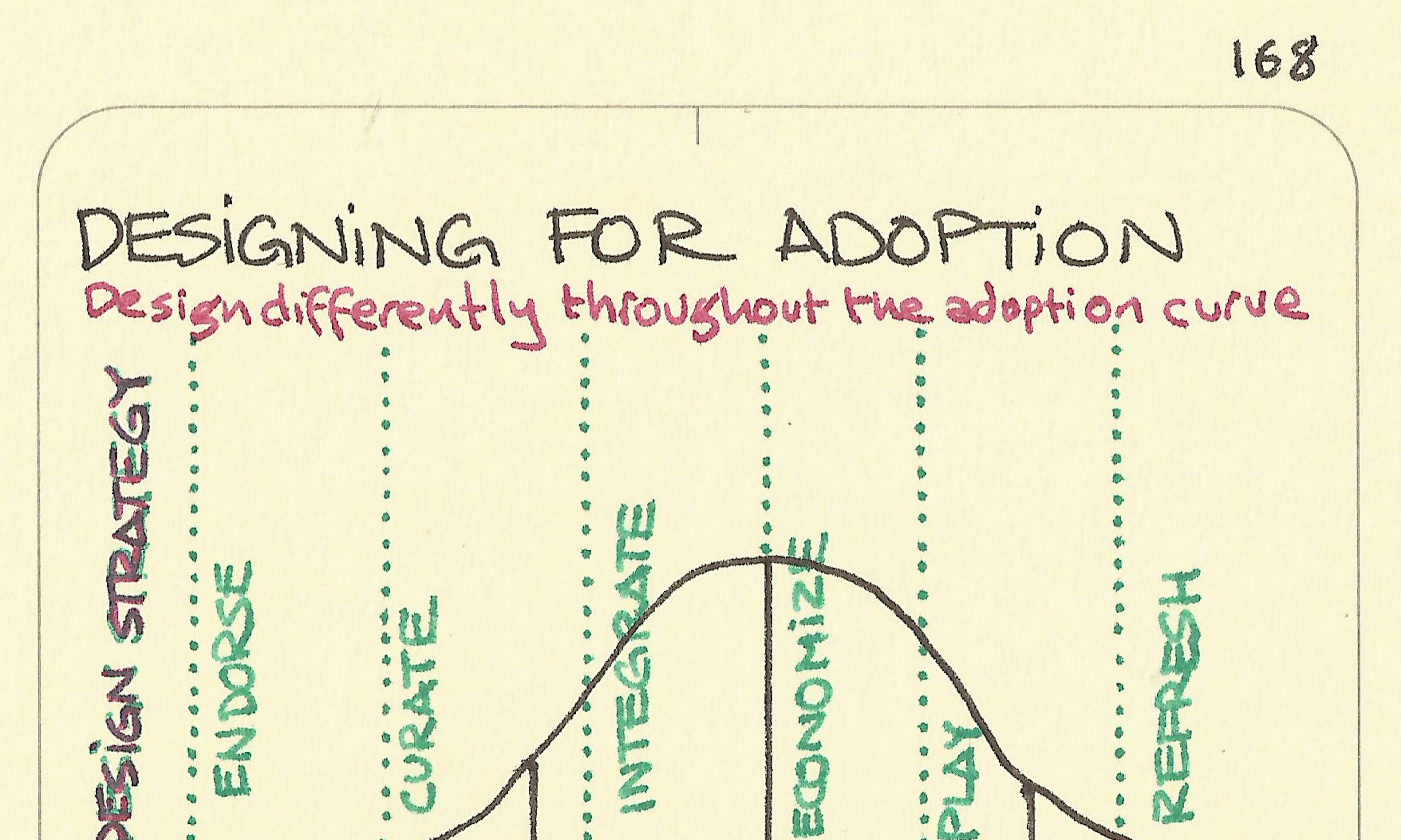 Designing for adoption
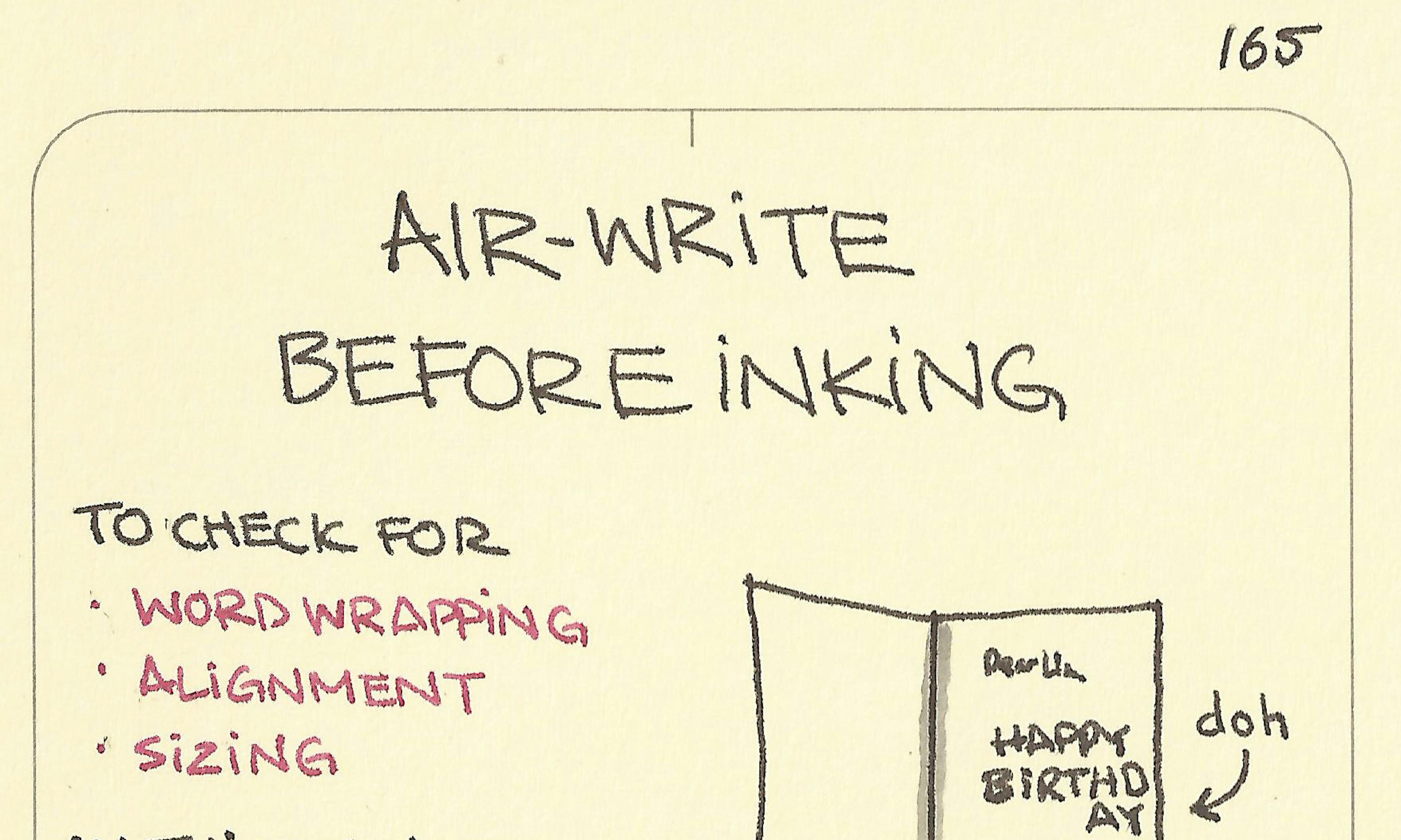 Air-write before inking
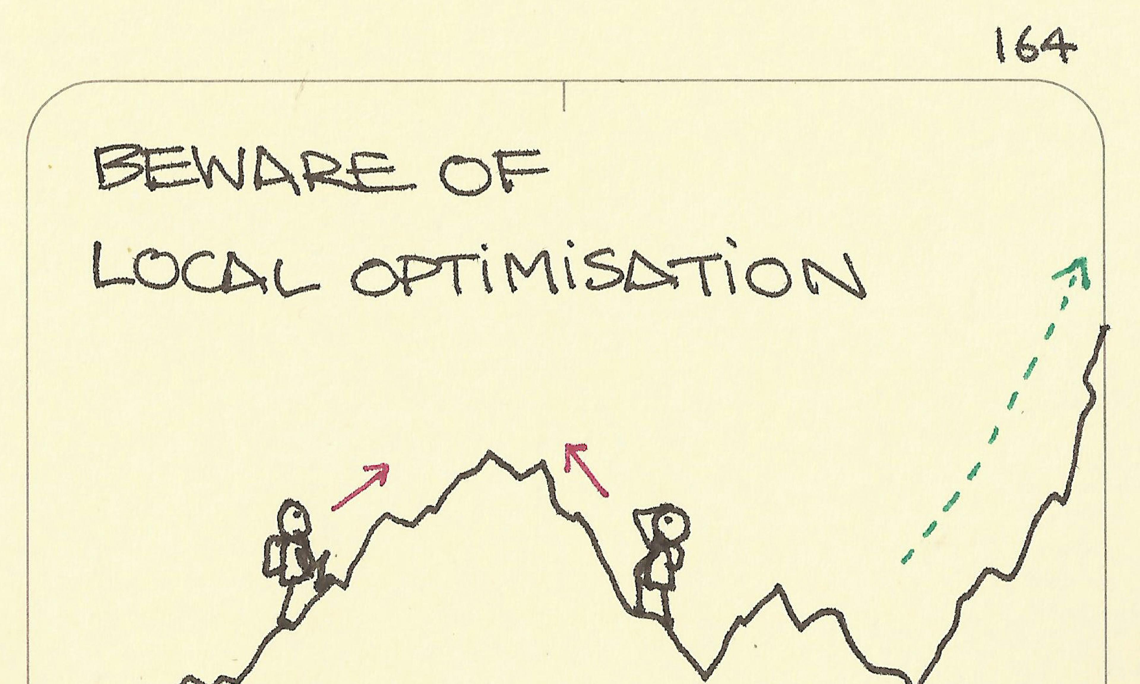 Beware of local optimisation
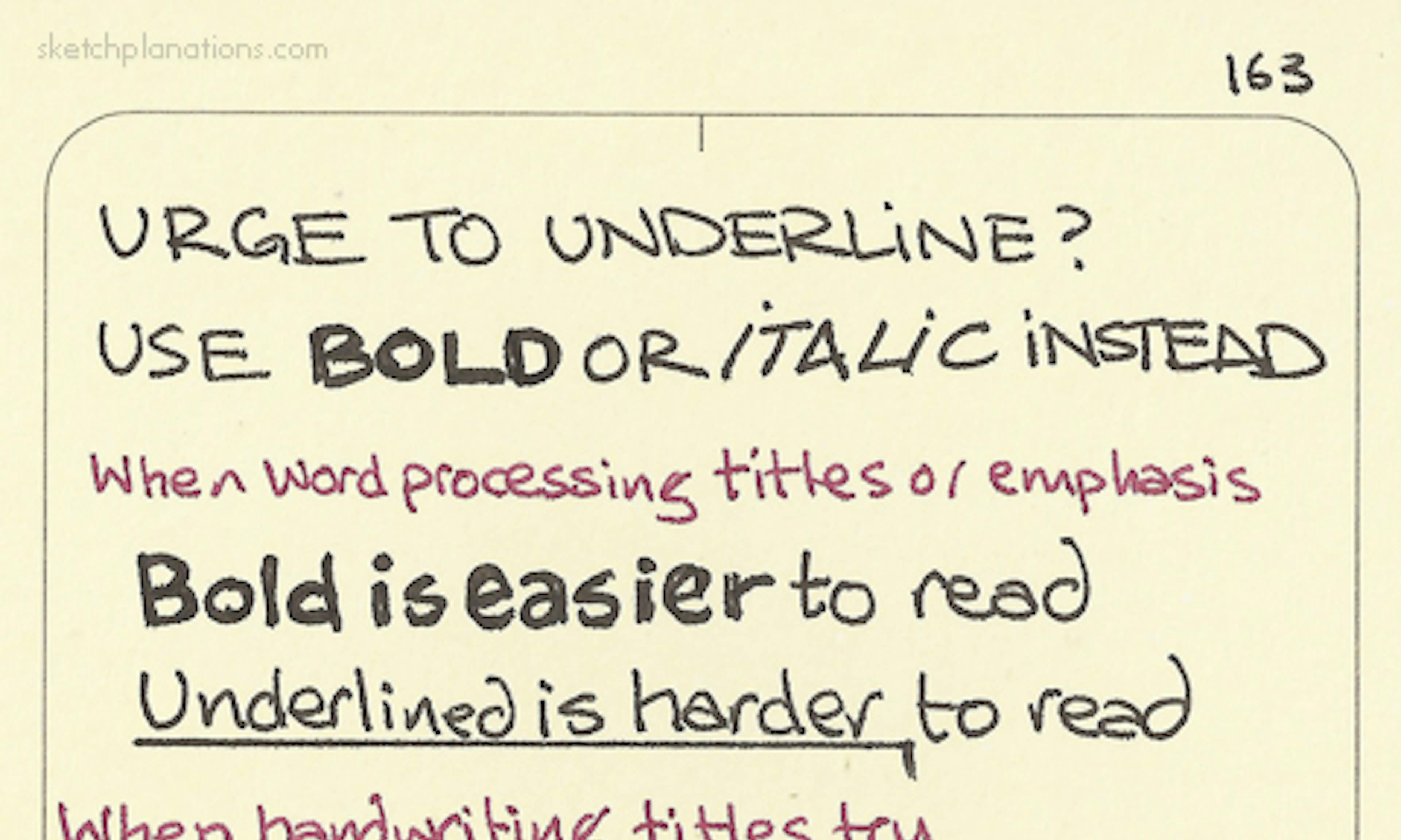 Urge to underline? Use bold or italic instead
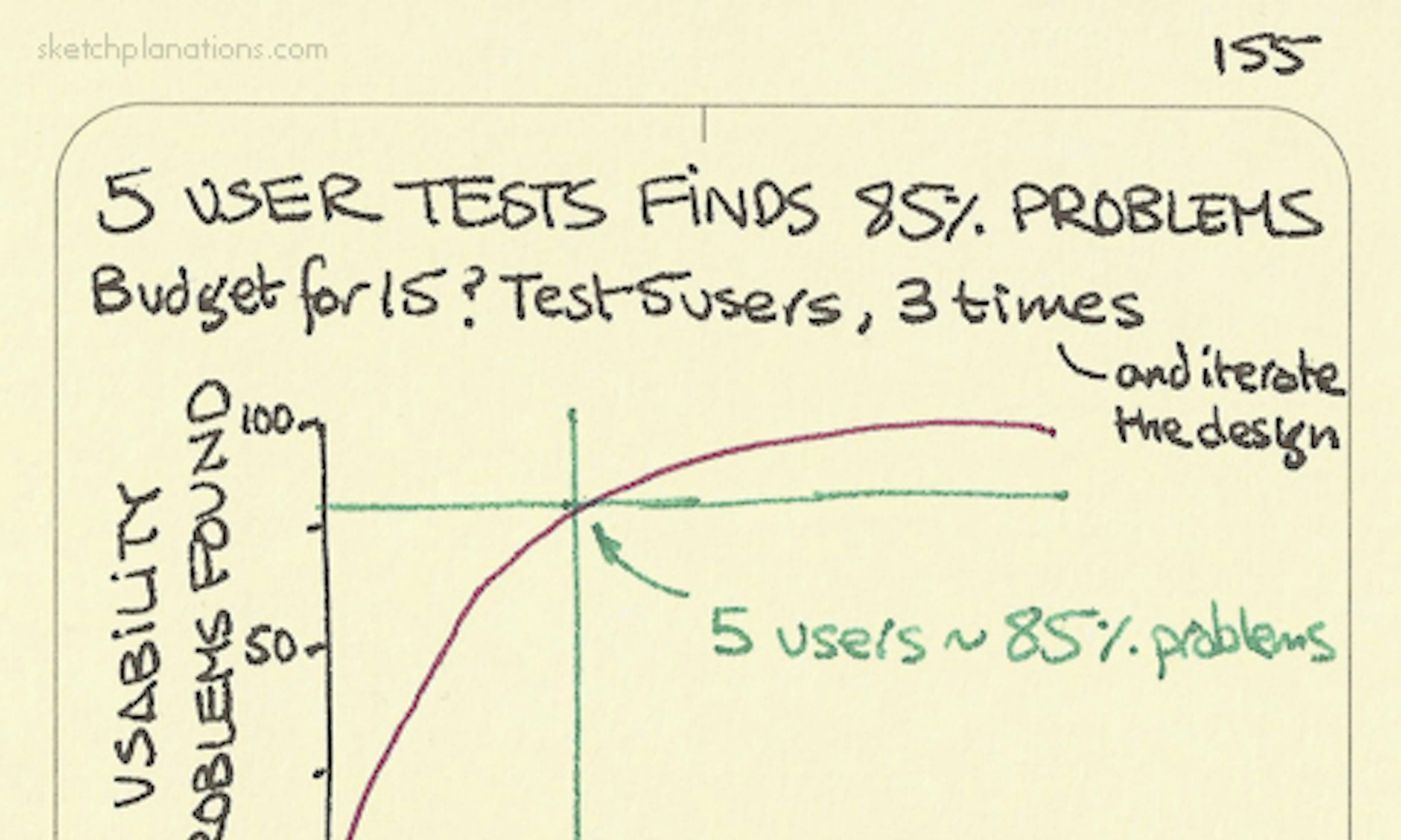 5 user tests finds 85% problems
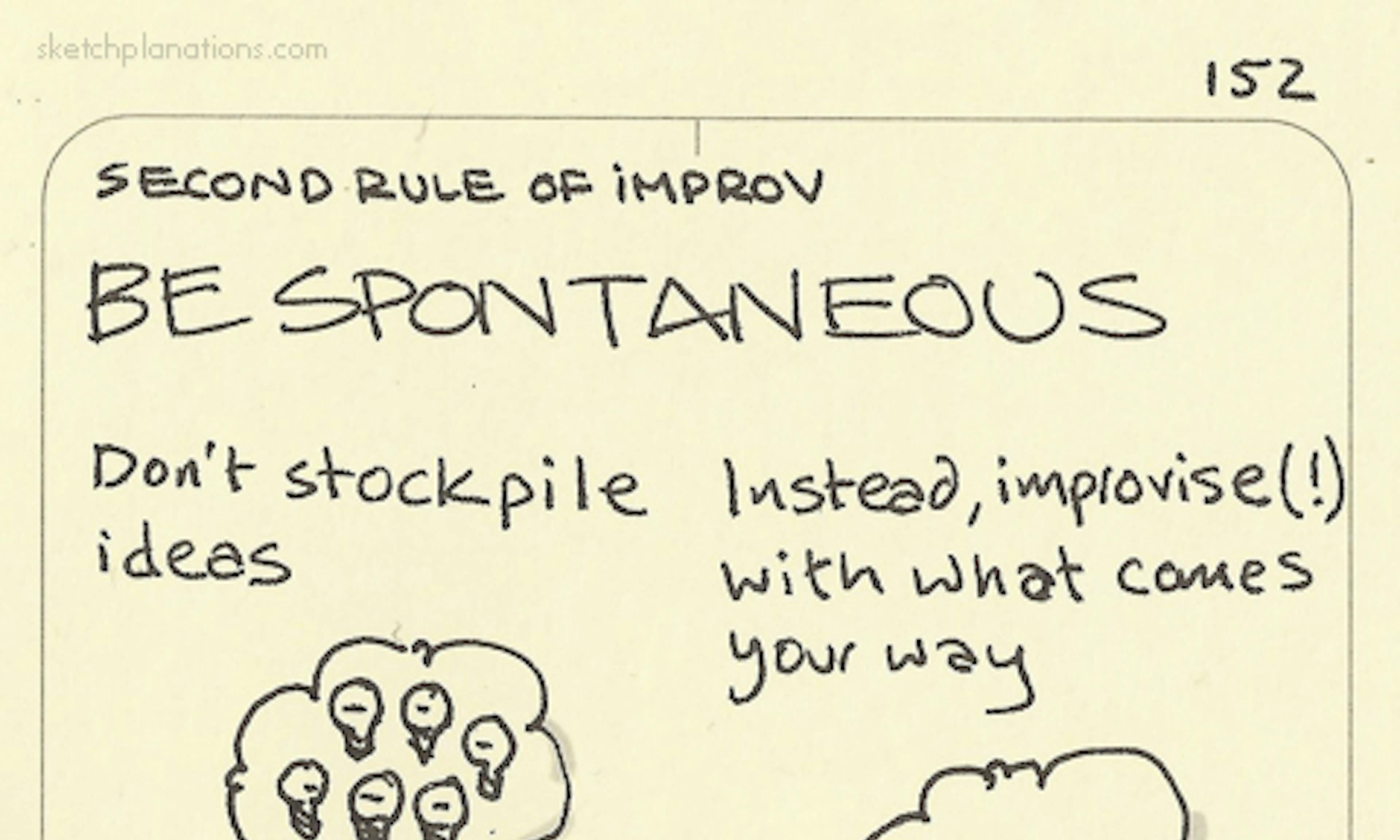 Second rule of improv: Be spontaneous
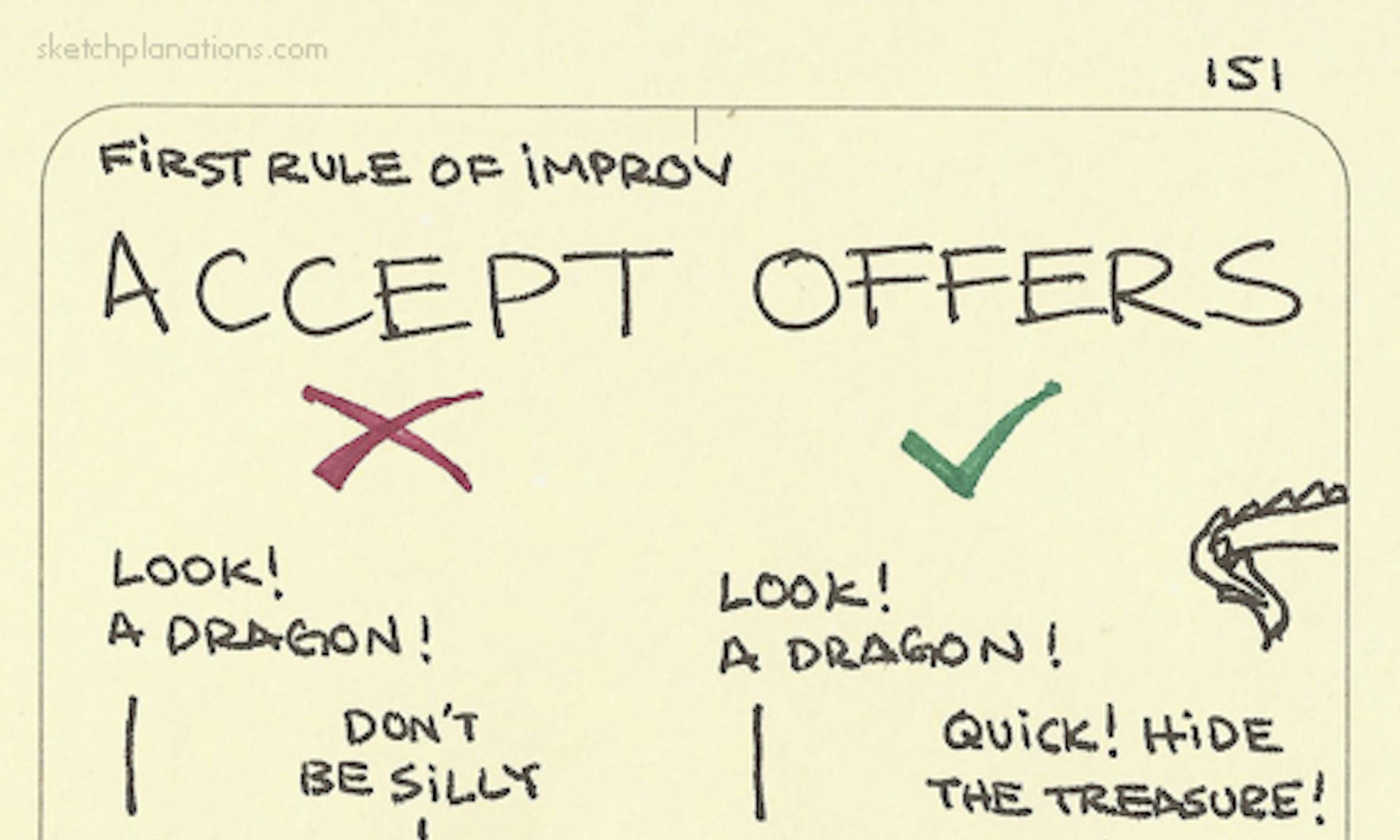 Accept offers
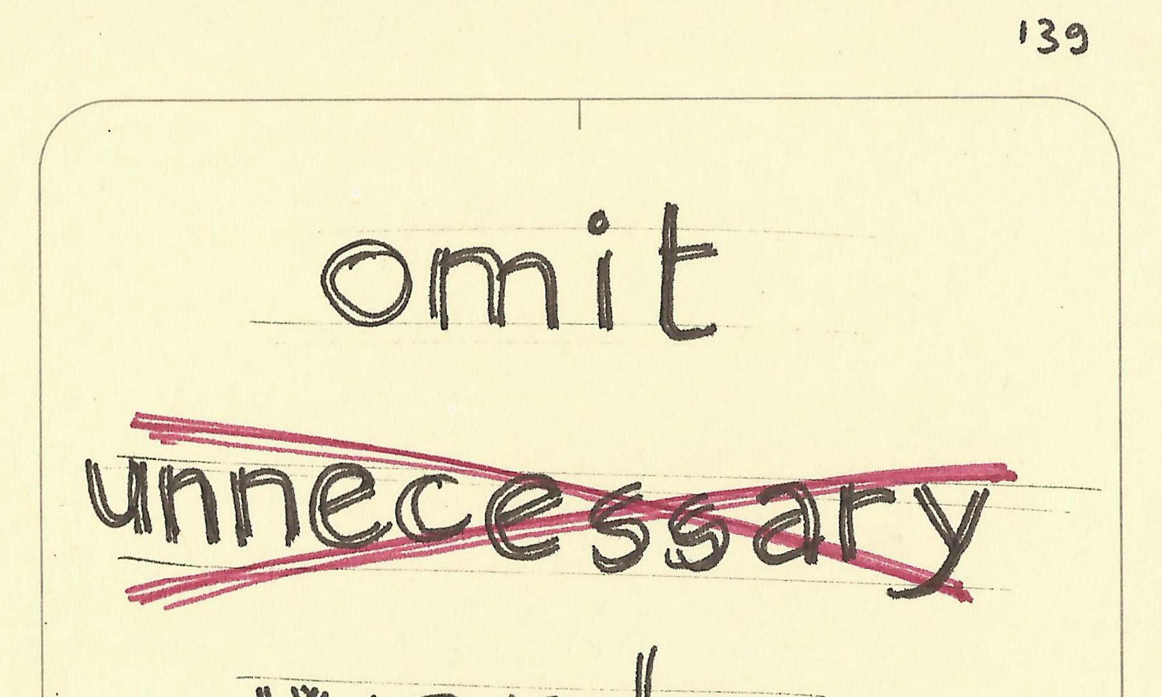 Omit unnecessary words
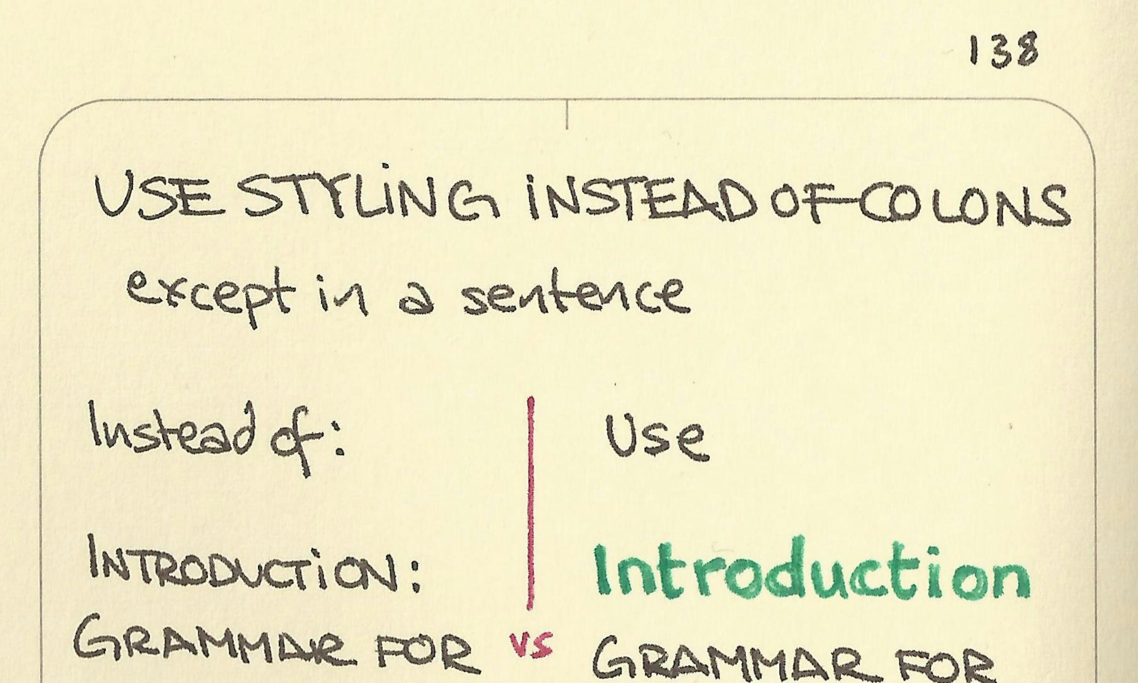 Use styling instead of colons
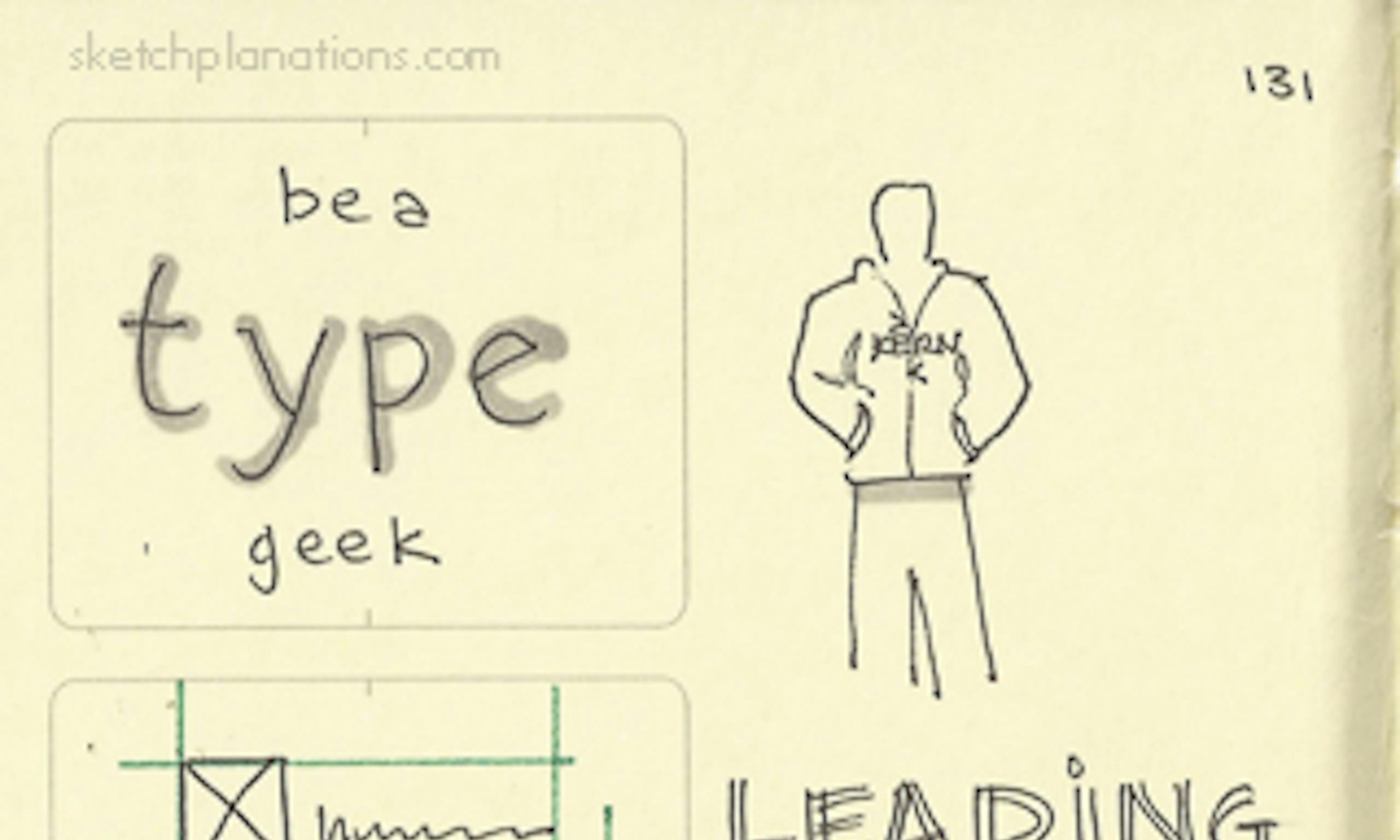 Be a type geek
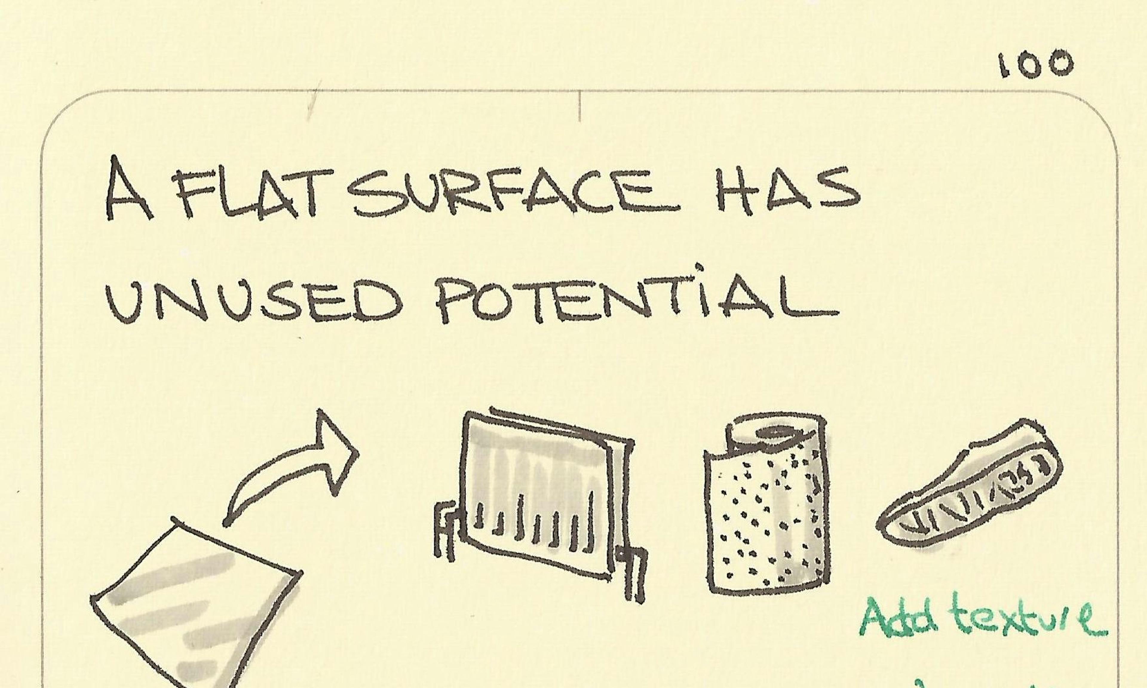 A flat surface has unused potential
 Don’t let your thinking be limited by your tools
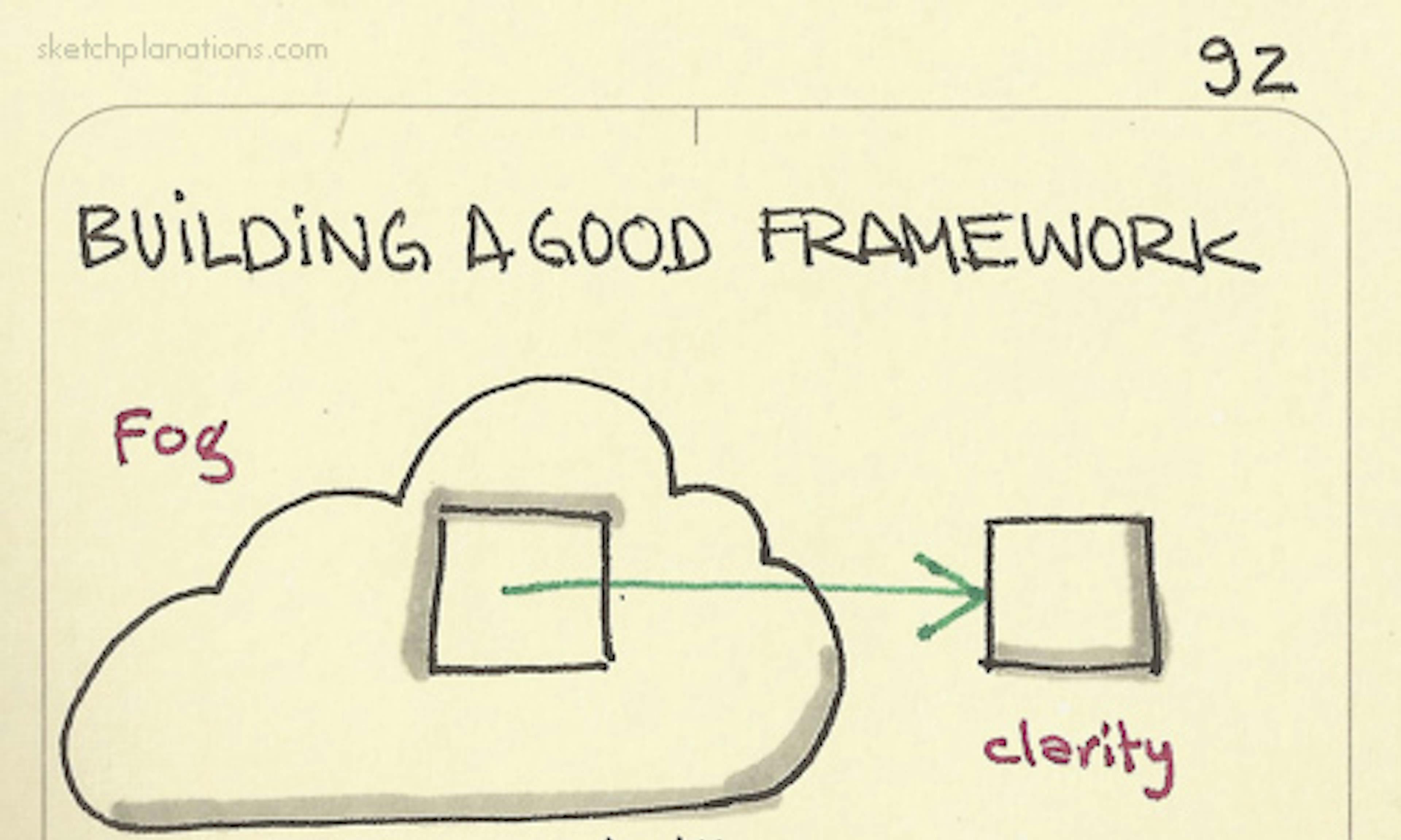 Building a good framework is like cutting cubes out of fog — Larry Keeley
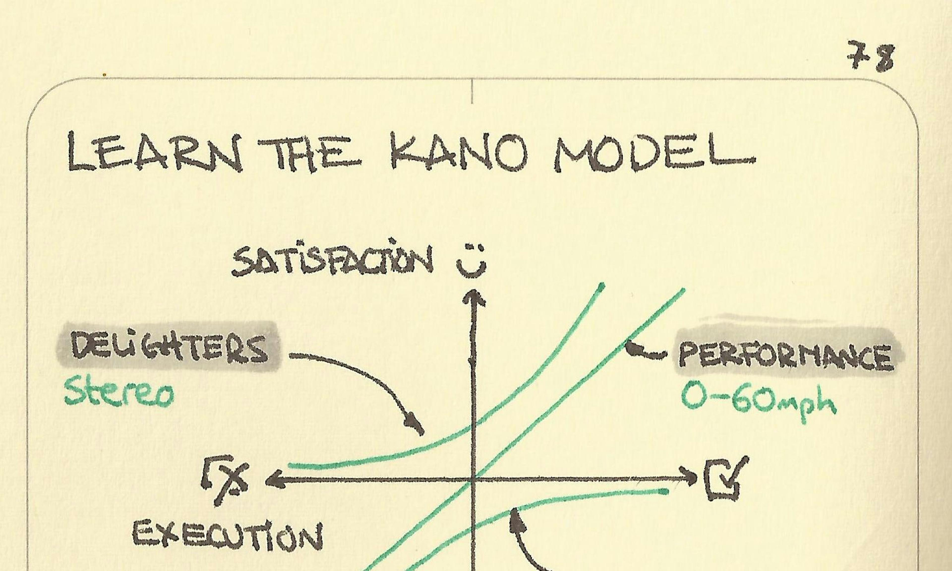 Learn the Kano model
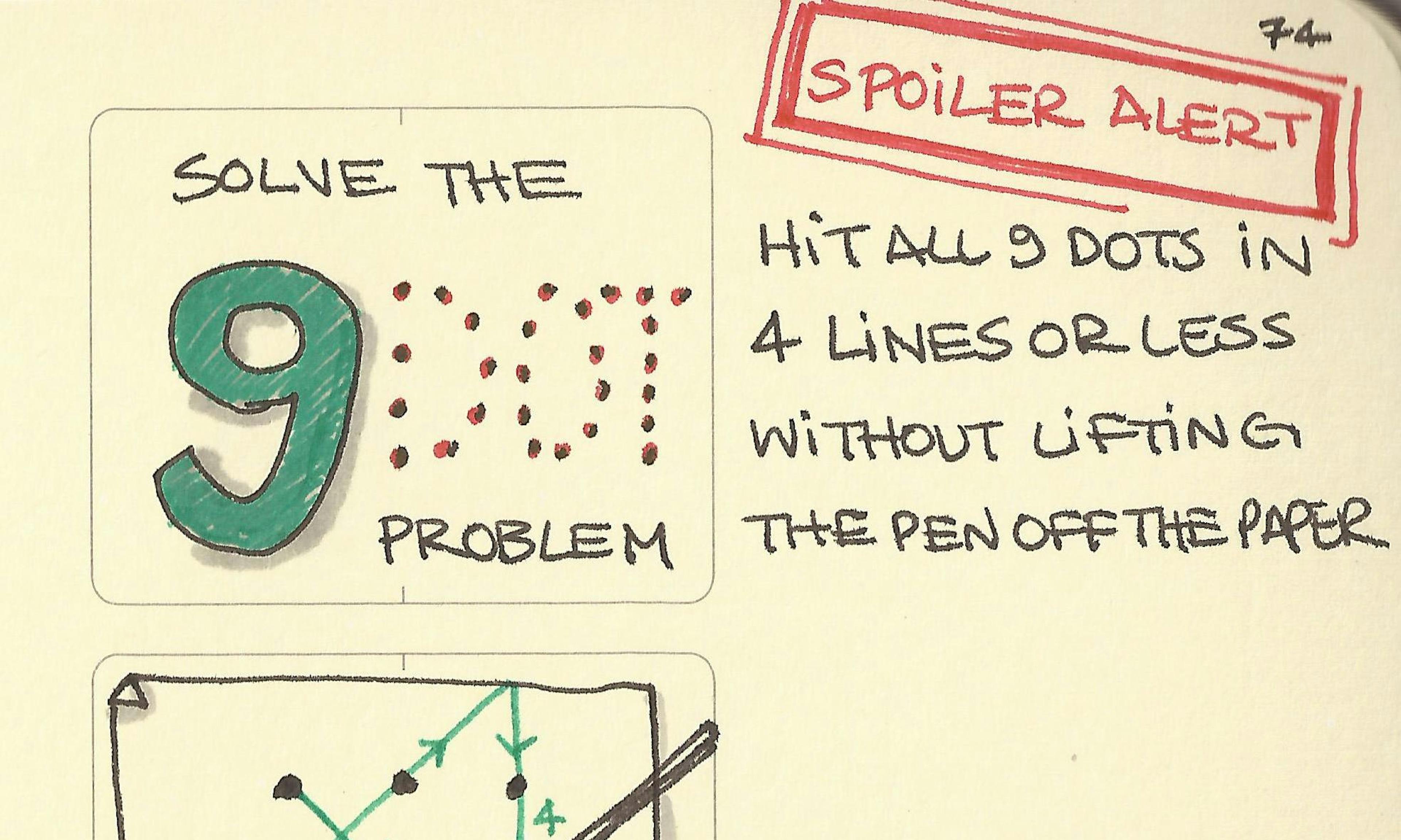 Solve the 9-dot problem
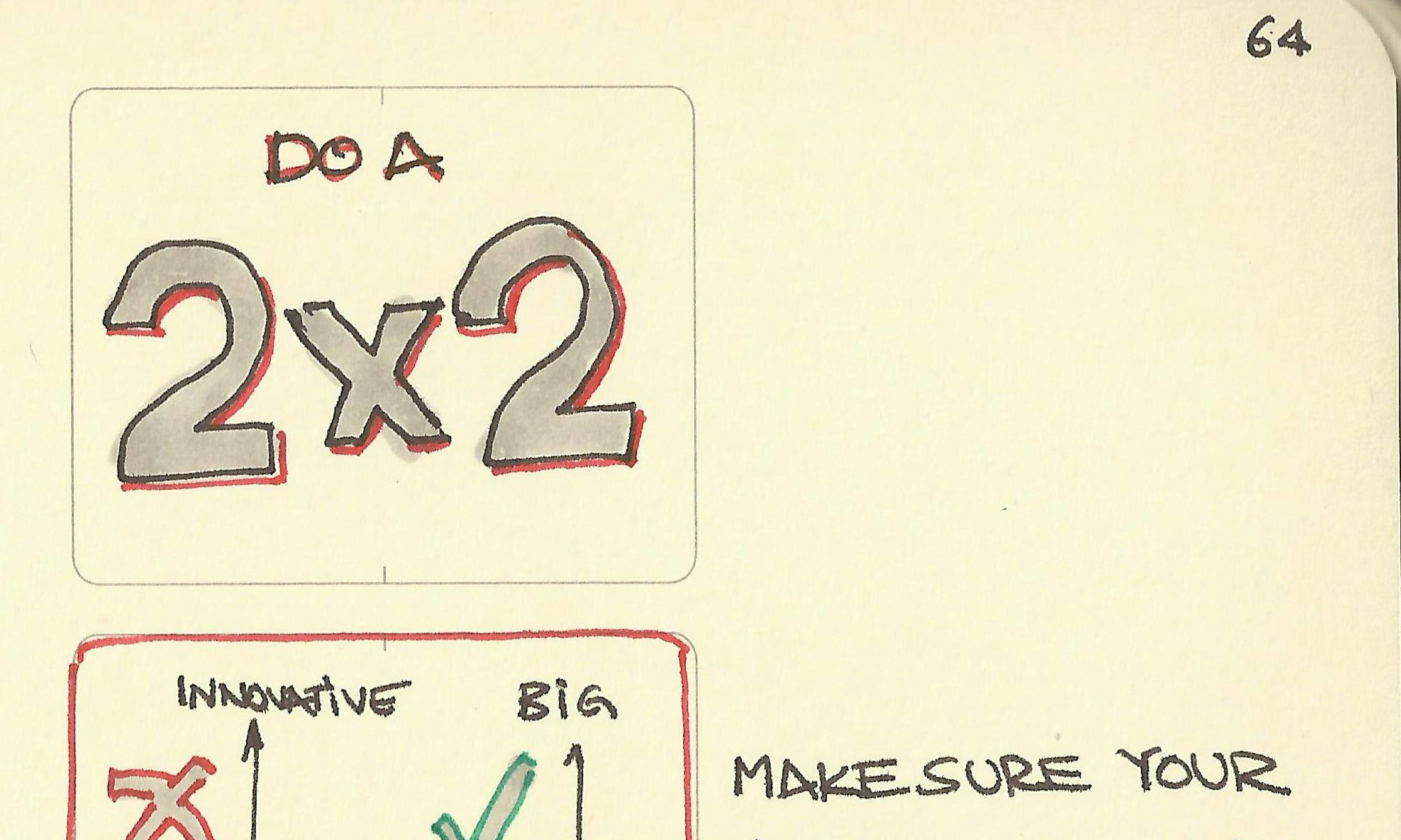 Do a 2x2
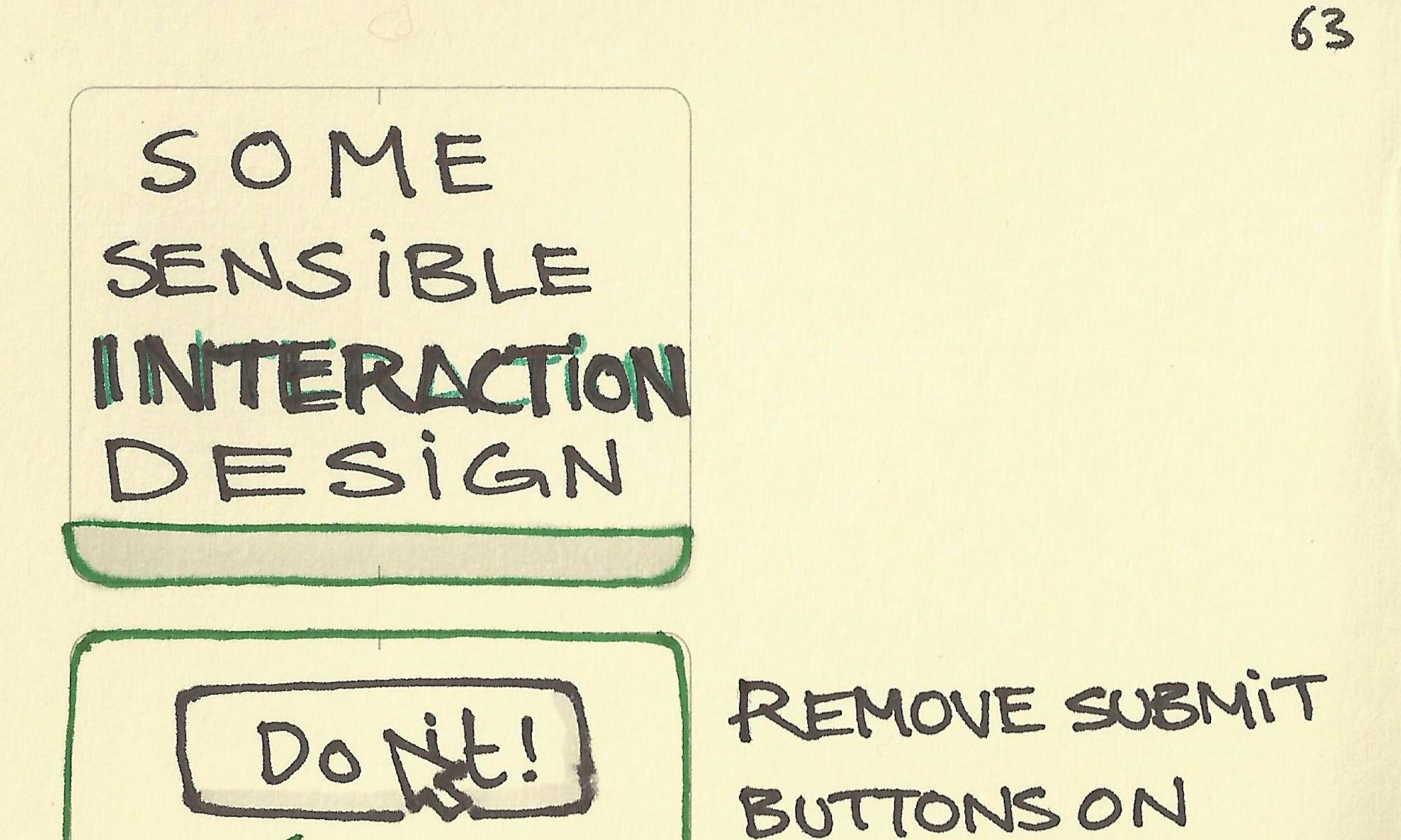 Some sensible interaction design
 Use white space with care to make your point
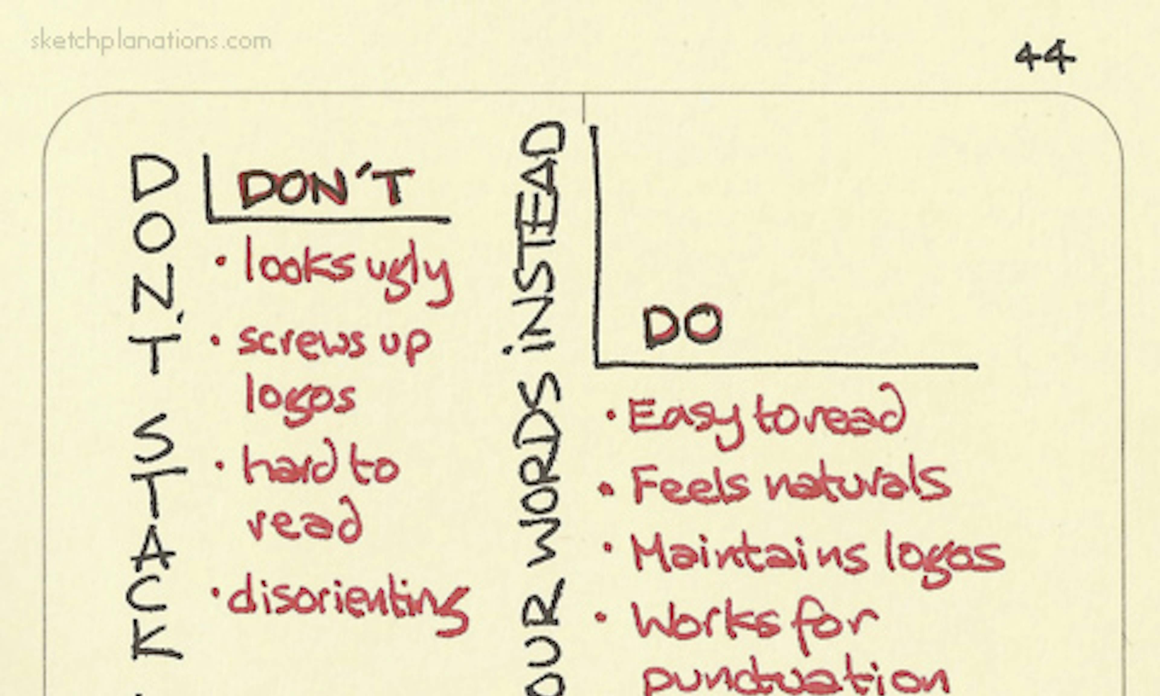 Don’t stack letters vertically. Turn your words instead
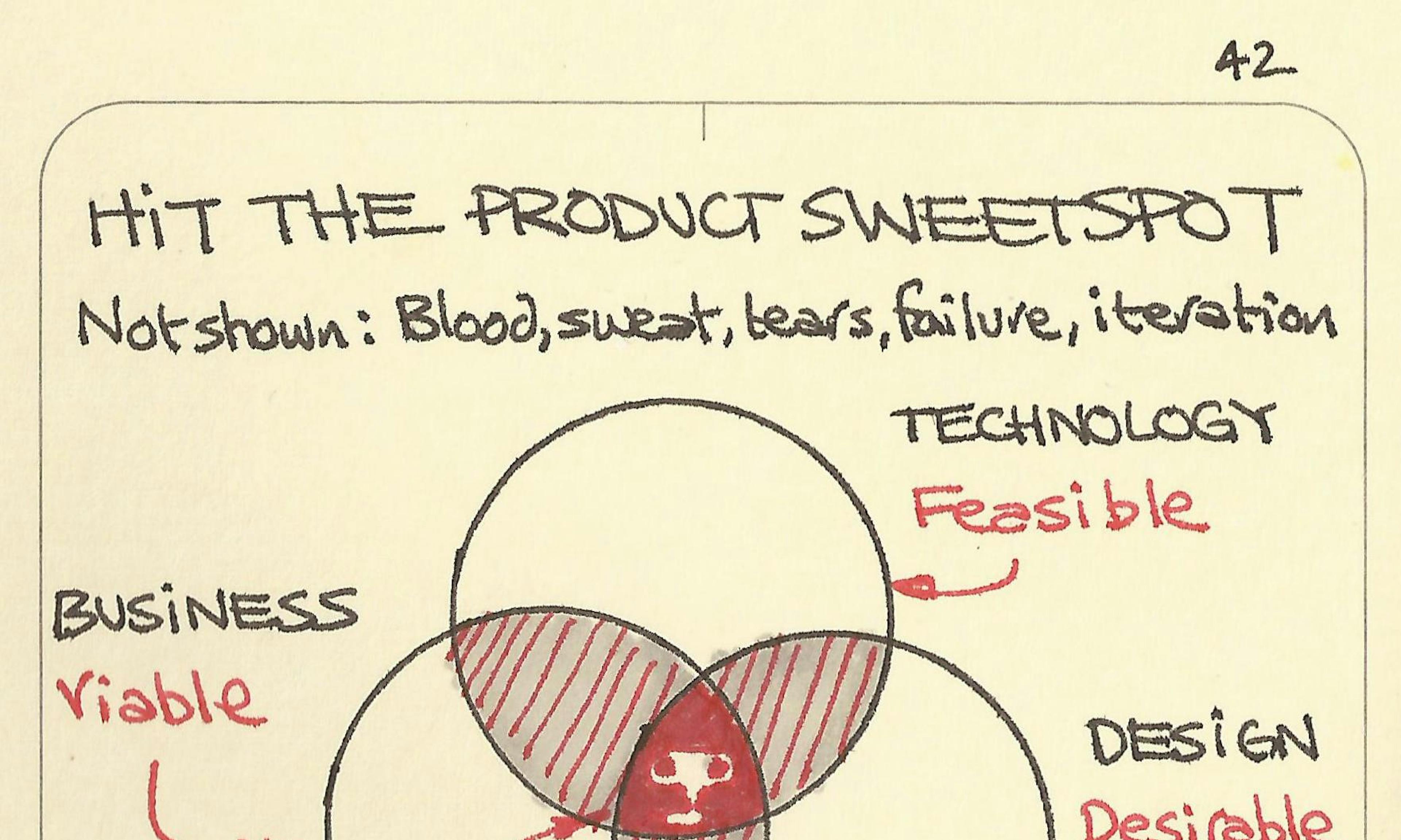 Hit the product sweet spot
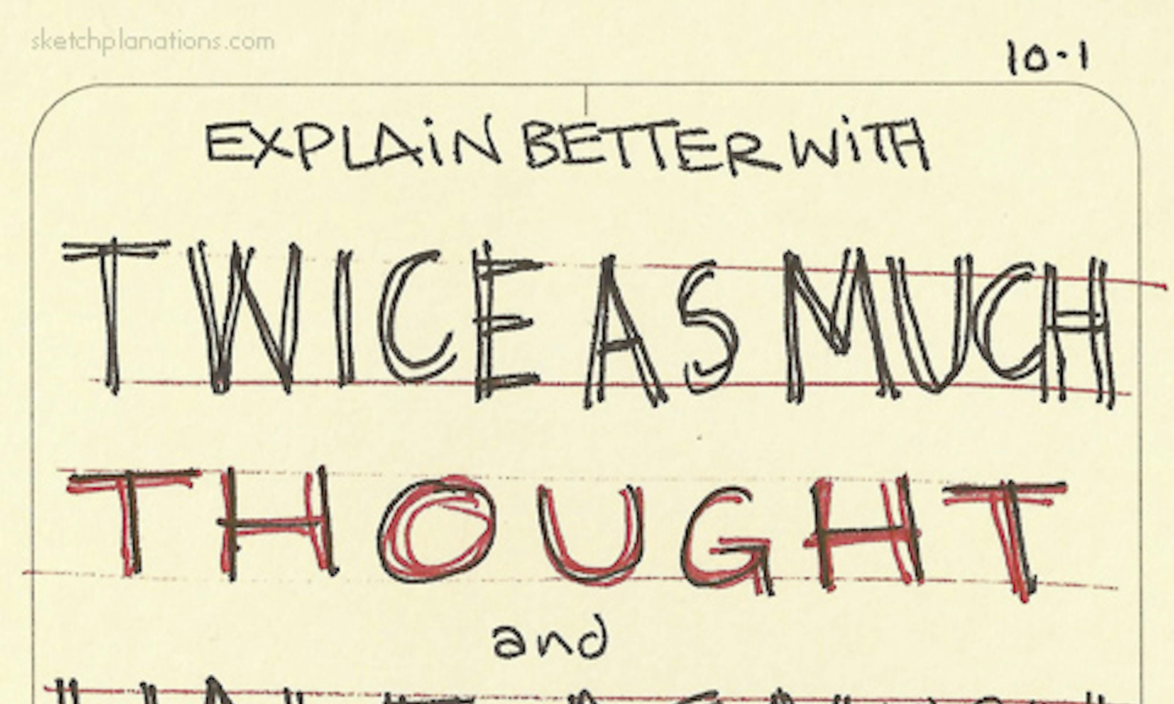 Twice as much thought and half as much content
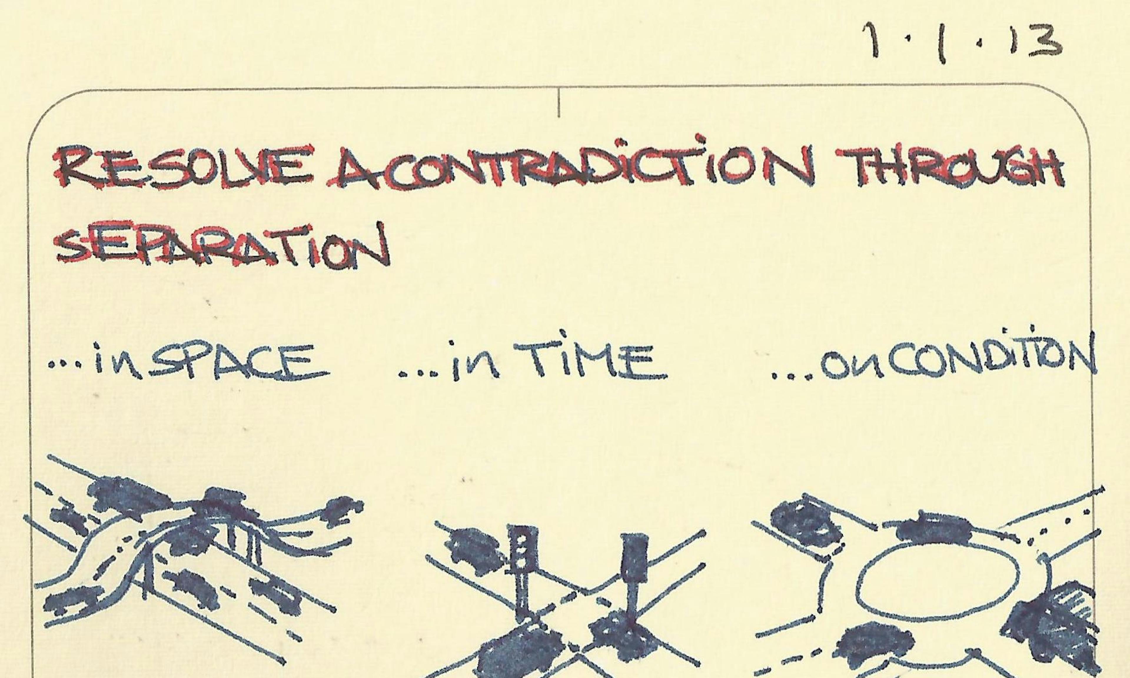 Resolve a contradiction through separation
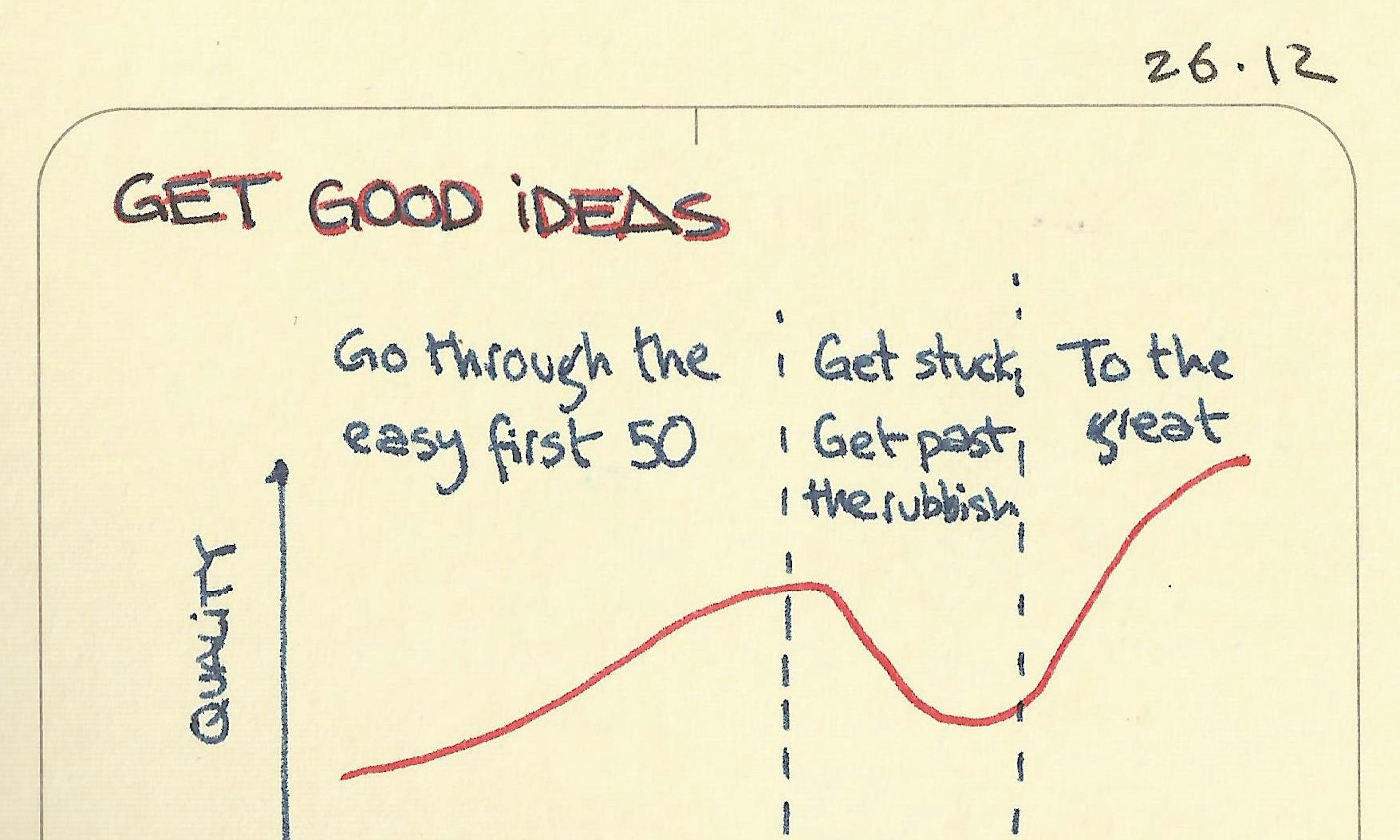 Get good ideas
