

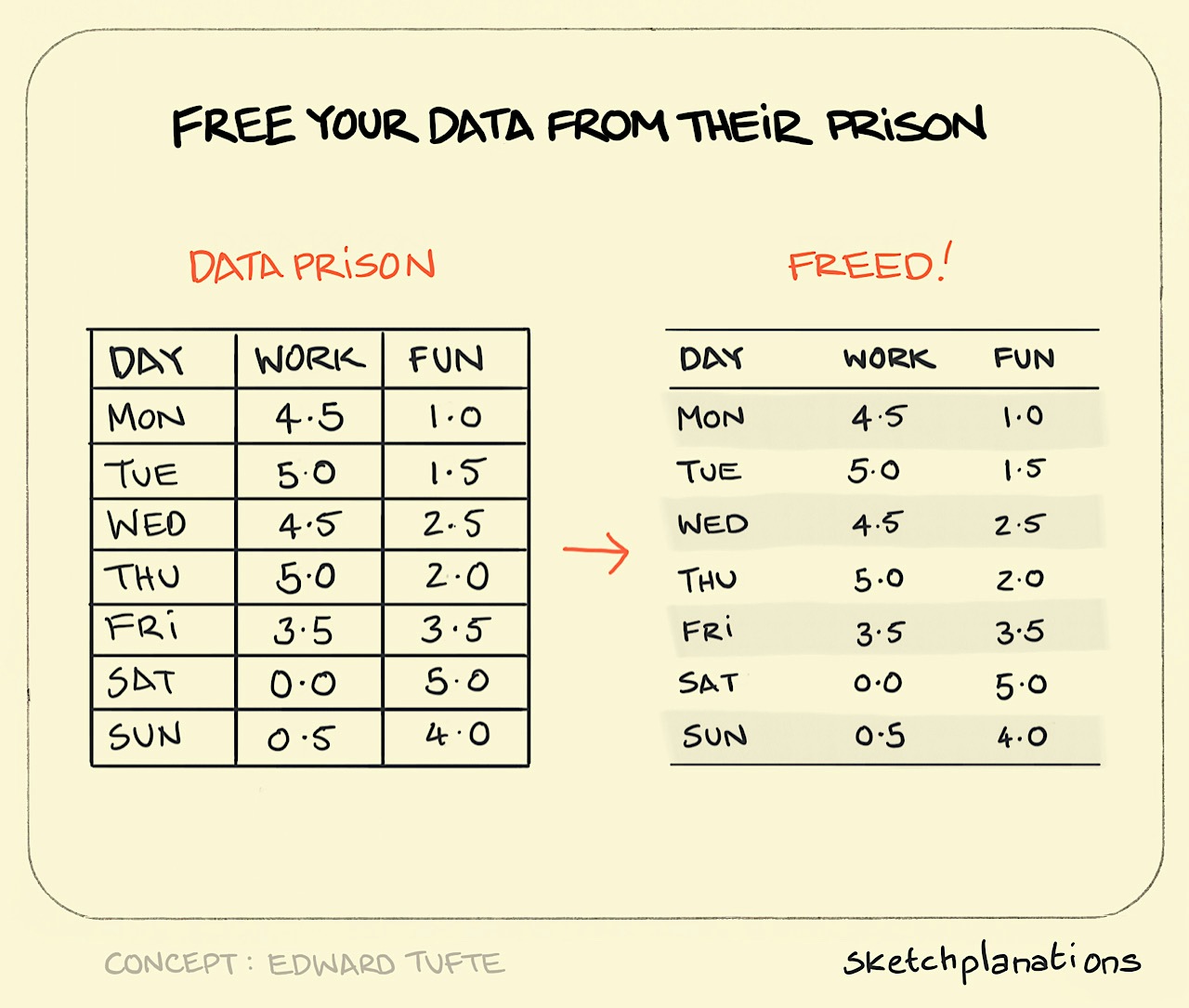
The data prison
- Download
- Copied!
👇 Get new sketches each week
The data prison is the default table where the bars of the cells crowd out your data with non-data-ink and lock your data into a prison.
When data is locked into cells, their relationships with other data are harder to see, and the reader has to work harder to learn from your table.
When making a table of data, consider if, by adjusting spacing and alignment, you can make the columns or rows clear enough as they are without the prison bars. And look for opportunities to remove the visual noise to let your data and the relationships between them shine out.
The data prison is a concept from Edward Tufte. Check out the beautiful Envisioning Information
More Tufte sketchplanations:
Published
Back to top