Maximise data-ink

- Download
- Copied!
👇 Get new sketches each week
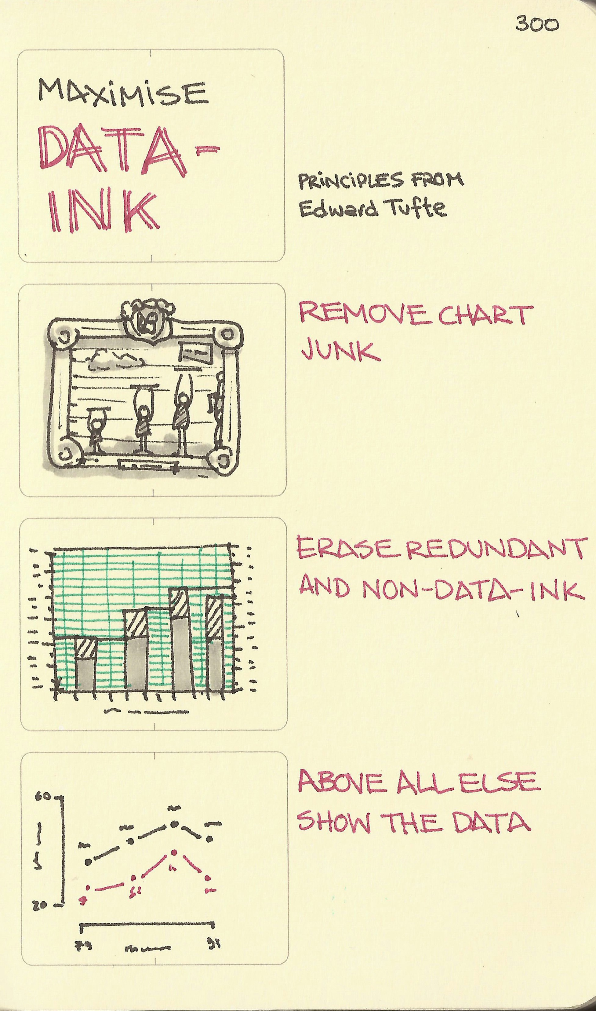
Principles from Edward Tufte. Remove chart junk. Erase redundant and non-data-ink. Above all else show the data.
Of course the present infographic trend laughs in the face of these principles in the interests of trying to encourage people to actually look at the data in the first place. But, assuming you actually want people to seriously infer some meaning from the data, these are not bad principles to follow when constructing your data graphics. Some basic Excel templates could do with a clean up for example.
Published

