Gestalt principles

👇 Get new sketches each week
The Gestalt principles of visual perception describe how our brains make sense of what we see. For example, they explain how we associate a photo with the text of a newspaper article or understand a series of words as a sentence on a billboard. These principles originated from the field of Gestalt psychology in the early twentieth century.
In laying out sketches, I try to consider how a viewer will understand what connects with what, the order in which the viewer will read the sketch with their eye, and how colour or formatting link related elements—skim through the back catalogue to see it in action. In creating each sketch, consciously and unconsciously, I use many of the standard Gestalt principles of design.
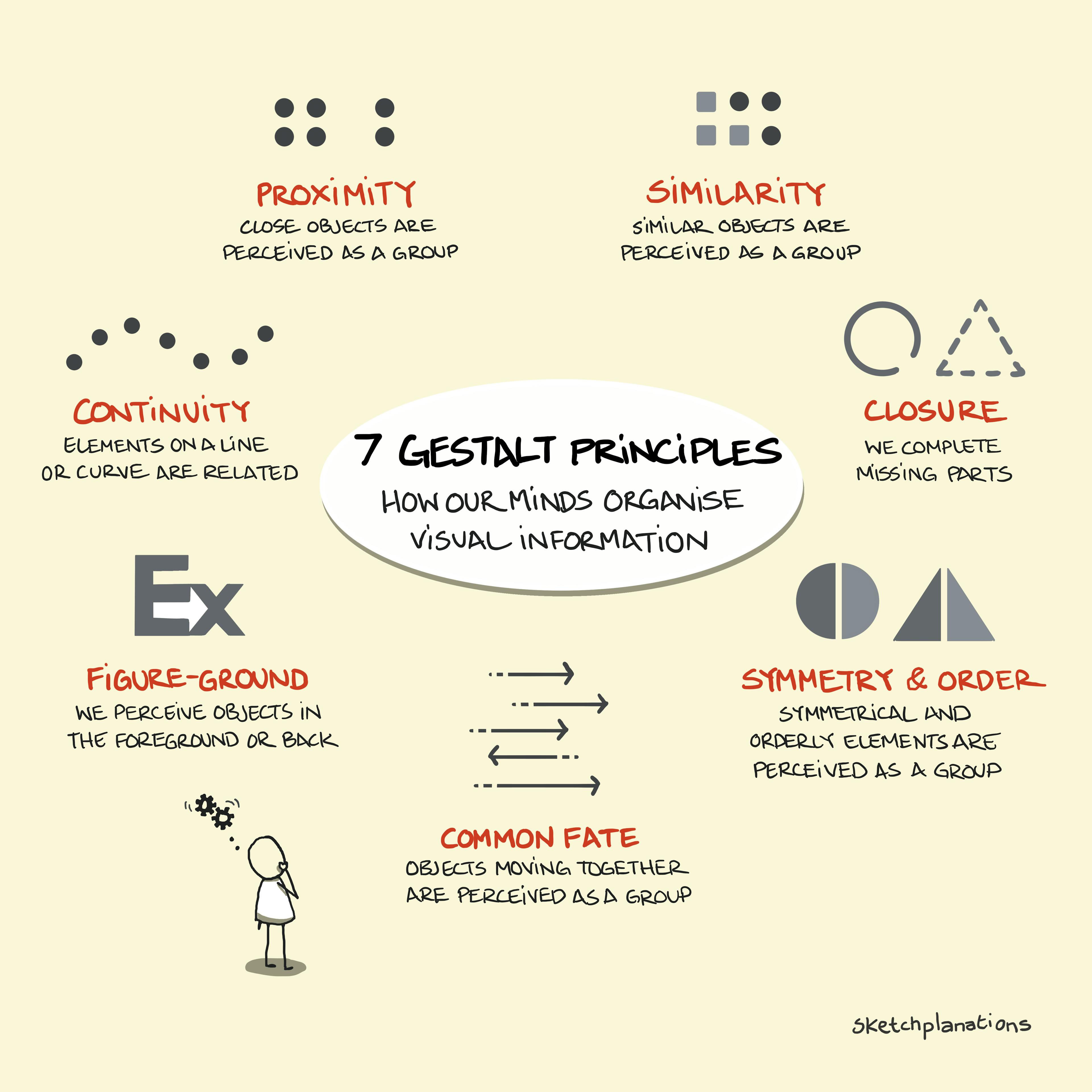
There are many Gestalt principles and some variations in the names. I chose seven common principles to illustrate:
- Proximity
Objects that are close together are perceived as a group - Similarity
Similar objects are perceived as a group - Continuity
Elements on a line or curve are related - Closure
Completing missing parts of images to create a whole - Figure-Ground
Identifying what's in the foreground or background - Symmetry & Order
Perceiving symmetrical or orderly elements as a group - Common Fate
Objects moving together are perceived as part of a group
The Gestalt principles are helpful for information design, user interface design, user experience design, graphic design and just about any design. It is also fascinating to spot how you unconsciously use them when interpreting designs you see. For example, look at the signs in an airport, a menu, or a page of your favourite app and see which principles are in play.
The Interaction Design Foundation has a great article on the Gestalt principles that explains their use in design in more depth. You'll also find many others.
Also see sketches on:

