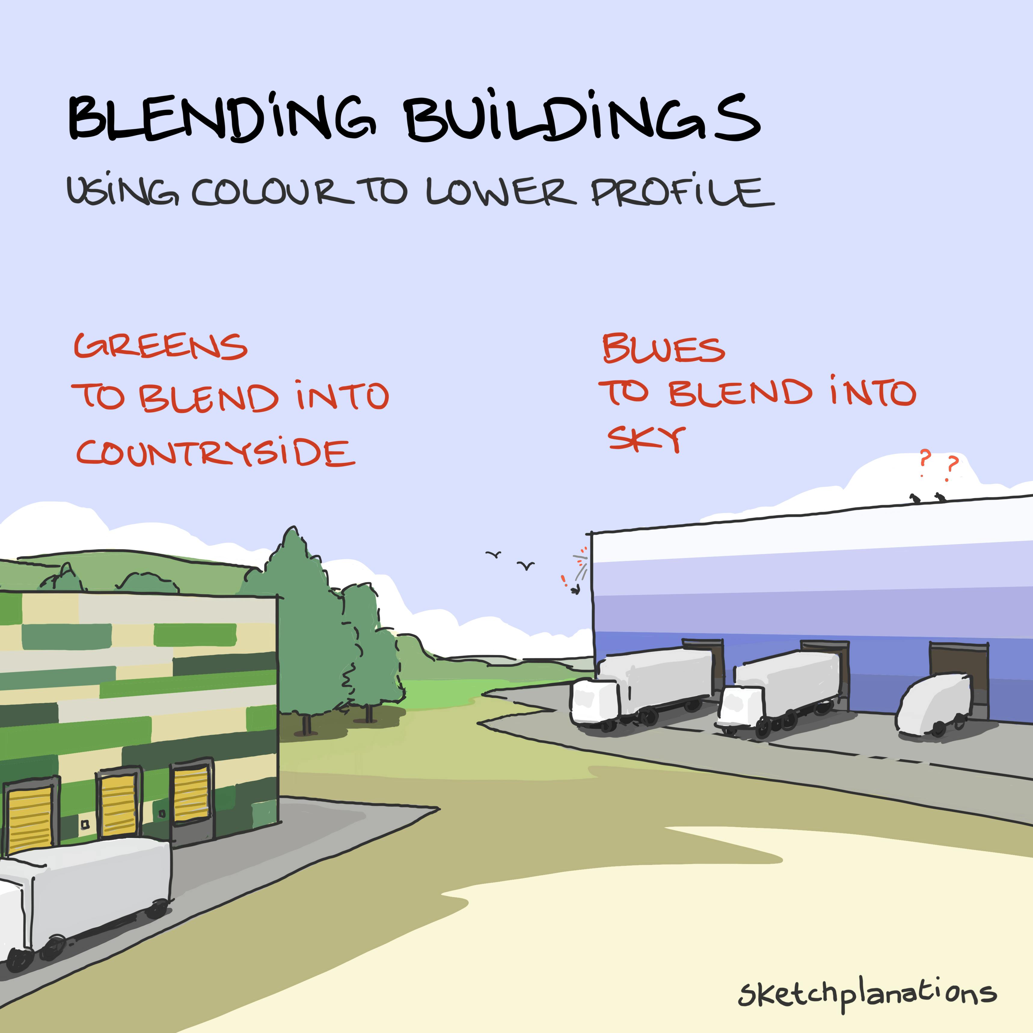
Blending buildings

👇 Get new sketches each week
While historic buildings in an ancient city centre make tourist attractions, most people would prefer the giant distribution warehouses that power online commerce and our world of delivery-everything to remain out of sight.
Several recently constructed distribution warehouses have started using enormous blocks of colour at scale to gently lead the eye and help buildings of exceptional size blend better into their surroundings.—greens to blend into countryside or "a beautiful sky blue " (video) to blend better with the sky.
Having passed both buildings with the patterns in this sketch, I can attest that the effect, in the right angles and light, is compelling—even though I noticed them more than ever as I spent time thinking about how well it works.
Read more about buildings designed to disappear into the landscape in Rowan Moore's Guardian article "A shed the size of a town: what Britain's giant distribution centres tell us about modern life "
This effect also reminded me of dazzle camouflage .

