
Affordance
👇 Get new sketches each week
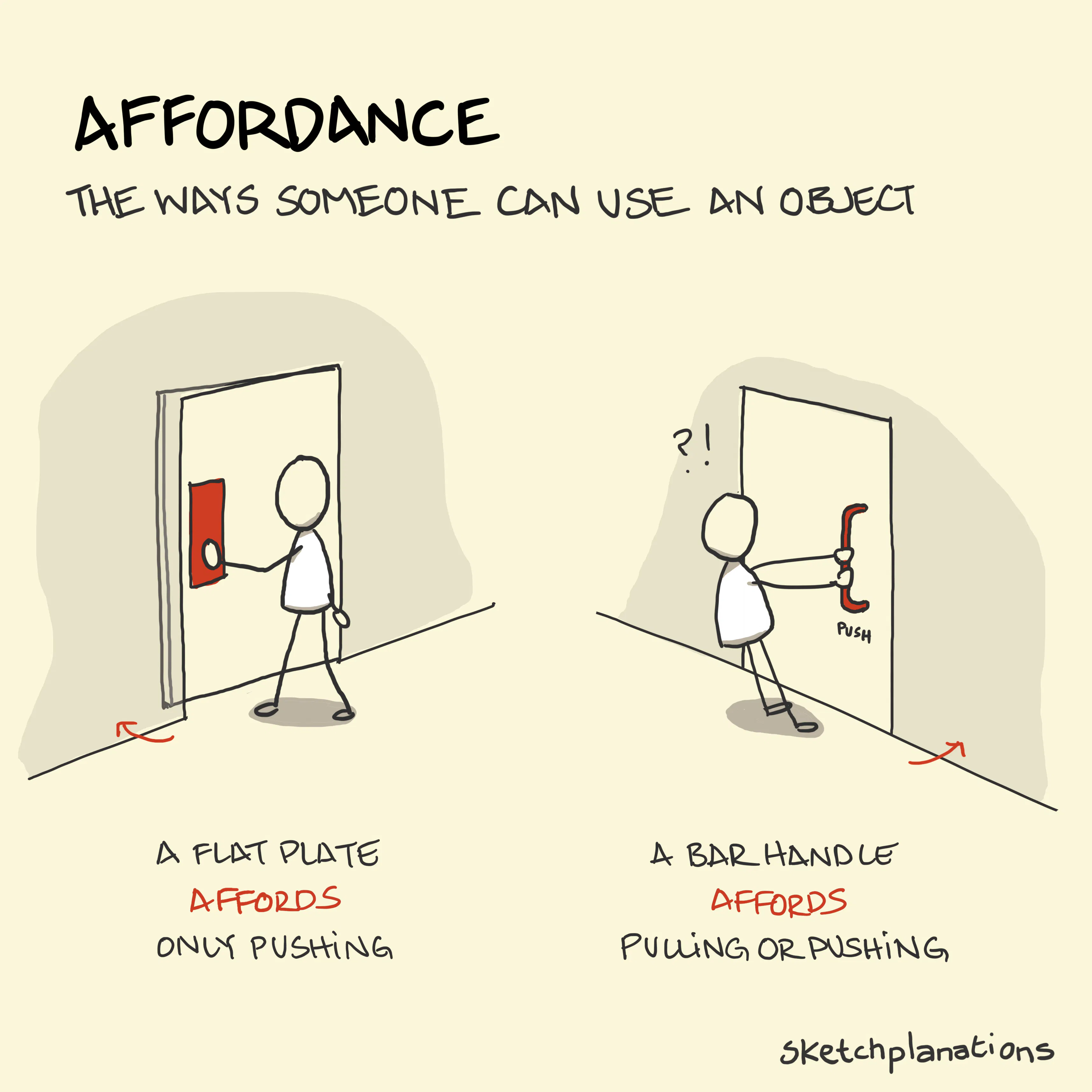
An affordance is what someone can do with an object. When you see a well-designed everyday product, the perceived affordances should indicate how to use it.
You shouldn't have to struggle to figure out how to use your shower to take a shower, and you shouldn't have to use trial and error—perhaps drenching yourself in cold water in the process. The design of an everyday thing should make it evident. An object should communicate a good part of how to use it through its affordances.
A recessed button affords pressing it. A sticking-out dial affords twiddling it. A toggle switch affords toggling. An apple affords tossing and catching it; an anvil doesn't. A high stool affords sitting, leaning against or standing on it.
Don Norman, who popularised the term in his classic book The Design of Everyday Things , talked a fair bit about doors. We can push or pull a door or slide it to the side. Sometimes, doors open upwards (though rarely downwards). In something as fundamental to our everyday living as a door, you might think that we had nailed their design sufficiently not to misuse them. However, I'm willing to bet that, like me, you have pulled a door when you needed to push it. A common culprit is adding a bar handle to a door on the side you need to push. While a flat plate attached to the door affords only pushing, a bar handle begs you to pull it. Often, a door designed this way gets a sign saying "Push." As Don Norman says, if your design needs a label, consider another design.
Once, I nearly walked away from a library with my two small boys because of door confusion. After going through an outer set of glass doors that slid open automatically as we approached them, the next set of glass doors stood resolutely shut. Concluding that the library must be closed, we were just walking out when someone walked up to the second set of glass doors and simply pushed them open. The first set of automatic doors had so cued me that the second set would also be automatic, and the glass doors held no clue that they would operate differently from the outer set that I almost failed to get into an open building.
Don Norman became so well known for pointing out the flaws of everyday objects that poorly designed products became known as "Norman doors ."
Don Norman's frustrations are mostly for everyday things. If you are an air traffic controller or an astronaut flying a space shuttle, it's reasonable to expect that some training may be wise to use all the advanced functionality. Yet in specialised environments like healthcare, good design—like avoiding storing drugs in alphabetical order—is critical to reduce the potential for failure.
Digital products struggle to provide affordances. Apple's touchscreen interactions and trackpads have little discoverability of what you can do with them: swipe down from the top-right, swipe up from the bottom, double-tap the side button, long-press on an icon, two-finger swipe right, triple-finger tap—all effectively invisible. Interactions like these reward repeated use and require learning to be effective. However, I think it's reasonable to expect a warm shower in a hotel on your first try without requiring training.
Also see: mapping, forcing function.
