Get the book!

Prefer to listen?
🎉 Help keep Sketchplanations ad-free 🎉 Keep this ad-free 🎉 Help keep Sketchplanations ad-free by supporting me
Explaining the world
one sketch at a time
Have great conversations about ideas through simple and insightful sketches. Visual explanations that are fast to read, fun to share, and hard to forget.
Hi, I'm Jono 👋
I'm an author and illustrator creating one of the world's largest libraries of hand-drawn sketches that make complex ideas easy to understand.
Sketchplanations have been shared millions of times and are used in books, articles, classrooms and presentations around the world. Explore nearly 1,000 sketches explaining ideas from psychology and science to business and everyday life.
Recent
A new sketch every week since 2013 🚀
 Endonym and exonym
 Melody and Harmony
 Fast Pool, Slow Pool
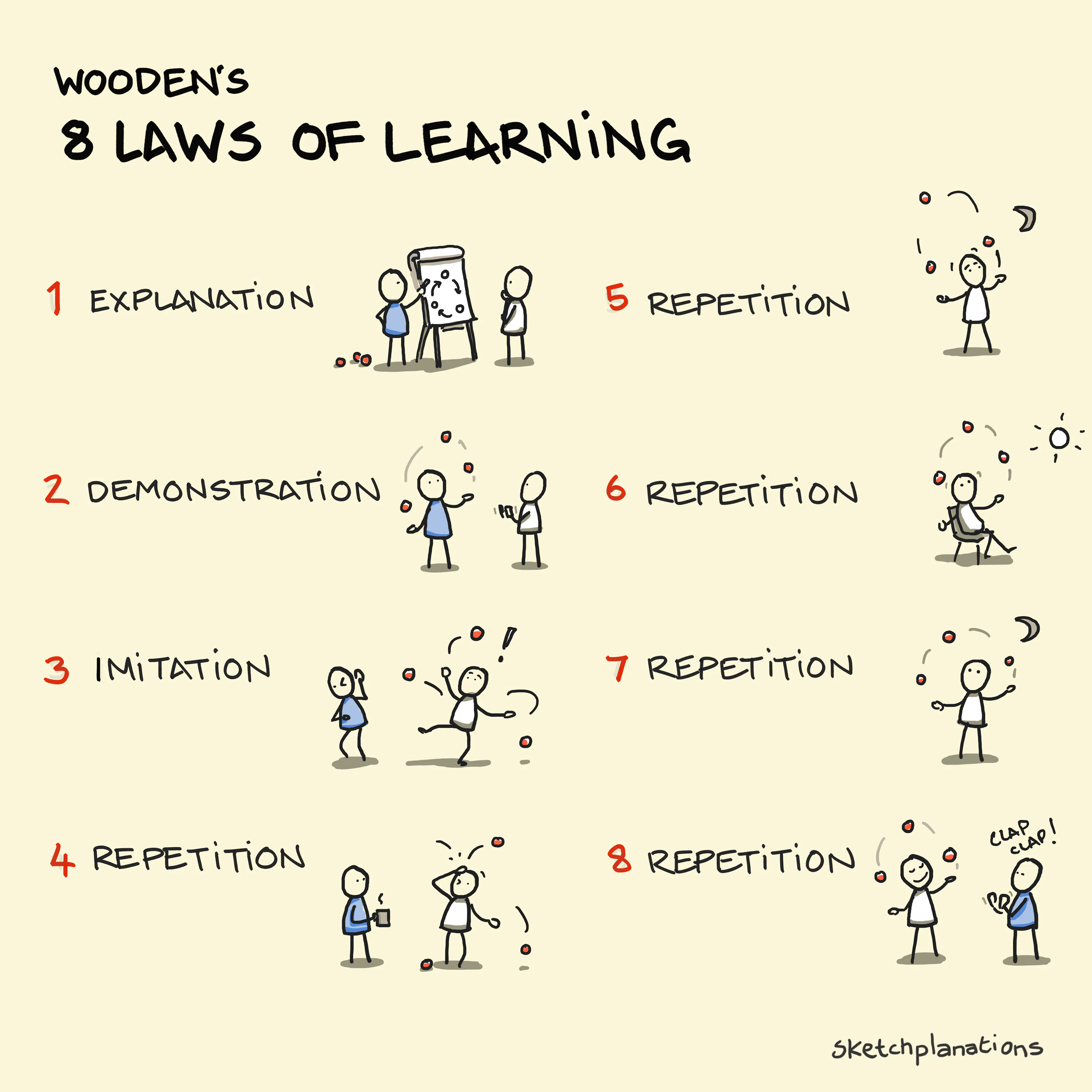 Wooden's 8 Laws of Learning
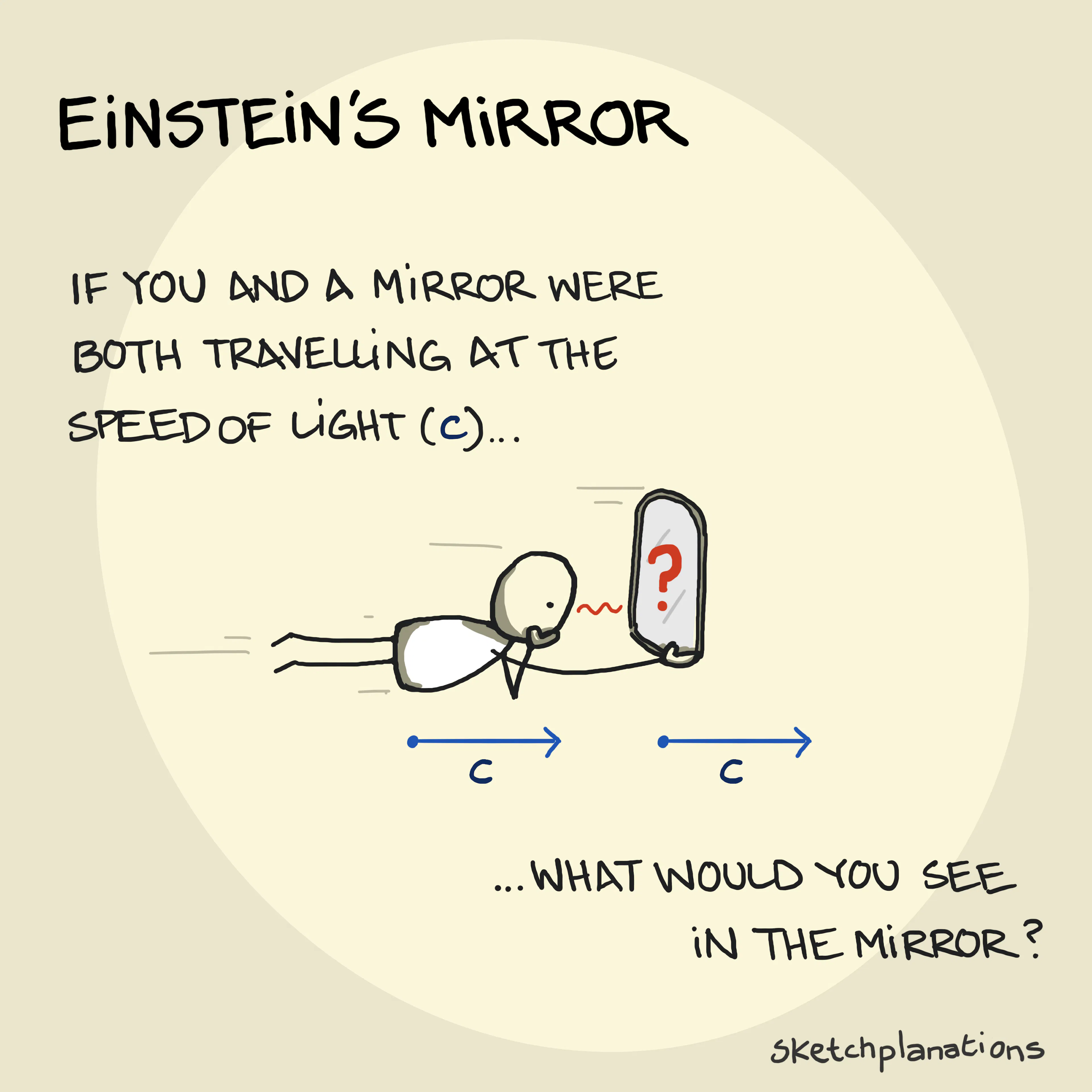 Einstein's Mirror
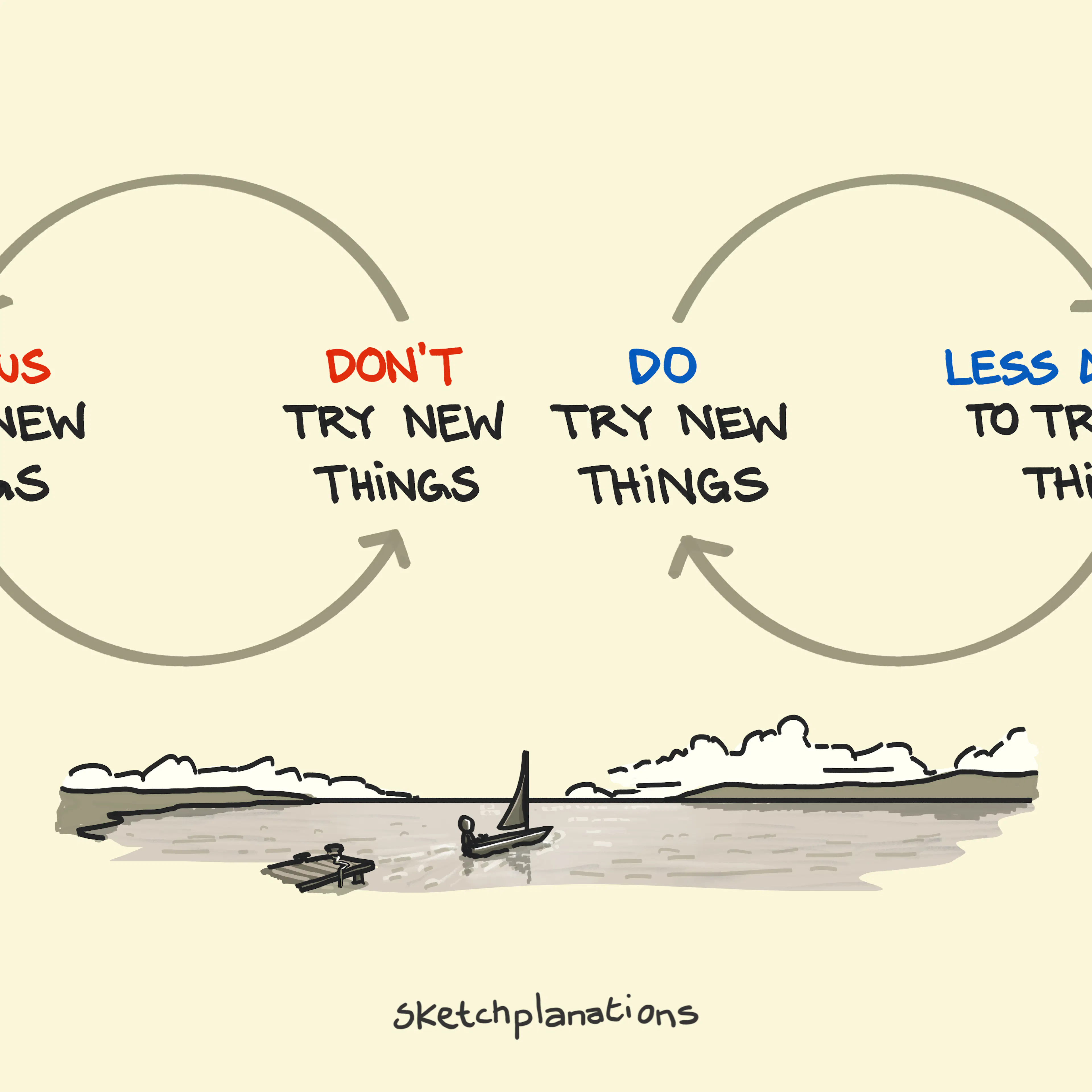 Trying New Things
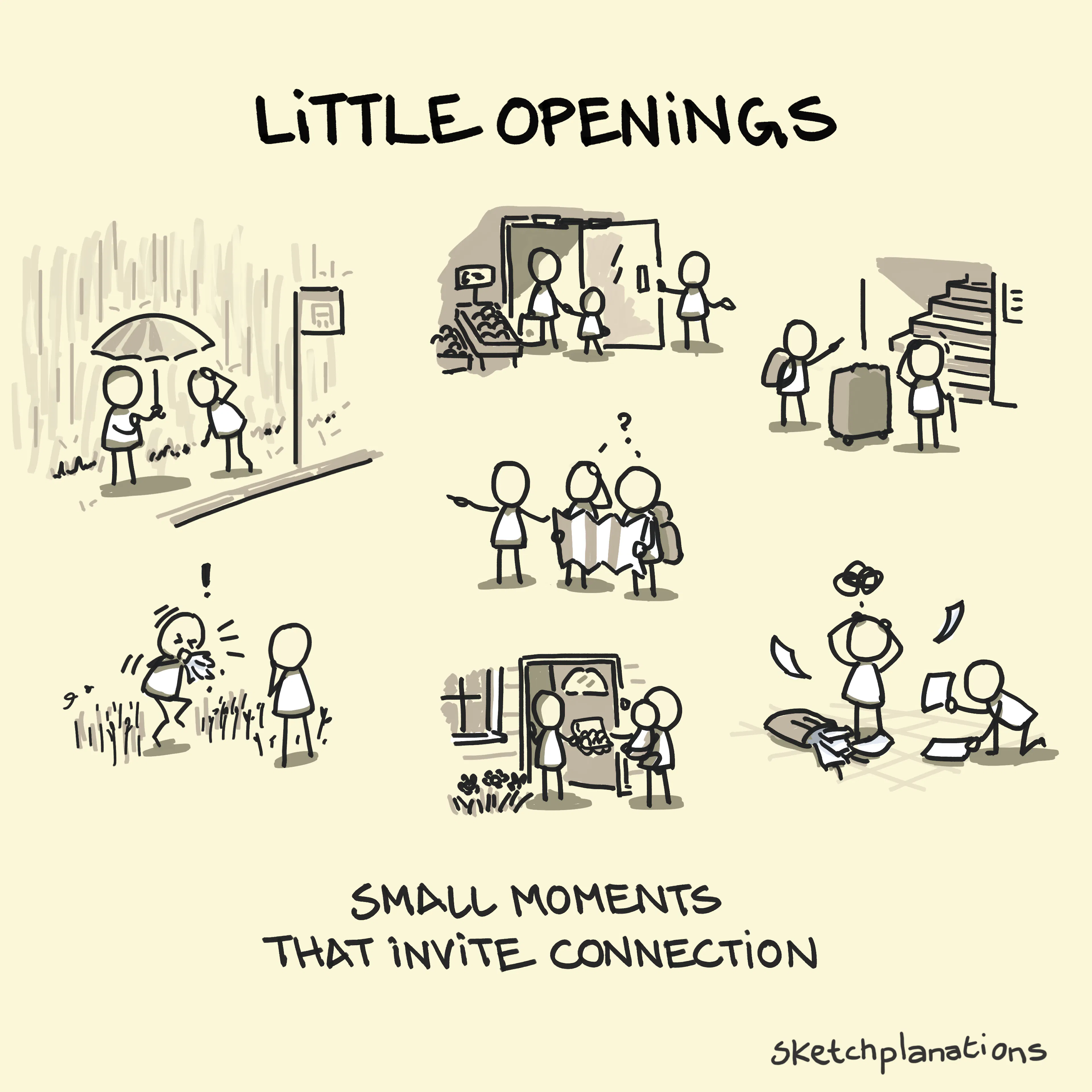 Little Openings
 Understanding El Niño
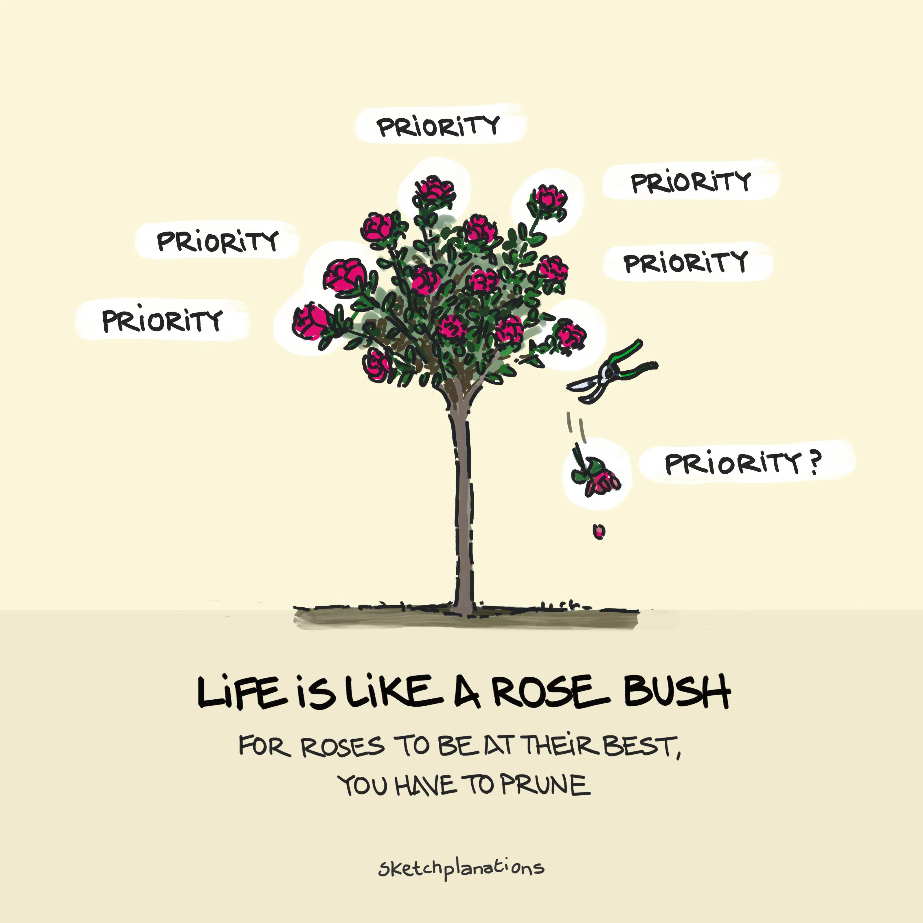
 Opening stubborn jars: an escalation of methods
 I will study and get ready and perhaps my chance will come — Abraham Lincoln
 Thermocline
 Recursive Islands
 Moravec's Paradox
 So Nothing Rhymes with Orange?
 The McNamara Fallacy
 All models are wrong, but some are useful — George Box quote
 The Iceberg Model
 Uitwaaien: The Dutch Word for Walking in the Wind
 Coffee: The Glorious Solution to The Coffee–Sleep CycleView all
In a Book: Big Ideas Little Pictures
5-star rated on Amazon!
Absorb big ideas with crystal-clear understanding through this collection of 135 visual explanations. Including 24 exclusive new sketches and enhanced versions of classic favourites, each page shares life-improving ideas through beautifully simple illustrations.
Perfect for curious minds and visual learners alike.
See inside the bookExplore visuals for
