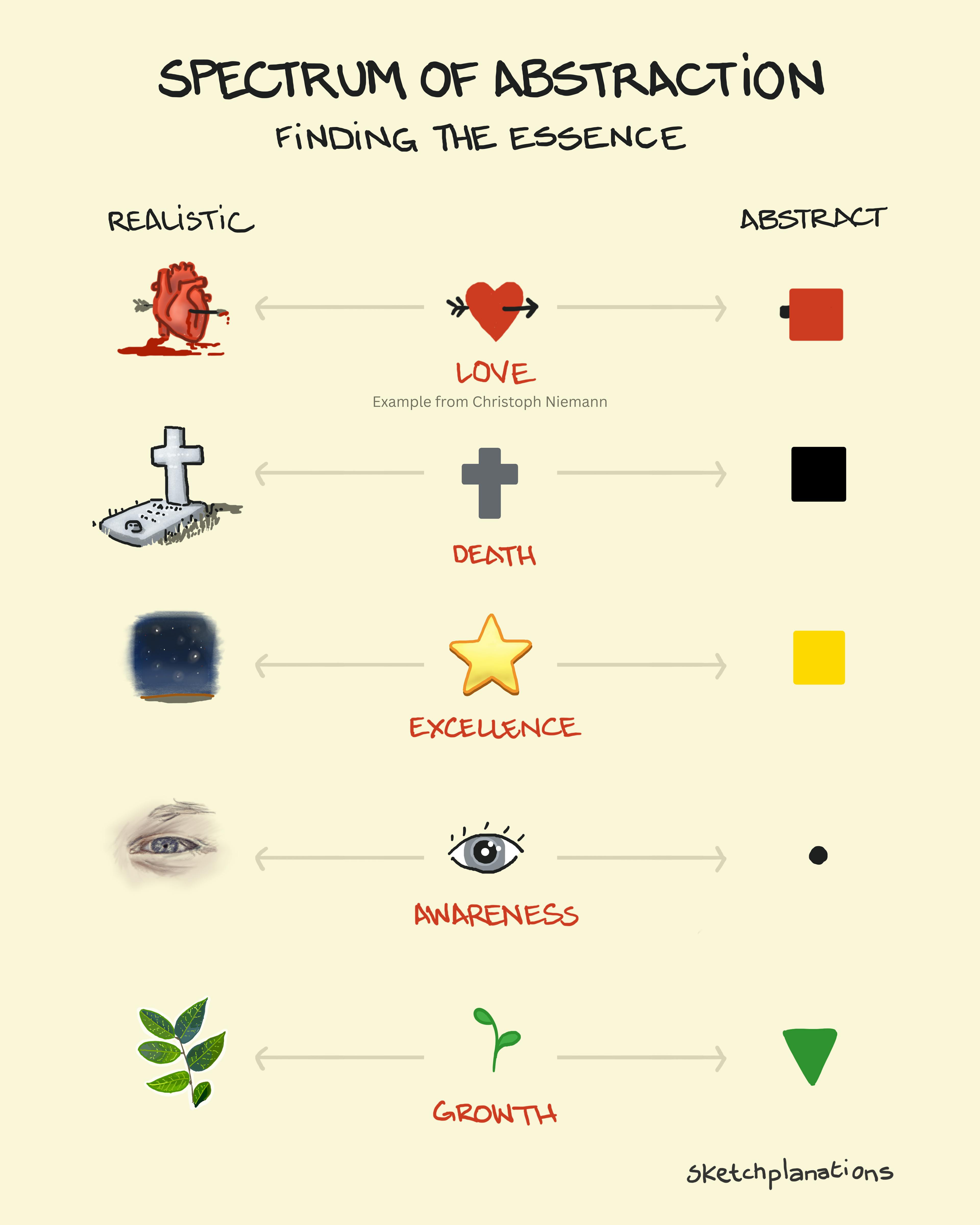
Spectrum of Abstraction
- Download
- Copied!
👇 Get new sketches each week
A fundamental act of art is choosing what to leave in and what to leave out. These choices express a point of view and what you communicate.
I’ve long been intrigued by iconography for exactly this reason. Icons strip things back to their essence so the message comes across without all the distraction.
Choosing What to Leave In and What to Leave Out
A pencil icon, like this emoji ✏️, ignores the scratches, the wood grain, the worn eraser, the pencil shavings, all the colour variations. It concentrates on the two ends and the colours, and the intent comes across more clearly.
Whenever you draw a scene, you get to choose what to include and what to omit. And in photography, I’ve often framed a shot to leave out the road, the power line, the signpost or the rooftop that would otherwise detract from what I was trying to show.
It happens in storytelling, too. You see a bottle of whisky and an ashtray for the grizzled detective in a film or novel. They also have cleaning spray in the cupboard and junk mail on the floor. But some of these add, and some detract.
Christoph Niemann on Abstraction
One of my favourite explanations of this comes from the Netflix documentary, Abstract: The Art of Design , in the episode with the brilliant Christoph Niemann . Here's how he describes abstraction:
"I would say that abstraction probably is, for me, the most important concept of art.
...I start with a thousand different thoughts and then I, one by one, throw them all out, until, at the end, I have the one or two or three that are essential to the whole question.
But the abstraction, for me, is this idea of getting rid of everything that's not essential to making a point.
...each idea requires a very specific amount of information.
Sometimes it's a lot: a lot of details, a lot of realism.
Sometimes it's really just this one line. The one pixel.
But each idea has one moment on that scale.
So, let's say you want to illustrate the idea of a heart as a symbol for love.
When you illustrate it as, just, like, a red square, which is the ultimate abstraction of a heart, nobody knows what you're talking about, so it totally falls flat.
When you go all the way realistic and draw an actual heart made out of flesh and blood and pumping, it's just so disgusting that the last thing anybody would ever think about is love.
And somewhere between that abstract red square, and the real kind of butcher heart, is the graphic shape that kind of looks like that, and kind of looks like that, and it's just right to transport this idea of a symbol for love."
The episode includes a brilliant Abstract-o-meter with the example of the heart and the scale: too realistic --- just right --- too abstract
Just the Right Information
It's stuck with me. In each sketch, with any icon or scene, there's a choice to be made about how much detail to include. What adds to the message? And what distracts from it?
Are there things you can leave out to make your message stronger? Or are there things that are missing?
Related Ideas to A Spectrum of Abstraction
Also see:
- The Pyramid Principle - organise ideas to communicate clearly
- Skeuomorph - design that mimics earlier ones
- Design for: A Glance, A Look, A Read
- Word spectrum
- Mapping: "If your design needs labels, consider another design"
- Rich Pictures for making sense of complex problems
- The Golden Ratio
- The Rule of Thirds
- Design by Committee
