

The Wheel of Death
👇 Get new sketches each week
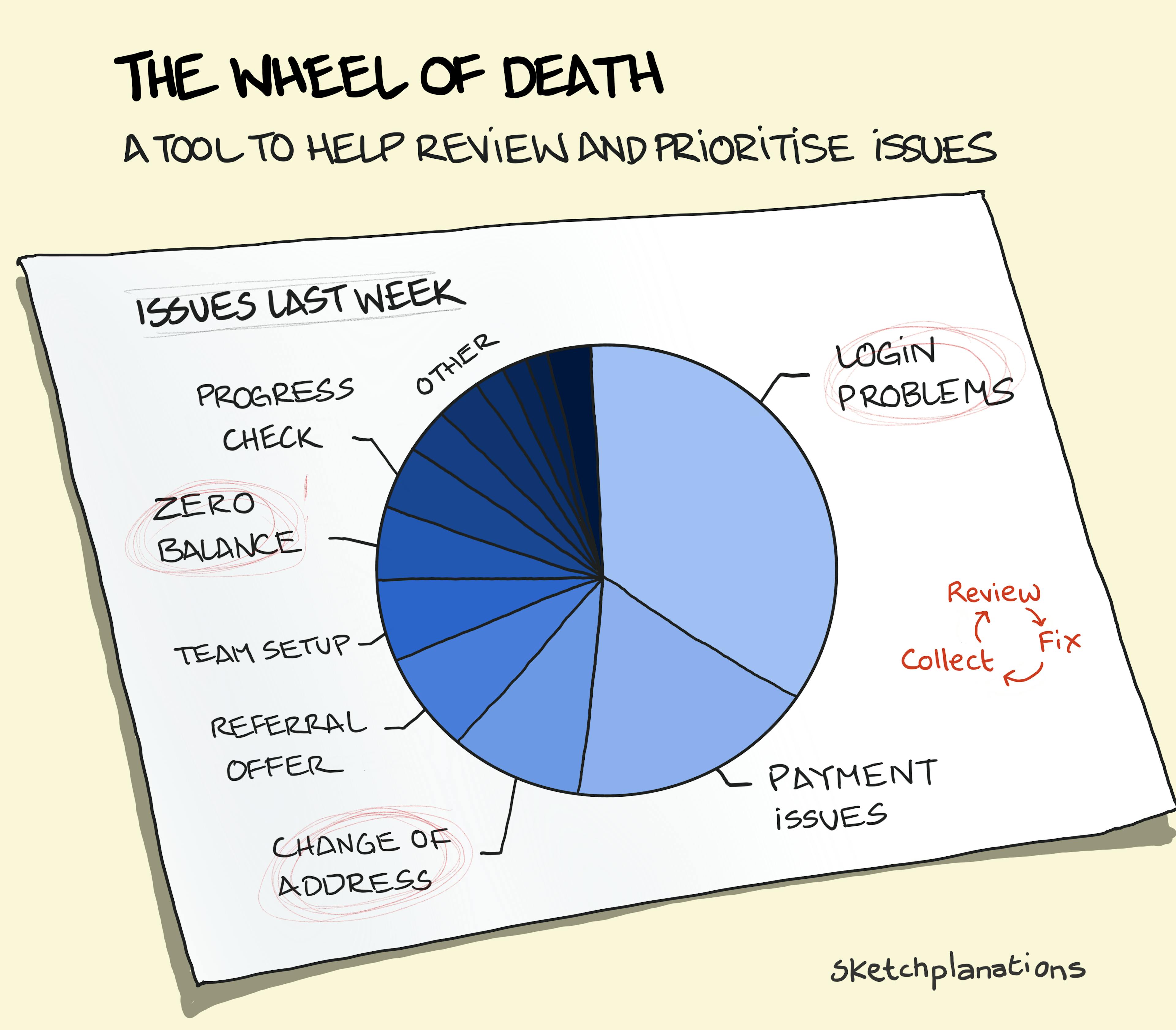
The Wheel of Death is a handy and simple tool to help prioritise issues and where to spend time fixing things.
I learned it from the domain of customer service. It's used something like this:
- Keep track of customer issues that you encounter each week by tagging them.
- At the end of the week, tally up the responses and produce the Wheel of Death to see the highest volume of questions or issues taking up the team's time.
- Use the Wheel as part of a conversation about where the company should focus to improve the experience and save time for the team and customers.
The proportion of issues is only part of the story, and other factors like how critical the issue is, how much time it takes to resolve it, and how much work it is to make it go away will all be part of the decision.
I learned it from working with a talented head of customer experience as we worked on fixing support issues, though don't confine its use to that. I find "the Wheel of Death" a name that sticks with me, but it could also be called the Wheel of Fortune. If you focus on the Wheel for a spell, it's hard for things not to improve.
Worth bearing in mind that in its form as a pie chart, you'll need to combine it with volume or time metrics, or it can look like you're not making progress.
I revised this sketch slightly from the original
