Dark patterns

👇 Get new sketches each week
Dark patterns are when people design interfaces intending to deceive or trick. Sadly we are all familiar with these. They're everywhere.
It could be the free trial that unexpectedly led to a subscription or the subscription that was easy to sign up for but had to be canceled by mailing in a letter. Or it could be an outward attempt at giving control over privacy but with options so confusing as to do the opposite. Perhaps you tried to adjust cookie preferences on a news website but could only find a button to 'Accept all' after editing your preferences—grrrr! Tricking people like this into sharing more information than intended has come to be known as Privacy Zuckering .
Remember popups that could only be closed once you found a tiny 'x' that moved around the screen?
I recently wanted to pause a subscription only to be told it would invalidate all the accumulated unused credits I'd paid for (I'm still paying).
The Pudding published a great analysis of unsubscribing from online services . At times this may be unintentional—there's naturally less incentive to work on great account closing and unsubscribe experiences than on signing up.
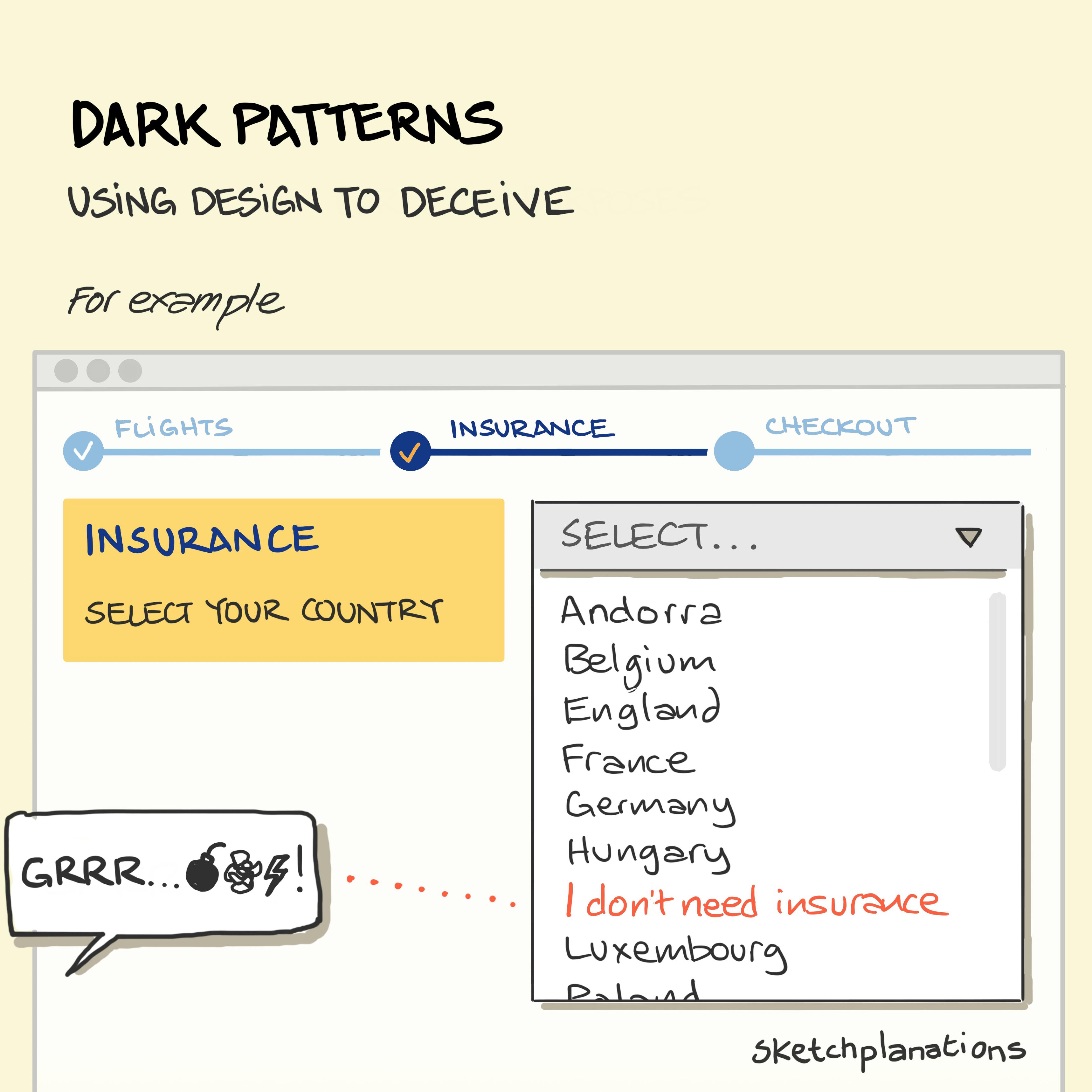
The example in the sketch was a real one I experienced (I wish I'd grabbed a screenshot) from an airline website where the designers buried the option not to buy insurance within the country select list.
And they're not just online. Sneaky casinos employ design in the physical world for their gain, such as removing references to time passing, such as clocks or windows, using mazelike navigation and the continual winning sounds of jingling coins.
"Dark patterns" was coined by Harry Brignull and documented at the Deceptive patterns site and now a book .

