

The Keeling curve
- Download
- Copied!
👇 Get new sketches each week
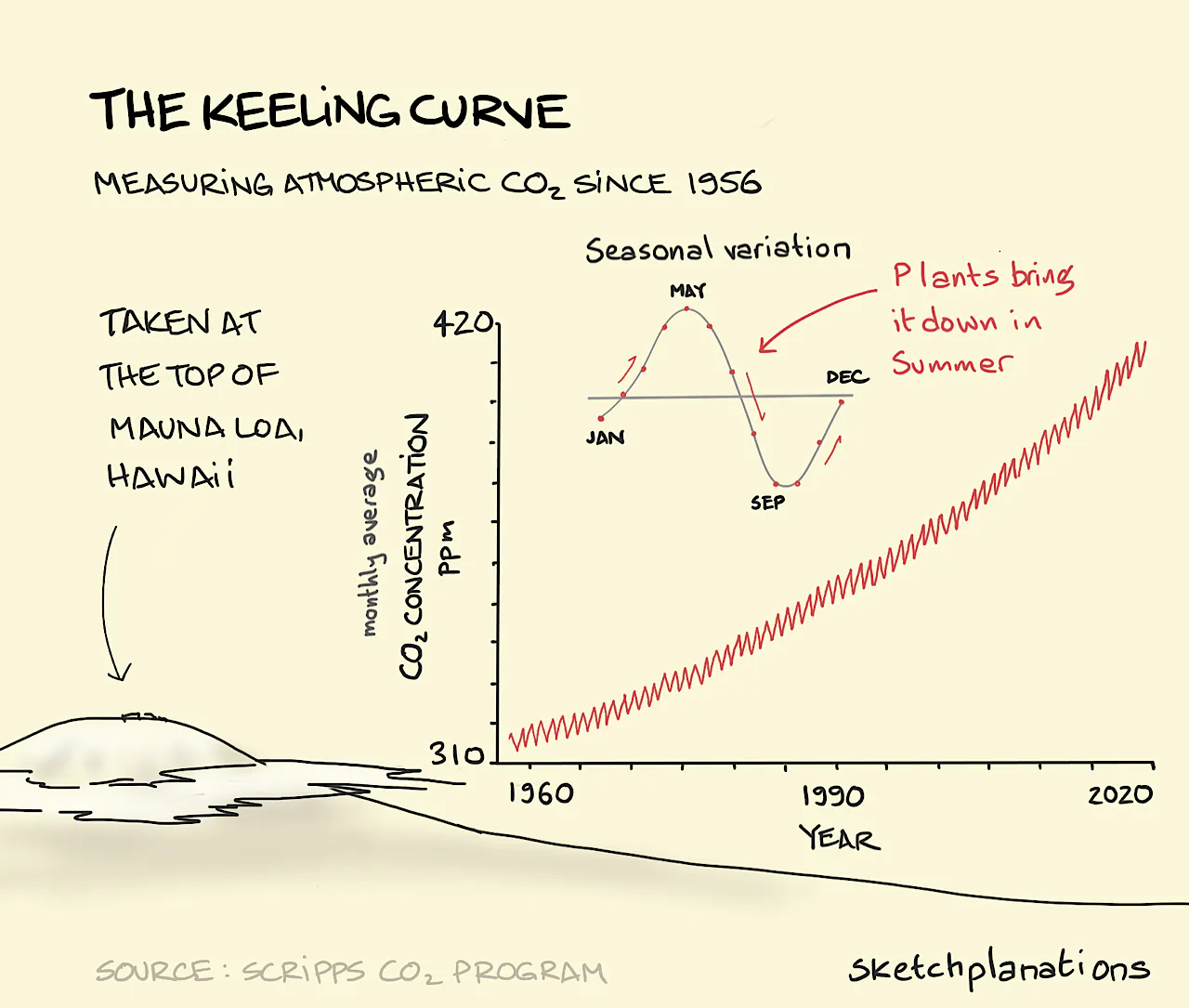
Perhaps the most important curve of our times, Charles Keeling’s curve shows the change in concentration of CO2 in the air with measurements taken every year for over 60 years. Taken at the top of Mauna Loa volcano in Hawaii because of its high altitude and relative isolation in the Pacific, Charles Keeling’s measurements show that the monthly average CO2 concentration in the air has risen from around 310 ppm (parts per million) to around 410 ppm in 2020. As a greenhouse gas this change in CO2 concentration is one of the critical causes of climate change.
The concentration varies seasonally as plants bloom in Spring and Summer reducing the concentration from its high around May as the CO2 has built up over the Norhern Hemisphere Winter.
The Scripps CO2 program is now overseen by Charles’ son Ralph Keeling.
