Flatten the curve of an outbreak

- Download
- Copied!
👇 Get new sketches each week
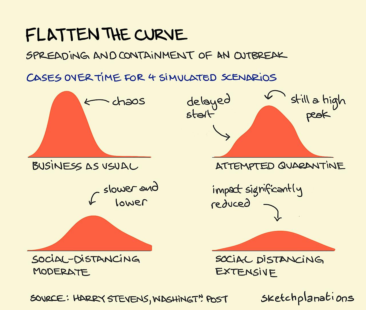
Writing this in the middle(?) of the coronavirus outbreak I thought it might be interesting to share these charts, created from the simulations in the excellent Washington Post article “Why outbreaks like the coronavirus spread exponentially, and how to ‘flatten the curve’” by Harry Stevens .
The charts represent different strategies for containment and mitigation of the effects of a contagious outbreak.
Trying to quarantine an area — where it is difficult to attain complete quarantine — delays the effect of an outbreak somewhat, but once released the impact is still significant with a potentially high peak of cases.
Social-distancing — staying away from each other to reduce the chance of infecting others if you are infected and minimise the chance of infecting yourself — in both the bottom scenarios in the simulation manages to both delay the onset of an outbreak and reduce the peak. Not included in this simple simulation is that reducing peak infections in particular helps the healthcare system effectively treat and care for those who are infected, and look after its healthcare workers. When healthcare is not overwhelmed this further minimises both the spread of a disease and fatality rate.
Read the article, run your own simulations, and maybe consider supporting the Washington Post, here: “Why outbreaks like the coronavirus spread exponentially, and how to 'flatten the curve’” .
Disclaimer: I am not a public health professional. These charts are from my results of the simulations in the article and the simulations represent a simplified, though instructive I think, view of an outbreak and these containment methods.
HT: Slava Kremerman

